2014 is "the year of the wearables" according to many tech pundits. A statement which I both agree, and disagree with. It has potential to be a massive year for wearable technology. Companies have already hurdled the first obstruction: Getting regular consumers talking about it. Even if they don't really know what a smart watch is, or what exactly it does, at least they're aware of its existence. But making them aware of it, and getting them to part with their hard-earned cash are two entirely different issues.
And to me, Pebble is the only company getting the key issues right, and getting the right balance between style and functionality. Giving it the best chance to make a success in the market it helped to create.
1. A watch is a fashion statement
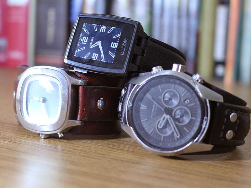
While wearables is a market much bigger than just connected watches, I can't help but feel the watch is where there has to be more focus from tech companies. But there also has to be a huge shift in mentality. A watch is much more than a gadget. It's a fashion item. It's an accessory. Put the Pebble Steel side-by-side with the LG G Watch or any of Samsung's countless Gear models. Only one looks like a proper watch. The others look like style-less plastic boxes with a rubber strap. They're also much bigger than a traditional, mass-market watch.
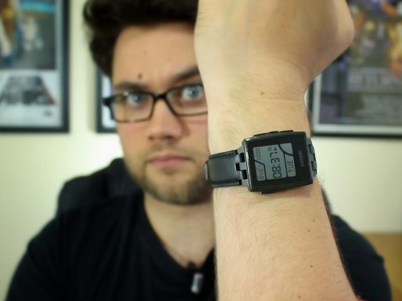
Pebble Steel, to the untrained eye, looks like a regular, classy watch. Nothing about the way it looks suggests it's a promising platform full of nerdy apps and watch faces (which it is). The face is covered in Gorilla Glass, and you have a choice of a timeless leather band or a metal-link strap. Both immediately look familiar, and wouldn't look out of place in a jewelry store. To some extent, Meta has approached the market in the same way. Its M1 has only recently been made available for pre-order, so we're yet to see exactly what they feel like to wear, or how they function.

2. Daylight Visibility
In the days before smartphones, when everyone either wore a digital Casio watch or something more traditional with a clock face, daylight visibility wasn't even thought about. Because it's the one thing you assume you'll be able to do with a watch: Read the time. In any condition.
It didn't matter if you were indoors or out. A quick glance at your wrist would be enough to to get the time. You didn't have to cover your watch with a hand, or move to a shaded area just so you could see what's going on.
Android Wear watches - so far - haven't even considered this. It baffles me that the manufacturers didn't put daylight visibility at the top of the "required" list of features. Forget fancy app integration, Google Now voice control, or a beautiful user interface. If I can't even see the thing when I'm outdoors, the product has already failed. I can put up with it in a smartphone, but in a watch? It's an unforgivable oversight.
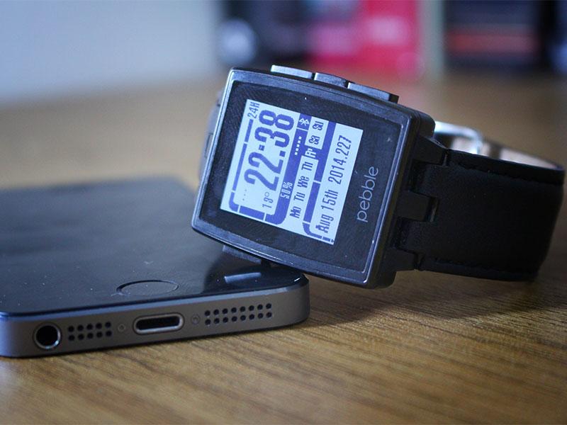
Pebble Steel has a monochromatic e-paper display that I can see in any light, and has a backlight for when it's dark. Perfect.
3. No attention-hogging
Presuming you're in an indoor area, and you have your Gear or G Watch on your wrist: It does too much. In my mind - and I'm happy to be disagreed with on this point - a watch isn't something which should command my attention. A smart watch should be something designed to remove the temptation for anti-social smartphone checking. If I'm having a drink with a friend, or out for dinner with my wife, the last thing they'll want is me checking my phone every time I get a notification.
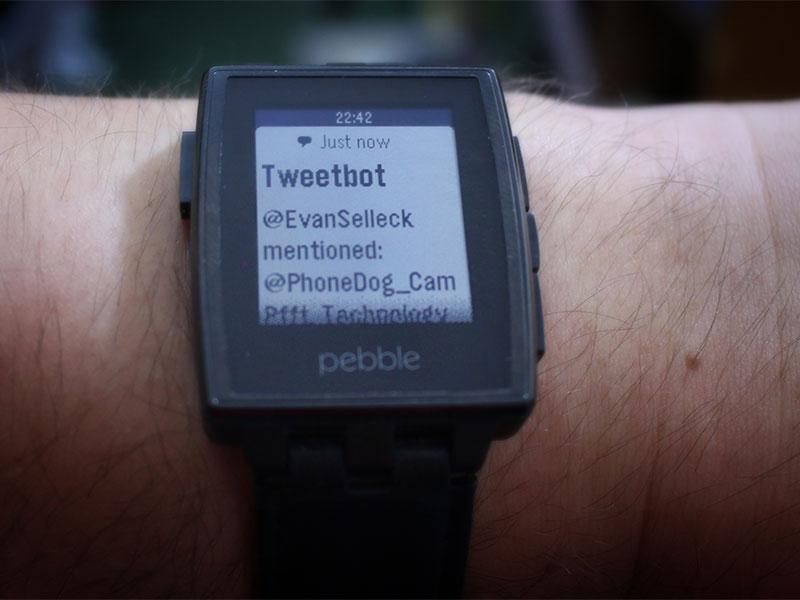
The temptation is also to ignore absolutely all notifications. Not a great idea if your kids are with a sitter and an emergency crops up. My Pebble shows me a quick notification which I can read in a split-second and get back to the conversation without the improper phone-getting. I can't control my phone with it as such, I have basic notifications and music controls. I can't post statuses, send messages, emails, engage in conversations, set reminders or calendar events. I can't action much, and I like it that way.
You could argue that you don't have to use all the Android Wear features, to which my response would be: So why have it? Why have a product designed to compliment my smartphone that virtually removes all need for the actual smartphone?
I don't want a device strapped to my wrist which has the potential to pull in my complete attention. I want a watch, which looks and works like a watch, but shows me notifications so I can decide what's worth getting my smartphone out for. I don't want an extension of my smartphone's operating system on my wrist. That's too much.

4. Battery
Another unforgivable oversight from a watch-making perspective is battery life. Because most smart watches have traded features, user interface and specs for the most basic watch requirements, you only get one day's use out of a Gear or G Watch. It seems utterly ridiculous to me that there's a watch on the market that needs charging every night. It's bad enough having a watch that needs charging at all. But every single day?
Now Pebble's not perfect here. I still have to charge it once every 4-5 days. But at least it doesn't require refueling as often as its Google-powered competition. Again, we're yet to see what Meta's M1 is like. From using a previous generation Metawatch, I'd presume the two are similar. We've also heard rumors that Motorola's Moto 360 will last 2-3 days. But that's yet to be proven.
5. Cross-platform
Having to change my watch because I've decided to switch smartphones is - again - another ludicrous oversight. If I want to switch between Android and iOS, I don't want to have to spend another $200-$300 on a new watch. I understand the necessity to make an ecosystem tight and desirable from a marketing perspective. But as a consumer, I approach almost all of my app or accessory purchasing decisions with an attitude of 'cross-platform is best'. It makes it easier to keep an open mind when shopping for gadgets.
If I drop a few dollars (or pounds in my case) on an app, I want to know I can still use its services from whatever machine I'm using. It's why I use Sunrise Calendar and Wunderlist as my main productivity apps. And it's one of the reasons why I'll always favor the Pebble to any of the Android Wear watches, or even the iWatch (when/if it comes).
6. Unsolved problem - Gender?
When it comes to making smartphones, I often criticize devices "made for women". It normally means a patronizingly pink outer shell, with "special" built-in software specially designed for girls. It'll maybe come with a pretty charm, and underwhelming specs and performance. Thankfully they don't exist as much these days. But with a watch, it's very different.
Like I mentioned in the first point, a watch is a fashion item, and women generally don't wear the same kind of clothing or jewelry as men. Watches - traditionally - are smaller, and styled differently to the men's versions. Because, for the most part, women have smaller wrists and hands than men. And not even Pebble has addressed this yet. You have a choice of either the masculine square shape and design of the Steel or the the plastic (now brightly-colored) nerdgasmic design.
Over past months, I've seen a number of wearable devices released specifically for women. They're mostly rings, bracelets/bangles or necklaces. But not many watches. And perhaps there's a reason for this. I have to admit, I've not gone delving in to watch sales figures to find the male/female divide, so I won't go making sweeping statements about who is more likely to buy a watch. But what I will say is that if you don't make a smart watch designed for women, you won't sell many at all to women. Seems like an obvious statement, but it's one manufacturers are ignoring.
If a smart watch can be packaged in a way that's appealing to women from all backgrounds, and with different styles, it becomes a more appealing object. Still gadgety enough to be attractive to tech-lovers but stylish enough to attract regular consumers. Essentially - A Pebble Steel for women? Not too much to ask for, right?

7. Wrap-Up and thoughts on Moto 360 and Meta M1?
Moto 360 looks like it's going to be the sexiest smart watch ever made. The style and consideration that's gone in to the design is exemplary. I've not seen the likes from Motorola since the Aura phone was released a few years back. It's good-looking enough to make me want to buy it immediately. But if it doesn't solve the display and battery life issues of the current crop of Android Wear devices, it won't take long to frustrate me.
And then there's the Meta M1 which I've not had a chance to check out yet. It's design looks fantastic, and that's no surprise given the man behind it. Frank Nuovo, the man behind some of the most iconic Nokia phone designs and the Vertu luxury phones. I have high hopes for it, and I love that it's available in different colors and at different price points.
In short, I want my smart watch to be as good at being a watch as a regular non-smart watch is, but with a few handy features which compliment my smartphone. So far, only Pebble's got it right in my eyes. Other companies like Meta, Cuckoo and Martian watches have all approached the market in a similar way, which I commend them for. But only Pebble's got my money so far.
What do you guys think? Do you use a smart watch, or is it still a pointless additional gadget to you?