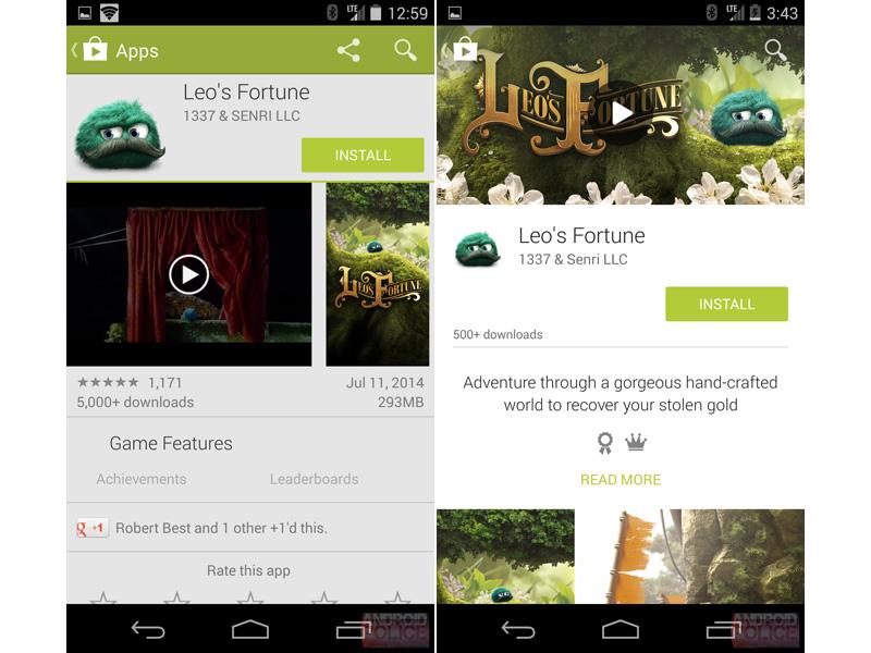
Google has packed a number of changes inside of Android L, but perhaps the one that users will recognize the fastest is Material Design. This design language brings a new look to many of Google’s apps along with bold colors and responsive design. We’ve already seen what the Material Design-ified version of Google+ looks like, and now some images that claim to show the refreshed Play Store have leaked out.
Screenshots shared by Android Police purportedly reveal the Material Design version of the Play Store for both phones and tablets. When compared to the current iteration of the Play Store, the refreshed version uses larger images and album art in the background of a listing.
Scrolling down will reveal even more tweaks to a Play Store listing. There’s more white space between all of the content, and the reviews section has gotten a bit more colorful with the addition of color review bars.

While still subject to change, this new Play Store looks like a nice update to Google’s app market. The increased white space makes text easier to read and should make it easier for users to learn more about the content that they’re looking at.
There’s no word yet on when we might see this updated Play Store roll out to users. Google has said that Android L itself is expected to begin going out to the public in the fall.
What do you think of this updated Play Store? Are there any other changes that you’d like to see made before this update is rolled out?
Via Android Police