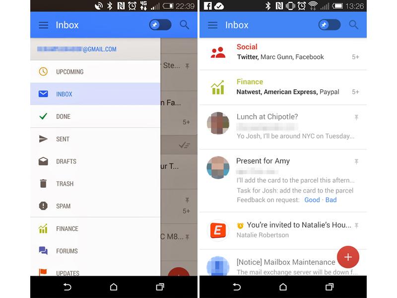
Remember those Calendar and Gmail apps for Android that leaked with refreshed designs back in April? Both apps featured designs that were fairly different from Google’s existing Android apps, and all that we know about their release was that they were being tested by Google. Well today more information on the apps have leaked, giving us a better idea of the direction that Google may head with all of its apps.
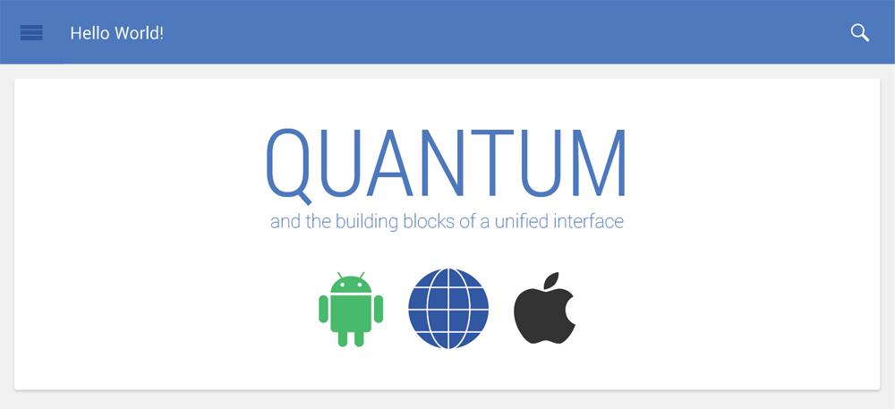
According to Android Police, Google is prepping a new design guideline known as Quantum Paper. The goal with Quantum Paper is to unify the design of Google’s apps on Android, iOS and the web. Some of the aspects of this Quantum Paper interface include an exposed “hamburger” icon, the pin toggle found in the Gmail app leak and the red “+” button that appeared in both the Calendar and Gmail leaks.

This new Quantum Paper framework is expected to begin rolling out with the “L” release of Android, whenever that’ll be released, at which point it’ll be made available to third-party developers as well.
Google has adopted a fairly unified design for its own apps recently, but it doesn’t seem like many third-party devs adopted the same style. Here’s to hoping that the situation changes with Quantum Paper, especially since Google may adopt the style on iOS and the web. If it does, users could switch between Android, iOS and the web with minimal trouble.
What do you think of the designs that we saw in the leaked Gmail and Calendar apps?
Via Android Police (Image via Geek.com)