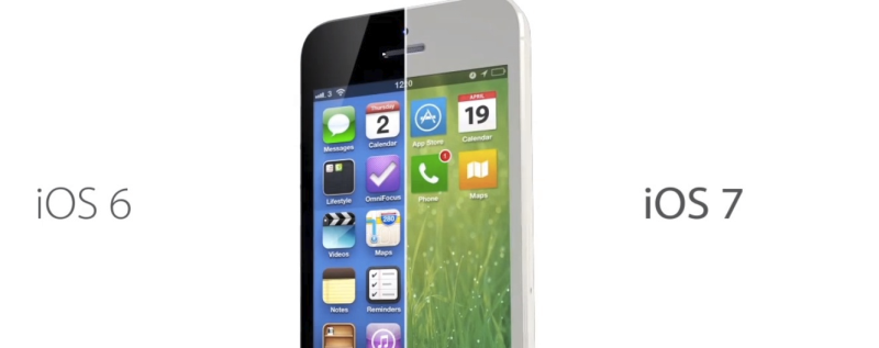
The rumor mill is hot lately with allegations all over. You have Apple hiring the ex-Nokia Lumia Photography Lead, the quite possible addition of Beats Audio to the iPhone, and now we have the rumor that Google might be revamping the way the Android homescreen and notification center looks like. With iOS just having a major revamp of its own last year, and other Android OEMs constantly refreshing the looks of their UI, there’s only one thing that I really want to see with any new design changes from here on out:
Give the designs some depth!
What I mean is that lately it seems that all design elements all point towards minimalism. Instead of having any real design changes everything is just becoming “flat” and thus making it “modern”. In my head, though, everything is just starting to blur together and look boring. Android went flat, iOS went flat, Windows Phone is about as flat as you can get, and BlackBerry... well, BlackBerry is actually doing okay. But for the most part, everything is flat, minimal, and entirely too similar.
I will say that Android has probably come the farthest when it comes to their latest design, because if you compare KitKat to some of their earlier versions it just looks worlds apart, in a good way. Early Android was as ugly as homemade sin if you ask me, but just the fact that the three top platforms are all aiming for the same basic design just kind of throws me off. Nothing really seems that different anymore (or interesting, at that).
I don’t think that Google will be bringing any depth in design to Android with their alleged "refresh", but it is what sparked me to think about how uninterested I am in the designs lately. I certainly hope that designs head in a more complex direction sometime in the future. I can’t quite put my finger on why I don’t really like it that much, I just don’t. I was positively tickled by the design of iOS 6 when it was first launched, but I couldn’t care less about the design of iOS 7. To me, it looks like somebody reached back into the 90’s, grabbed all of the colors they could find between Bill Cosby’s sweater collection and Dave Coulier’s shirts and threw them in a phone. A little too bright, a little too colorful, and a lot of gradients. No thanks.
Android’s not as bad, KitKat doesn’t look horrible or anything. I do think that Gingerbread was my favorite out of the bunch, but maybe I’m just living in the past and can’t get over how much better I thought Gingerbread was compared to Froyo or any other previous version of Android.
As for Windows Phone, well, I can’t really blame them. Minimalism has always been their thing, and it’s what made the platform so much more interesting compared to the other two. Plus, Windows Phone is on a different level of minimalist.
Beggars can’t be choosers, and it’s not something that’s obviously going to stop me from using smartphones or anything like that. It’s just something that I hope is just a trend and will change in the future to seem like it’s graphically improving. In my opinion, minimalism seems like a step back instead of a step forward.
Images via iMore, iDownload Blog