It’s been a while since Android got any sort of meaningful user interface refresh, with Android 4.0 Ice Cream Sandwich being the last time that Google gave its mobile OS a makeover. It looks like that may change soon, though, as a new rumor claims that Google is playing with the idea of revamping the Android home screen.
According to a new report from Android Police, Google is currently experimenting with the idea of making major changes to the Android home screen and notification panel. This includes a heavier reliance on the multitasking key, a new look for the notification tray and a quicker way to access Google Now.
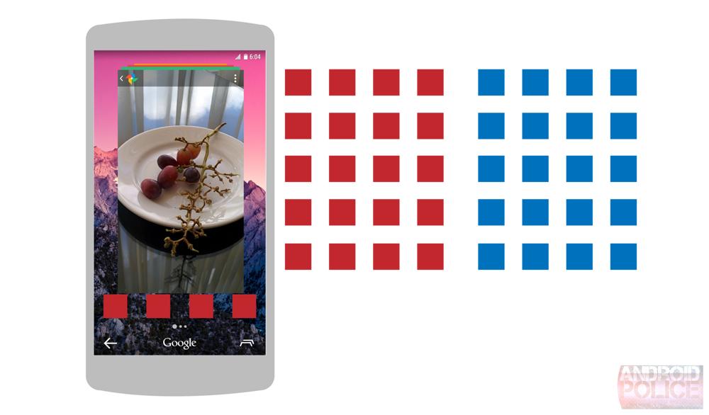
First up, it’s said that the multitasking button will be the way that users access their recently-used apps as well as their app tray. Pressing the multitasking key, which would be located on the right side of the on-screen buttons, will bring up a stack of app “cards” rather than thumbnail images. Google may also allow users to enter the multitasking view by swiping down from the action bar of an app that’s in use.
At the bottom of this multitasking view will be a dock of four apps. Swiping to the right of the multitasking view will reportedly take the user to the grid of apps. This new grid suggests that Google could be toying with the idea of getting rid of widgets, as this leak doesn’t seem to contain any evidence of where they would go.

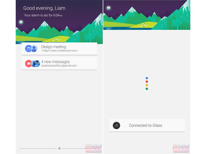
Moving on to notifications, it’s said that the panel of alerts could take on a Google Now look, complete with an image up top and card-style notifications. These alerts may also be divided into the upper half and lower half of the notification panel, with important alerts going up top and low priority and ongoing notifications going in the lower half.
Finally, Google Now is expected to retain its current look and feel. Users will be able to access the app in a new way, though, which is by performing a swipe up from the bottom of a home screen. It’s said that Google may also enable support for the “Ok Google” phrase nearly anywhere within the UI.
As is usually the case with reports like these, it’s worth noting that this is all very much unconfirmed right now. Google is said to be experimenting with these changes, so it’s not yet known which tweaks, if any, will actually be pushed to the public. That said, it’s been a while since Android got any kind of makeover, and once Android Wear hits the scene, Google may want to give its little green robot a bit of a makeover so that it looks similar to the wearable-focused software.
What do you think of this rumor? Do you like the changes that Google is toying with?
Via Android Police