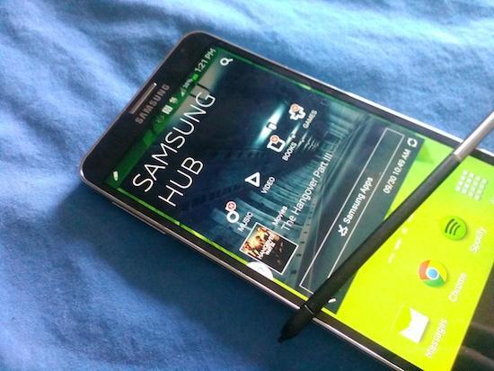
I've now passed the halfway point with the Galaxy Note 3 during my 30-day challenge, and so far I'm a pretty content individual. Most of the issues I've had with previous Samsung-branded devices are still there, simply because Samsung doesn't feel the need to fix what isn't broken in their eyes, but the total package with Samsung's latest Galaxy Note smartphone/tablet hybrid is pretty dang good.
I can't help but look back at what we've already covered, though. During this challenge, as each day progresses, I can't help but think back to how it connected to something I've previously covered or talked about. How does TouchWiz, what we're going to be covering here in just a few moments, relate to the hardware on the Galaxy Note 3? Are they built to coincide together? Or are they just two things that simply exist in one?
We'll get to that.
Before I get into the software, I need to touch on one thing with the body of the Galaxy Note 3. The more I use it, the more I like it. This is pretty much exactly what happened with me last year, with the Galaxy Note II. I wasn't convinced I'd like it before I picked it up, but the more I did, and the more I used it, the more I fell in love with the overall design. It may not look like much, and there might not be anything too astounding with the physical design, but it does feel great in the hand.
Okay, now that I've got that out of the way let's talk about TouchWiz, shall we? This is version one million thirteen of TouchWiz, if my calculations are correct, which means we should expect to see plenty of design changes, additions, and aesthetic face value alterations in every nook and cranny. That's not really the case here, though.
(That's not the real version number of TouchWiz, by the way, but you already knew that.)
My time with TouchWiz has been the same it's always been: I can understand the appeal of the features that Samsung includes, like in the notification shade (I'll elaborate on this in a bit), but for the life of me the colors and cartoon-look of the whole thing still just rub me the wrong way. Keep in mind that this is entirely personal. As a review, TouchWiz on the Galaxy Note 3 has been surprisingly smooth, even 17 days in, and I haven't really noticed any moments of lag or hesitation. It's a lot better than it used to be, especially with a lot of usage. By now, I'd normally be yelling at a TouchWiz-infused phone for lagging on me, or just otherwise not working the way I think it should.
That hasn't been the case with the Galaxy Note 3. Not yet, anyway.
The notification shade in TouchWiz on the Galaxy Note 3 for T-Mobile isn't terrible. It's not nearly as bad as it is on other devices, on other carriers. T-Mobile's footprint in the notification shade can be absolutely overwhelming if you don't deactivate their notifications, or always-running plan overwatch patterns (like text messages sent, or data used). But if you turn them off, and just let it run as plainly as it can be, then it's really not bad at all.
Running without anything bogging it down, the Galaxy Note 3's notification shade is just toggle buttons --up to 10, and you can pick the ones you want-- and a screen brightness adjuster that you can remove, too, if you want. That leaves room for notifications and that's fantastic. The Galaxy Note 3's come a long way from its predecessors in this way, and it deserves a lot of credit for it.
The rest of TouchWiz just doesn't impress me in the same way. It's still too colorful (not helped by the AMOLED display, mind you), and it still just feels like a kid's toy. Changing the font doesn't help. And digging into the Settings is almost labyrinthian, thanks to all the options, and areas that you can change. It's exhausting. I mean, just to find the Battery information? Yeah, you've got to go to the fourth page of the Settings, scroll down, and there you'll find it.
It's hard to argue that Samsung doesn't add the most benefit to the proprietary software war, even as LG and HTC step up their respective games. Samsung knows how to pack it all in, for sure, and that certainly hasn't stopped with the Galaxy Note 3. The simple truth is that it can get overwhelming, though. Just finding the battery info shouldn't take me four pages (accessible through a tab at the top of the display, mind you), and more scrolling. Lists have always been the staple of another company. It's a bad trend for Samsung to follow.
In the end, TouchWiz doesn't drag the experience down on the Galaxy Note 3 as it has in the past, and that's all it really boils down to. For me, personally, I don't think I can get over it like I could with the Galaxy Note II, but who knows. I've still got a bit of time with the device in this challenge, and considering the Galaxy Note 3 is still trending so high in our Official Smartphone Rankings, maybe TouchWiz will grow on me.