Looks like Apple and Google are fighting to see who can have the biggest week of news. Following the arrival of Google Wallet on iOS and the release of a free Quickoffice app, Google today announced that it has retouched its logo to help celebrate the launch of a new Google bar. The refreshed logo isn't terribly different from the old one, but Google does say that it "refined" both the color palette and the shapes of the letters used. Expect the new logo to rollout across Google's product line in the coming weeks.
While this updated Google logo isn't a total redesign, it's obviously got a new look that appears to be in line with the whole "flat design" trend that we've been seeing so much of in mobile lately. We've seen similarly flat designs on Windows Phone and iOS 7, and now it appears that Google wanted in on the flat fun too. The refreshed logo isn't a huge change, and the small changes that have been made could that have been made may actually take some folks a while to notice, but it does look nicer and a bit more modern than the previous logo.
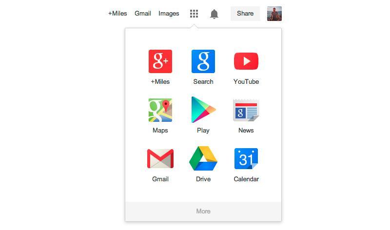
In addition to its retouched logo, Google announced that it's rolling out an updated Google bar that includes an app launcher. The launcher is represented by a small grid of dots, similar to the one already used on Android and Chrome OS, and is meant to give users quick access to Google products like YouTube and the Play Store. Like the retouched Google logo, this new Google bar will be rolling out to users over the coming weeks.

Via TechCrunch, Inside Search