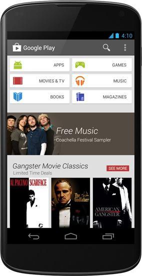
Get ready, Android users, because it looks like that Google Play Store redesign that we've gotten a couple of peeks at will be headed your way today. Google just announced a refreshed look for the Play Store, complete with Google Now-like cards and larger images that offer a better preview of the content that's on offer. Along with the new look, Google says that the redesigned Play Store will group together similar content, show a never-ending stream of new recommendations and a simplified buying process to make purchasing new content faster.
While today's Google Play Store refresh may not be quite as drastic an overhaul as some of the redesigns that the Android storefront has undergone in the past, there are quite a few changes included in this new update that help to bring the Play Store more in line with the rest of the vanilla Android look that Google has been working on. I'll have to reserve judgment until I can actually spend time with the update, but so far I'm digging what I'm seeing, especially when it comes to the Google Now-style cards that are included.
Thankfully, Android users won't have to wait long to start shopping in this new-look Play Store. Google says that its redesigned storefront will roll out to devices running Android 2.2 Froyo and higher starting today, April 9, with the update expected to continue hitting smartphones and tablets around the globe in the coming weeks. To help keep you occupied until the new Google Play Store makes its way to your neck of the woods, you can find images of the Nexus 4, Nexus 7 and Nexus 10 sporting the redesigned app in the gallery below.