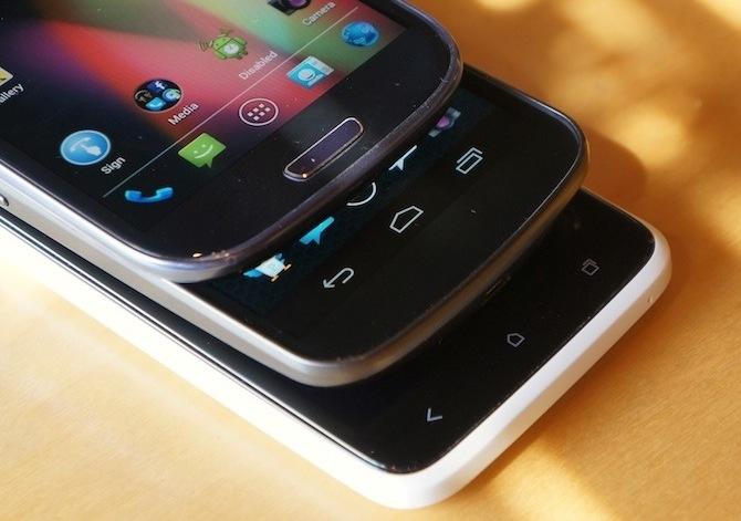
With more than a couple hundred Android phones having been released, there is no shortage of one thing: choice. You can find smartphones in just about any price range shy of $800 (sans contract, of course), with great cameras, extra small or extra large displays, gigantic batteries and you can even find phones with built-in projectors. Smartphones can be composed of all sorts of different materials and we've expressed the importance of button and port placement more than once now.
But this time around, I want to focus on an aspect of smartphones that Android manufacturers seem to be torn over. Navigation buttons.
Since the introduction of Ice Cream Sandwich, to continue following Android design guidelines and thus continuing to support Google services such as Play Store and Gmail, manufacturers had to revamp their navigational button layout from the legacy four-button layout to the new three-button layout, dropping menu and search for Recent Apps. The menu button has since been moved to the Action Bar at the top of the display and is now referred to as action overflow.
In Honeycomb, the Android team also added support for software navigation buttons in tablets, which trickled down to phones in the Ice Cream Sandwich update. However, the Samsung-made Galaxy Nexus was the first smartphone with on-screen buttons and very few manufacturers have followed suit.
At CES in January, no phones (that I recall) reflected the changes made in Ice Cream Sandwich. The Samsung Galaxy Note, for instance, featured the standard four-button layout we'd grown used to. The Huawei Ascend P1 S featured a three-button layout, but was simply missing the search button – it didn't trade search and menu for the Recent Apps.
Since May, though, we have finally started to see some manufacturers respond to the design changes.
HTC reacted by creating a three-button capacitive layout as seen in the One X above (bottom). While they didn't totally scrap the menu button like Google would prefer, Samsung went with a combination of two capacitive (Menu and Back) and a physical home button. And recently we've gotten a look at Motorola's adaptation, which I'm almost certain had some influence from Google itself. The Motorola Photon Q 4G LTE, DROID RAZR M, DROID RAZR HD, DROID RAZR MAXX HD and Atrix HD all feature on-screen buttons in the pure stock Android layout: Back, Home and Recent Apps. And last week, we saw LG's take on the new navigational button layout on the Intuition headed to Verizon: Back, Home, Recent Apps and Action Overflow.
The question is: which configuration do you prefer? Do you like a menu button? The more stock-like Back, Home and Recent Apps config?
I have used them all personally and extensively. In practice, capacitive buttons are much more common and feel more responsive. Over the course of three years, I have gotten over my love for physical buttons (thanks to a long history with BlackBerrys) and come to love capacitive buttons.
In theory, though, I like on-screen buttons better. While they do make the effective display space a bit smaller (a 4.7-inch display with on-screen buttons is effectively a 4.5-inch display in normal use), they can allow the phone to be smaller by reducing the bezel at the bottom edge of the face of the phone. Non-display space that would normally be dedicated to capacitive keys is not needed. And the on-screen buttons hide away when it matters most, like when watching videos. Not to mention, if you're into hacking your phone, with very minimal effort, you can alter the on-screen buttons to essentially whatever configuration you want.
That said, I have used the Galaxy Nexus off and on for the better part of five months and I have an issue with its soft buttons. Comparing the on-screen buttons of the Galaxy Nexus with the capacitive buttons on the HTC One X, the responsiveness of the navigation buttons seems to be a bit worse than those on the One X. I find myself having to hit the display more than once to jump Home.
The one thing I cannot stand, though, is physical buttons. They're fine if they are used for power buttons or volume rockers. But on Android phones, I have never been fond of physical buttons. I'm beginning to believe this is why I don't like the Galaxy S III all that much, or why I'm only partially excited for the Note II.
I would love nothing more than to see more phones with soft navigation buttons, or no buttons at all. (Gestures are awesome, though not always intuitive.) In the meantime, capacitive buttons aren't a bad alternative, though. Where do you stand, ladies and gents? Capacitive, physical or soft buttons? What about a combination (like the Galaxy S III)?