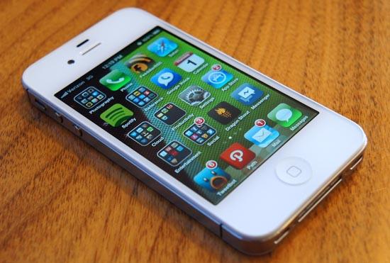
If you take a look at iOS now and iOS from around the time of its induction, it's not hard to see that the visual changes are few and far between. Apple has relied and coasted on the familiarity and popularity of its mobile operating system for five years, and it has left the interface mostly unchanged the entire time.
Until this year, complaints from users and industry experts alike have been relatively scarce. Why "fix" and change iOS if it works and performs well and people like it, right? But Evan, I and an abundance of our colleagues are starting to discover that iOS is finally beginning to show its age.
Between 2007 and now, the most dramatic interface changes in iOS are the addition of folders, task switching, the ability to set wallpapers on the home and lock screens and a redesigned notification method. Oh, and there's Notification Center which is mostly pointless and easily forgotten. Other than that, it's the same old grid of icons with basic functionality.
Prior to the iOS 6 announcement at WWDC in June, we all were hoping Apple would introduce something new: an interface overhaul, a refresher of some kind, useful additions, etc. Through an excruciatingly long presentation, however, we learned iOS 6 is much of the same with only a few notable improvements, like additional functionality in Siri, Facebook integration, iCloud Tabs, Passbook and over 200 other minor improvements, most of which will go overlooked.
In short, that means we all will have to wait at least another year before we see any major improvements to the iOS interface. That news could come at the expense of long-time iOS fans growing tired of the dated software. No less, in the meantime, we can revel in some of the coolest iOS interface concepts that we can only beg Apple to adopt.
We're bound to see a handful of concepts to surface over the next year or so. And the few we have seen so far have expressed new ways to display and dismiss notifications, a way for Apple to implement widgets to the left of Spotlight, new task switching methods and entirely redesigned interface, all of which are in need of an update.
But one that popped-up recently is done by Joost van der Ree. He made a video and published it to YouTube just under a month ago, revealing a couple of ways he believes Apple could improve iOS and how it operates. The change is Notification Center. In his mind, he feels Apple will minimally change Notification Center by mimicking the way it has been implemented in OS X Mountain Lion. The linen has been dropped behind the home screen. No big deal. But van der Ree's true genius shows with his implementation of Mission Control, Dynamic Badges and Flipcons. Let's break this down a bit:

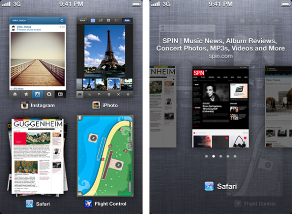
Mission Control – Much like I have been talking about lately (and mistakenly calling Dashboard, my mistake, I'm relatively new to OS X), van der Ree has conjured up a way Apple could implement Mission Control in iOS by way of a single-finger gesture from the bottom of the screen upward. The gesture brings up a two by two grid of the most recent applications, similar to the current task switching method, only more visually appealing. Applications that have more than one state open like Safari tabs, for instance, stacks similarly to cards in webOS. You can preview and scroll through the individual tabs. It seems very useful, intuitive and fresh.

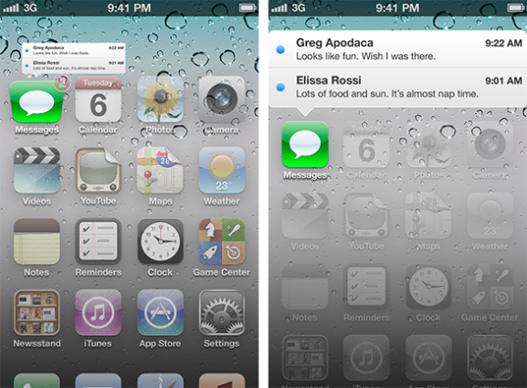
Dynamic Badges – One of my least favorite aspects of iOS are the badge notifications that appear on the upper right hand corner of an application icon when an incoming notification is received. The problem, however, is that there is no direct way to see what notifications the badges correspond with – there is no real direct tie to Notification Center. Through van der Ree's method, however, with badge notifications, the user simply pulls down on an icon with a badge and the notifications will be stacked in a banner-like "bubble" above the icon. Perfect and simple.

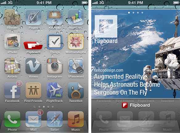
Flipcons – Inspired by Dynamic Icons by Jan-Michael Cart, van der Ree took the idea of displaying immediate application content without fully opening applications. For an application that has dog ear displayed instead of a badge notification, simply drag down on the icon to display a widget-like preview. Personally, I think this is genius. It's sleek and brings some much-needed spice and functionality to the home screen.
To be frank, these changes aren't major. They don't address all of the problems with iOS and only show that there are a million ways that Apple could improve iOS. But Joost van der Ree's concepts are brilliant and very Apple-esque. And, at the very least, I hope Apple can take some notes from this guy … and the dozens of other people just handing them ideas for innovating and updating their quickly aging iOS interface.
I can't wait for Apple to bring the iOS interface into the 21st century. It's a long time coming and cannot happen soon enough. Here's to hoping they can take some hints from van der Ree.
What say you, folks? Is iOS in dire need of a refresh? Do you like van der Ree's concepts? Have you seen others you like more? Or do you like iOS just the way it is? Sound off in the comments below and feel free to share you sentiments on van der Ree's work!
Images via The Tech Block