There has been a lot of back and forth around interface design of late. Specifically, designers and developers alike are duking it out over skeuomorphism. Some say that it's purely ornamental; therefore, design-wise serves no purpose and should not be used. On the other hand, it can make some applications and software beautiful.
So what is skeuomorphism, exactly? According to Wikipedia, a skeuomorph is "a derivative object that retains ornamental design cues to a structure that was necessary in the original." In layman's, applications that show skeuomorphism are digital creations that mimic their analog counterparts. For example, a note taking application that looks like a moleskin notebook or a camera application that places the viewfinder in the middle of a mock-up of a retro, analog camera from yesteryear (i.e.: Retro Camera). In terms of interface design, skeuomorphism can be found in nearly every type of application that has some relation or parallel to an old, analog device or object.
Controversy – if that's what you want to call it – around this design has been going on for some time. As with most things, some people love it, others hate it.

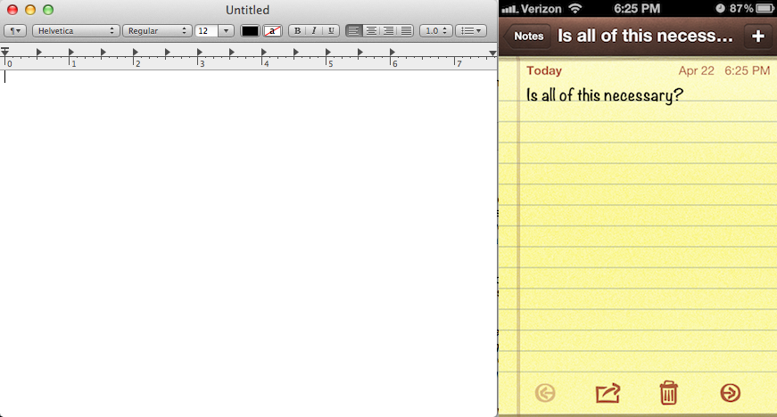
But the debate really took off after Apple announced OS X 10.8 (Mountain Lion) in February. Many of the iLife applications originally looked like any old computer program would: a relatively bland window that plainly (without any frills) displayed the content it was intended to display. In the Mountain Lion update, more and more skeuomophoric design is seeping in. And many are arguing that it goes against Apple's penchant for minimalism in design. Take TextEdit, for example. It looks and performs like your average text editor. Notes on iOS, however, looks like a yellow legal pad. It adds no functionality and is there solely for aesthetic purposes.
On Friday, however, Tobias Ahlin, a 23-year-old interface designer working for Spotify (whose newly updated Android application is absolutely gorgeous), wrote a piece on his personal blog about skeuomorphism and how there may be some hidden usefulness to it. Ahlin says:
"There are some usability benefits with skeuomorphic design that are often touted. In iBooks, for example, Apple makes it obvious by using a book metaphor that you should swipe your finger over the pages to flick to the next page. Rubber banding – that nice little bouncy effect when you’re scrolling – is also very much skeuomorphism, though a subtle effect that has come to become loved by most. While these benefits of skeuomorphism are great, I want to talk about skeuomorphism that pisses people off; seemingly useless skeuomorphism that is almost solely used for decoration."
Ahlin references the newly released drawing application for iPad, Paper, that took the market by storm. When you open Paper for the first time (which I have never done), you are met with a start page consisting of journal look-a-likes. He contrasts Paper with Brushes, a similar drawing application for the iPad that "has been used to create no less than four covers for The New Yorker." The interface to Brushes, while still using skeuomorphic design (a photo frame-like interface), "tells a completely different story," according to Ahlin.
"The functionality of Paper and Brushes are basically the same, yet the perceived purpose is totally different," says Ahlin. This can be blamed entirely on the differences in interface design, nothing more. He goes on to compare several different application, like the old version of iPhoto and the version introduced in OS X 10.7 Lion. He shows that skeuomorphism can actually be used to make applications more fun and even more intuitive, in some cases. But iCal and other productivity apps are perfect examples of where skeuomorphic design should not belong.
Ahlin's closing line reads, "Done right, skeuomorphism can retain the simplicity and ease of use of an interface while empowering users to act."
I've been dabbling on this for a while (since I started reading into the debate in February), trying to decide exactly where I stand with skeuomorphism. And, likewise, I've been wondering how you, our loyal readers, feel about it.

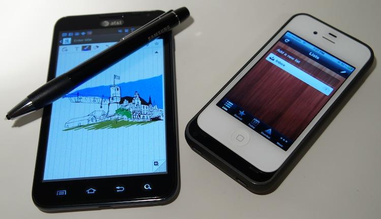
I looked through my phones and took note of which applications I used and whether the developers implemented minimalist designs or more along skeuomorphism. I realized that I rarely use applications that mimic their analog counterparts. Notes on iOS, for instance, has always been my last option for taking notes despite being a Mac user and having iCloud sync options. I opt to use Evernote and Google Docs, which sport much cleaner, basic interfaces. Nor do I use iBooks, Newsstand, Retro Camera or any other heavily skeuomorphic apps. The only one I have found that I do use is Samsung's S Memo app, solely because it's built to work seamlessly with the S Pen. Pictured above is Samsung's Mini Diary application that I have yet to use (I just created the displayed entry for demonstration purposes).
I'm no design guru, but I feel skeuomorphism – at least when it's to the degree Apple or Samsung have been using lately – to be somewhat degrading, demeaning and superfluous. It's as if the developers are assuming I don't know or can't figure out how to use their applications. Sure, there are a lot of people out there who may not immediately pick up on how an application's interface works, but a short tutorial or pop-up hints work just as well without the air of constant insult.
Making the Notes application resemble a legal pad or making a diary app resmeble a moleskin is no less silly than making the Phone application a rotary dial.
I am not a fan of abundant skeuomorphism. But I'm interested in how you feel, readers. Do you like it? Do you feel it gives your applications a more polished, quality feel? Or, like me, do you prefer a minimalist interface (with a small amount of skeuomorphism, like rubber banding) instead?