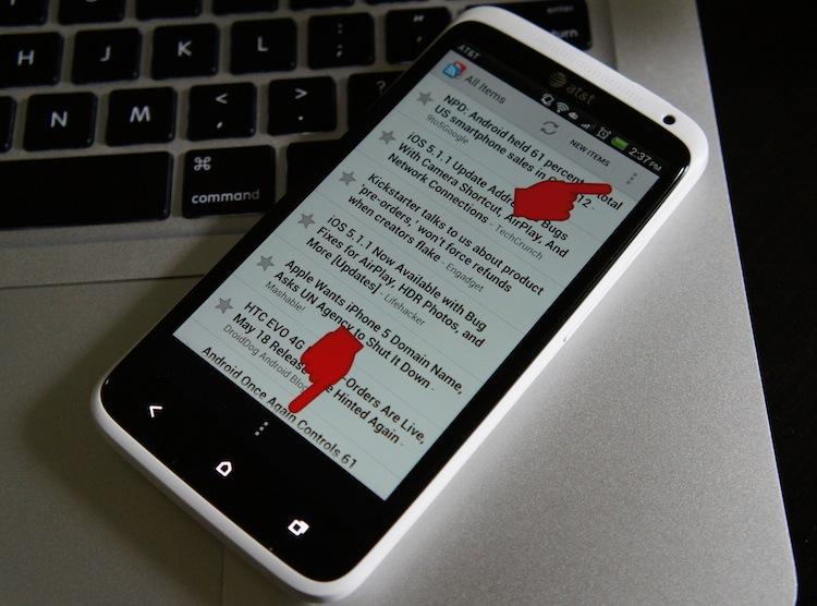
The first thing you will notice about some of the newest Android devices is that they no longer sport the four capacitive buttons (Back, Home, Menu and Search) below the display like their legacy counterparts. Instead, they only have three hardware buttons: Back, Home and Recent Apps. This means they're missing one critical function; there is no longer a dedicated menu button on most new Android devices, and the software fix has been slow to catch on.
Initially, it was a contained issue. The only handset missing the menu button at the time was the Galaxy Nexus by Samsung, and only a small percentage of Android users had their hands on the Google device. (Honeycomb and ICS tablets don't have menu buttons either, but it's not really an issue with them.) Still, it caused quite a large stir in the community and on review sites across the Web because it was unclear to many developers just how to accommodate for the lack of the physical button. Not to mention, it was terribly difficult for users to get used to. It could be confusing when first opening an application, as the menu button would sometimes find itself alongside the on-screen navigation buttons. Other times, it would be appropriately placed in the action bar, at the top of the display.
Since the Galaxy Nexus had virtual buttons instead of capacitive, it was mostly a non-issue then. However, on-screen buttons are not mandatory, and devices like the HTC One X, One S the Galaxy S III and newer devices of the like, three capacitive buttons are on the bill. As you can see above, that spells trouble for applications that have not yet been updated.
In late January, Scott Main, lead tech writer at developer.android.com, wrote a piece on Android Developers Blog titled Say Goodbye to the Menu Button. Main's aim was to promote use of the action bar and a consistent experience across Android. He notes that it should no longer be considered a menu button and that it should now be referred to as action overflow. And he explains how the lack of a physical menu button should be dealt with. Main says:
"If you’ve already developed an app to support Android 2.3 and lower, then you might have noticed that when it runs on a device without a hardware Menu button (such as a Honeycomb tablet or Galaxy Nexus), the system adds the action overflow button beside the system navigation.
This is a compatibility behavior for legacy apps designed to ensure that apps built to expect a Menu button remain functional. However, this button doesn’t provide an ideal user experience. In fact, in apps that don’t use an options menu anyway, this action overflow button does nothing and creates user confusion. So you should update your legacy apps to remove the action overflow from the navigation bar when running on Android 3.0+ and begin using the action bar if necessary. You can do so all while remaining backward compatible with the devices your apps currently support."
In case you missed the key sentence in Main's quote, it's the bold one. Main advises developers to update their applications to remove the action overflow from the navigation bar (where the Galaxy Nexus' on-screen buttons are) and move them to the action bar. He explains how to do this – and how to disable the action bar entirely – towards the end of his article. And, from what I can tell, it doesn't seem all that difficult. (It's mostly determined by which version of Android you're developing for and how many versions back you support.)

Yesterday, when I started tearing through the HTC One X and setting it up, I started stumbling across the very thing I dreaded; I opened Facebook and there it was. Instead of being in the action bar like most applications, the menu button action overflow is a single button that stretches 720 pixels wide and 96 pixels tall across the bottom of the display. Zite, one of my favorite reader applications, is the same way, except it actually does something in the Facebook app. In Zite, pressing action overflow does nothing.
Okay, so there are some applications that haven't been updated. I get it. Big deal.

But then I opened Google Reader, which has always been my favorite way to view RSS feeds via mobile. As you can see in the top picture, it has the action overflow in the action bar and navigation bar.
If Google expects its developers to create beautiful applications (which we now know is most certainly possible), should they not lead by example? The YouTube application was once like this, too, but has since been updated. Google Voice is updated, Google+ is updated and so are many others. But there are also quite a few – like Reader, Shopper, Currents and likely some others – that still do exactly what Google suggests developers should avoid by updating their applications.
Is it a big deal? Not really. It's silly, annoying and it's mostly lethargy on Google's part. I understand if some applications by third-party developers have yet to be updated. But this is Google we're talking about here. It's something that they could easily fix – likely in less time that it has taken me to write all of this. (Oh, by the way, they still haven't updated Google+ with a tablet UI.)
Come on, Google. You're better than that!