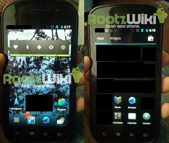
Ice Cream Sandwich – Google's next Android update that will supposedly bring tablet and phone software back together – is all the buzz in the Android camp. Google has yet to release any significant information on ICS, but we know it's supposed to be a major update and will likely take us into version 4.0. Aside from that little tidbit, we've all been waiting (im)patiently on any deets we can get our paws on and an official release date.
Up until Friday, we honestly had no clue what to expect. Many have speculated that the update will remove the need for physical or capacitive buttons, and judging on Google's stance on fragmentation, the update will hopefully resolve any outstanding issues there as well. As far as visuals go, we've been relying on nothing but our own gray matter. But as of early afternoon on Thursday, we can now thank the guys over at Android Police and RootzWiki for what appears to be pictures of the elusive software. So what all did the alleged leak entail?
First and foremost, it's a good idea to keep in mind that every aspect of what is shown in these screen caps is easily faked and the legitimacy of the shots are up in the air. Even though these come from the same guy that brought us a peek into Gingerbread before it released, I would still keep a healthy dose of poutine on hand while reading this and the source posts.
The moment I read the headlines on Thursday evening, I became extremely excited. I've grown mostly bored with Gingerbread and Honeycomb (at least in its stock nature) and have been on the lookout for anything Android or update-related for several months now. After seeing the screenshots, however, it was all I could do to keep myself from yawning and dozing off. We were all hoping the changes would bring major aspects of the Honeycomb UI – its holographic, black and neon interface – to handsets. But it appears the changes are much more subtle and … well, a bit underwhelming.
Personally, I don't believe this is Ice Cream Sandwich at all due to several discrepancies. Note that on the About page the “Android version” field is usually filled with a number, not the platform version's moniker. Not only that, but I have a feeling Google would take the time to space the words in “IceCreamSandwich.” Also, something is just off with the highlight color. The cyan used in the signal and battery meters and also shown in the app drawer are neither from Honeycomb or Gingerbread. Instead, the color favors many of the cyan hacks and themes revolving around CyanogenMod.
If you take a look at the picture detailing the app drawer, why is there a “Widgets” tab in the app drawer where “My Apps” normally reside? Why are all of the third-party apps blacked out? And why are the native apps (Browser, Phone, etc.) themed with cyan (they're a darker blue than the cyan displayed in the notification area)?
Of course, if these shots are real, it's worth noting that it likely isn't finished and is still in a rough-cut development stage. It is also worth considering that a large portion of the completed changes are on the back end rather than interface updates thus far. Regardless, there are simply too many unanswered questions and discrepancies for me to even begin to believe this is really Ice Cream Sandwich. Google is looking to move forward and leave iOS choking on its dust. A good portion of the changes here are mediocre at best and hardly what I would consider a “major update” from Google.
My best guess? This is coming from someone with a little creativity, a little humor and a big desire for attention. I've been wrong before and I'll surely be wrong plenty more, but here's to hoping that I'm right and this is not Ice Cream Sandwich. I would rather see ICS look more like the Honeybread theme for CM7 and even that has grown old.
What say you, Androidians? Is this a fake? Or has Google really made Ice Cream Sandwich one of the most uneventful and boring updates since Cupcake to Donut? Speculate away in the comments below!