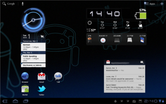
The Samsung Galaxy Tab was the first high-end Android tablet, but it hit the market equipped with Android 2.2, or Froyo. The problem was, Froyo was not meant for tablets; and is not optimized for such large displays. As of last Thursday, Google's latest version of Android became available to the masses. Android 3.0, AKA Honeycomb, is a version of Android made specifically for tablets and addresses the issues we've previously had with Android in tablet form. So what is it about Honeycomb that makes it so much better for those larger devices?
With widgets, icons, multiple home screens, and live wallpapers, the Honeycomb UI is fundamentally the same. The stock 2.3 and earlier Android launcher is a 4x4 grid for your icons and widgets. The Galaxy Tab's launcher – a modified version of Samsung's TouchWiz custom UI – is a 5x5 grid. With Honeycomb, the grid is now 8x7. This allows you to add several large widgets to a single home screen. A widget that would take up nearly the entire screen on the Tab, will only take up a very small portion of your XOOM's home screen. This gives you ample space layout your home screen exactly the way you want.
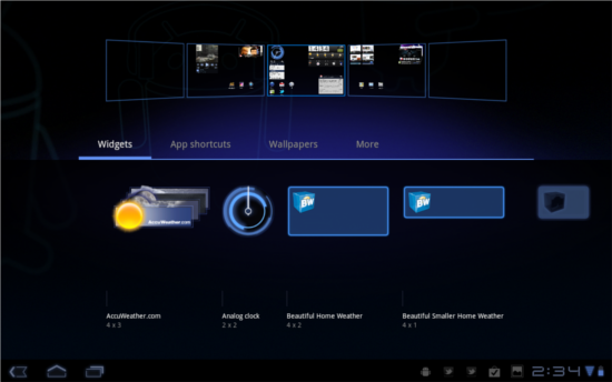
Until now, the way you add widgets to your home screen hasn't really changed. With Honeycomb, the process has been redesigned and transformed into a polished, user-friendly method. Also, the app drawer is no longer a vertically scrolling drawer. Instead, it is an organized (by all applications and downloaded applications) page that better fits the natural landscape orientation of Honeycomb.
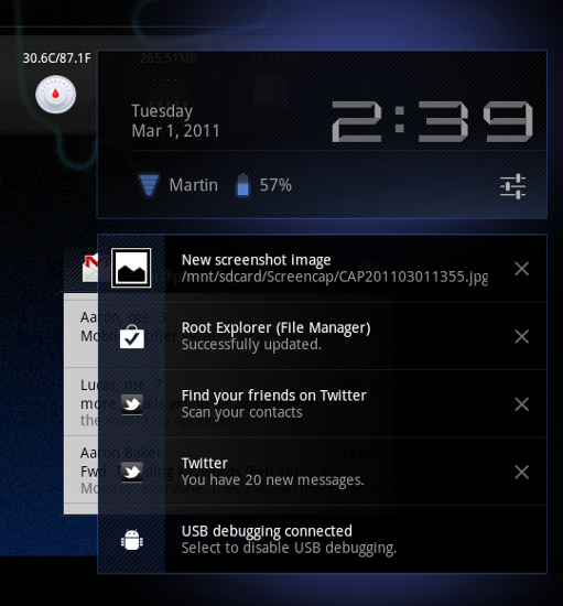
Notifications in Honeycomb are no longer hidden by a pull-down menu. They pop-up at the bottom right corner, in a growl-like fashion and are stored in the System Bar, like on Windows. When you tap the clock, all of you notifications will appear like pictured above (notifications can be viewed individually by tapping the icons instead of the clock). You can dismiss each one by tapping the X on the right side. A quick-access settings menu has also been added here. By tapping the settings icon below the clock, a menu will appear where you can toggle Airplane mode, open Wi-Fi settings, lock screen orientation, adjust brightness settings, toggle notifications, and launch the full Settings application.
![]()
An element of the new Honeycomb UI that is growing on me is the on-screen buttons. With Honeycomb, physical and capacitive buttons are not mandatory. These on-screen buttons are dynamic and change their position and orientation with the orientation of the device itself. In addition to the standard back and home buttons, there is a Recent Apps button that helps you switch between applications with ease. You will also find that there is no menu button by default. When you launch applications it will appear, though not always in the same place. Sometimes it is in the lower left corner on the System Bar, other times it is in the upper right corner of the Action Bar as a drop-down menu. No functionality is lost here, but it's confusing when you're trying to get used to it. Over time, it becomes natural to check the upper right or lower left corners for the menu button.
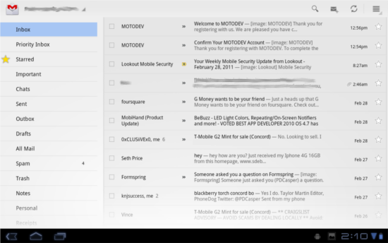
The most impressive improvement I've found yet is within the native Gmail application. Much like the native email application on the iPad, the Gmail app on Honeycomb is composed of two viewing panes. You have your folders (inbox, outbox, etc.) on the left, and the right pane displays the contents of the selected folder. If you select Inbox on the left, all the messages in your inbox will appear on the right. That's not all. You can quickly select multiple emails and drag and drop them into separate folders. Yes, drag and drop. When I first found that out, it blew my mind. This makes managing email on the tablet just as easy, if not easier, than on my desktop. The same two-pane style can be found in Settings, and Contacts, too. This setup better utilizes the large display area, and eliminates the need to press the back button so much. You can view the folders and their contents at the same time.
Something that truly affects the XOOM and Honeycomb, for the moment, is the high resolution display. Not many applications have been updated to properly render on devices with higher resolutions. For applications that have been coded to be scalable (should fit any display), they render just fine without pixelation. But the content obviously isn't optimized for such a large display area. On-screen buttons are long and narrow, and there is a lot of wasted display space. It almost makes the device seem over the top or the display feel too big. For most applications with fixed graphics (mostly games), you will notice pixelation. It will take some time for the developers to update their games with high-res graphics, but I think it's safe to say they're coming. Some games like Rocket Bunnies, Angry Birds, and Gun Bros have been updated and look pretty good on the 10.1-inch display of the XOOM.

Despite being scarce, there are applications out there with support for Honeycomb. Most notably, the CNN and YouTube app are great and display what tablet based content should look like. PowerAMP, which I purchased for my myTouch a few weeks back, has also been updated. It is the same application that you would install on your phone, but it renders completely different. This is how most applications will be on Honeycomb, once updated.
The web browsing experience on Honeycomb is amazing. It feels much like that of the desktop version of Chrome and you can even sync your Chrome bookmarks. The pages render very well and very quickly. Currently missing Flash support, not all videos will play straight from the browser, but it hasn't bothered me any. Zooming and panning in the browser is lightning fast. It's the closest you can get to a desktop-like browsing experience without cranking up the old PC.
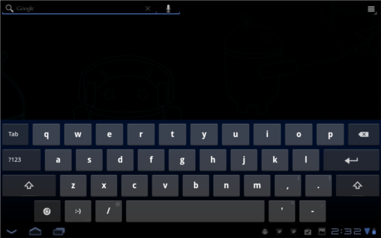
Text input has also been modified on Honeycomb. The keyboard has been optimized for the larger display area and extra buttons like tab, comma, and hyphen buttons have been added. This keyboard doesn't differ too much from the Gignerbread keyboard, and it even has the same word suggestion field. The text selection method is also the same, but the Action Bar at the top of the screen has been utilized for editing (cut, copy, paste, etc) text.
With all of the improvements included in Honeycomb, I say that Google has definitely brought the heat. Other tablet OSes have some serious competition. This version of Android makes you feel like you're using a more powerful operating system; it's as if you're using a desktop OS, not a mobile OS. Aside from the few minor bugs and glitches I've come across, the Honeycomb experience has been extremely fluid and pleasing. Once more applications get updated to support the larger resolutions and better display content, Honeycomb could be enough to knock the crown from the iPad's aging head.