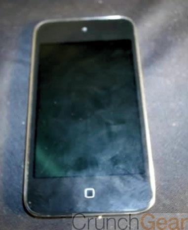
Since 2007, Apple’s iPhone has had a pretty standard design element to it. While the back and sides of the smartphone have changed pretty dramatically over the years, especially in the revision that launched with the iPhone 4, the front of the handset has stayed the same. A standard 3.5-inch capacitive touchscreen, with spaces at the top for the earpiece (and now a front-facing camera), and a space at the bottom specifically reserved for what’s called the Home button. It’s a single physical button right there on the bottom that allows users to exit applications, or reach their home screen quickly from a different page. The home button also has other features, all of which is made pretty simple by the physicality of the button. Double pressing is easy and you know when it’s happened thanks to the feedback of the button. But, new leaked images suggest that Apple may be changing the Home button, at least as far as it goes on the iPod Touch.
The leak suggests that not only is Apple shoving a ton of memory into the device, but that the Cupertino-based company is looking to add a capacitive touch button to the bottom of the device. And while there are some differences between the iPhone and iPod Touch line-up, Apple has been making those differences less and less over the years. With that in mind, it’s not too far-fetched to consider that Apple may be thinking about adding that capacitive touch button onto the bottom of the newest version of the iPhone, too.
I’m personally not the biggest fan of capacitive touch buttons, simply because they can be activated without really trying. There have been times when I’ve been playing games like Fruit Ninja on other devices with capacitive buttons on the bottom of the screen, and my swiping finger has accidentally activated one of those buttons and I’ve lost my game. A physical button makes an issue like that non-existent for the most part, and that’s one reason why a lot of people prefer a physical button. And it’s probably one reason why Apple designers have chosen to stick with the physical button, despite all of the iPhone’s revisions.
But, if Apple does indeed launch the iPhone 5 or iPod Touch with a capacitive button on the bottom, it could leave a lot of room for Apple to include a lot more interactive elements to the device, and iOS. We’ve seen patents in the past for touch and gesture-controls from Apple, and this could be the easiest way for Apple to include those features just below the bottom bezel of the device. That capacitive button could be used to open a whole new world of interaction with your iPhone or iPod Touch.
Or, it could just be a capacitive button. And, if that’s the case, many people may think it’s a great addition for the iPod Touch, but would you want that type of button on the next version of the iPhone? Or would you prefer Apple stick to the physical button design, and leave well enough alone? As that old saying goes: “If it isn’t broke, don’t fix it.”