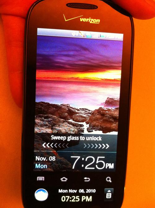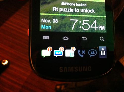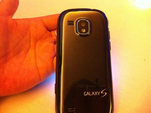
Last night, Samsung announced its latest device in the Galaxy S line of Android phones, the Samsung Continuum. Set to launch November 11 on Verizon Wireless, the $200 handset (with $100 mail-in rebate) is practically the same as the Fascinate, another Android phone on Big Red. But there's one really key distinction — dual screens. On the Continuum, there's a small secondary 1.8" "ticker" display set underneath a primary 3.4" screen.
They call it a "ticker" since it's reminiscent of the ticker feed that you see below a TV newscast like on CNN. The main program/interview/analysis is going on in the main area, and there's a line of news headlines that juts across the bottom of the screen. Sammy believes consumers want a similar method for notifications, and are willing to sacrifice some screen real estate (of the main display) to get it.
So, are two displays better than one? Well, after having had a chance to play with the Samsung Continuum, I have to say that I have mixed feeling about this.

When I saw the Ticker, I thought it was really cool at first. There's something about having instant access to notifications that's terrifically practical and super appealing, and it was pretty responsive and swift. (Maybe a little too swift. Sometimes, I launched the weather or RSS app accidentally while swiping through the little screen.) But overall, it worked pretty well. And it was handy, having music controls available without unlocking the device, in addition to text messages and other notifications.
After the demo, however, I was left with a strange feeling, as though something didn't sit ?quite right with me. It was the thought of having my personal messages on display. The grip sensor that activates the ticker is located at the lower sides — and that happens to be exactly where most people would naturally hold a phone. ?
I can just see it now — my mother handing me my cell, and accidentally seeing a saucy text. No thanks.
Now it's worth noting that users can shut off this particular feature or set the lock screen, to add a layer of protection from wandering eyes. (There are settings that allow you to turn on or deactivate specific features. Or if the lock screen is activated, then the small display only shows the ?weather, time and date.) But here's the thing: Wouldn't that defeat the whole purpose of the Ticker? To put my important notifications instantly in my view?
So this seems like a flaw in logic for me, at least with this current incarnation. Perhaps in the future, when mainstream smartphones have grip sensors that identify the owner via palm or finger prints, I'll find the feature more appealing. (Yes, I know the technology exists, but we aren't even close to seeing that become prevalent yet in mobile phones.) Then again, perhaps there are other settings that make this a non issue. We'll know once we have the actual device in the house.


Some other first impressions:
In general, I liked this phone, but didn't love it. It's more spec'ed out than an intermediate smartphone, but there are some pretty big omissions here that knock it out of the running as an advanced device. So I'm guessing that opinions on the Continuum will hinge on its most prominent feature: the Ticker. People will either love it and wonder how they ever got along without it, or consider it a gimmick that isn't worth the sacrifice of the main screen size.
When PhoneDog gets its review unit, we'll let you know which side of this fence we fall on. Me, personally, I'm leaning toward the latter for now.
In the meantime, check out Adriana's hands on with the Samsung Continuum.