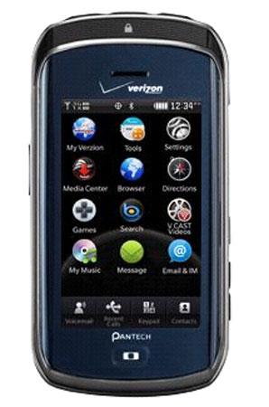
The Pantech Crux is a very (how should I say it?) different device. On the outside and at first glace, it looks normal. It's your typical candybar phone with a 3-inch touchscreen display; however, once you actually pick up the device you start to notice some weirdness. First of all, it's a slider, but not really, because it only slides about half-an-inch and the only purpose of that is to unlock the screen. Once you unlock the screen, you're immediately presented with a very different UI. Then you have this single touch-sensitive button that isn't quite a Back button and not really a Home button either. It's sort of this button that just does whatever it thinks it should do at the moment. It's programmed to do something, that's for sure, but the functionality of it changes. Or maybe I haven't quite figured it out yet. True, I've only had the Crux for less than twelve hours so these are my true very first impressions. Here are some things I've noticed:
- The sliding-down-to-unlock thing isn't working for me. I know it adds some spice to otherwise boring routine of simply pressing a button to unlock the screen, but it just seems very unnecessary. If there was some other purpose for it (like, say, slide down to unlock and then slide up to reveal the camera) then I would let it slide (pun intended), but as it is, it just seems like a waste of time.

- The UI is strange. It's not completely out of this world, because it does contain features that we've seen before, but I've never seem them carried out quite like this. You have the typical three homscreens that we usually see, but they are just screen that you swipe around to access. They're actually screens places around a 3D triangle that spins on an access. You access each page by swiping to turn the triangle and then tapping on that page. One page is actually the Main Menu (again, kinda weird), one page is apparently for Social, and one page is for pictures or other media. I like this idea, but I don't like the designation of each screen. For example, the Social page has icons for Social Beat, MySpace, Twitter, and Facebook; however, the MySpace, Twitter, and Facebook shortcuts just take you to the Social Beat application which has its own shortcut anyway. You can then actually rotate the page to reveal shortcuts that were displayed in the background. These take you to Gmail, Google Talk, YouTube, and News. There's not enough time to go into the oddities of this UI, but just know that it's very strange.
- The single navigation button, like I said, has very confusing functionality that seems to change everytime I press it. I can't figure out if it's a Back button, a Main Menu button, or a Home button (whatever "Home" is). It does all of that, but only at certain times. Confusing, to say the least.
- Okay, so now that we've got all the weird stuff out of the way, let's talk about the basics. The touchscreen, for example, is great so far as I can tell. It is a capacitive touchscreen and, though I haven't tested it with a lot of scrolling, because the UI requires a lot of swiping and gesturing, I can tell you that it's very responsive. The display has a resolution of 320 x 240 - a standard amount of pixels, but it looks great and gets the job done.
- Apparently, the phone is a media-centric phone, so you're given media controls at the top of the device as well as a 3.5mm headphone jack. There is a microSD card slot that supports up to 32 GB of memory and the phone actually ships with a 1 GB card pre-installed.

- I'm not too terribly impressed by the camera, though it is a 3 MP camera, but it lacks a flash and autofocus.
- The phone is very sleek and slender. At .5-inches thick, it looks and feels great. It's not hollow or cheap feeling.
- The 1100 mAh battery should be enough to keep the Crux powered on for at least a few days, if not more. Further testing will be done to see exactly how long it lasts.
So, it's not your typical phone. It doesn't fit into the usual mold. If that's your thing, check it out. If not, you may want to look into something else. I'll have put it through its paces before I decide if it's a worthy featurephone, but I already felt like we got off to the wrong start. We'll see. At $49.99, it's not too much of a gamble, but I would try it out before I take the leap. Or at least wait a couple of days so you can read my full review. For now, you can check out our Pantech Crux unboxing video.
