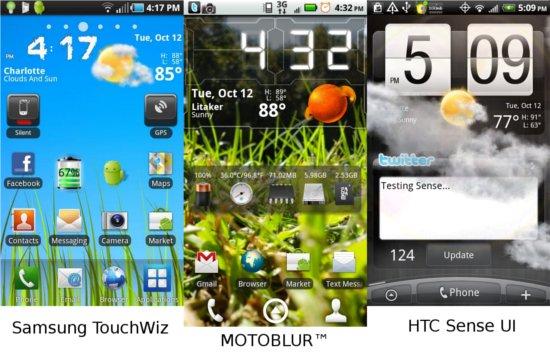
Android has spread like a wildfire across the cell phone market over the past year. With numerous manufacturers now rapidly releasing a collection of different devices, we're starting to see a lot of custom user interfaces from them. Most notable is HTC's Sense UI, but that's only one of many. Motorola touts MOTOBLUR, Samsung makes TouchWiz, and there are a few other interfaces that come stock on devices that aren't talked about quite as much.
One of my favorite things about Android is the customizable home screens and widgets. Quickly and easily, this can become one of the most annoying things about Android, too. I'm a little bit OCD when it comes to my Android device. I like to have the majority of every page filled. I have a particular layout that I like and when a custom UI has seven pages, setting it up and making it usable gets a little ridiculous and is essentially pointless. Typcially, I use three home screens, not four, five, six, or seven. Some user interfaces even offer nine home screens. In my personal opinion, anything over five is a little bit extraneous. Sure, you can use seven home screens, but I know that having seven pages with MOTOBLUR, I never used over three of them. I never waste the time or effort of scrolling over to them (or now jumping with the circle tabs at the bottom of the screen). It's quicker to scroll through my applications to launch rather flip four pages to look at a tiny widget. I will say that Motorola has made having seven pages a little less of a headache, but Sense and TouchWiz have not.
I've never been a huge fan of MOTOBLUR as most of the widgets look the same and are visually disgusting and bland, not to mention the seven home screens. The only custom UI that I've ever liked, and hated to bid farewell, was Sense UI. Since I have parted ways with HTC and split with their beautiful interface, I have been glued to using Launcher Pro, a home replacement application found in Android Market. With this I can set how many home screens I want, and set my phone up the way I like. Unfortunately, this makes setting up a little more involved, and I wouldn't recommend a home replacement app to an Android newcomer.

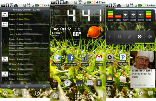
On my main home screen I always use System Info Widget, Beautiful Widgets, and a variation of applications, usually my current Twitter client, Facebook, Text Messaging, and Gmail. The only other widgets I ever use are Power Control, Agenda Widget, and Audio Manager Widget. Sense UI carries a handful of amazing widgets that I would prefer to use and can justify having more than three pages with. With a little more real estate (possibly an Android tablet) and more designated rows and columns more homepages with larger widgets would be more efficient. But until then, I will stand by my original statement that these custom UI's have too many home screens. They could definitely learn from the developers of home screen replacements like Launcher Pro, ADW Launcher, and others.
I'm curious to know who uses more widgets and how many screens your setup typically utilizes. I'm not saying how many widgets you stick to your homescreens, but how many you use. Does anyone need over five home screens? At that point, doesn't having so many home screens become convoluted, confusing to new users, and more that it's actually worth? Sound off below! I want to hear your thoughts.