The Good: Biting from Twitter for iPhone app (the artist formerly known as Tweetie), Osfoora captures and optimizes Twitter’s functionalities in a sleek, easy-to-use format.
The Bad: Not much to complain about with this app.
The Verdict: The developer has clearly listened to the needs of avid Twitter users and delivered a product which is satisfyingly complete.
I’ve been waiting for a Twitter client that possesses all of the features one looks for in a solid Twitter app and I’ve found it in Osfoora. Osfoora is developed by Said M. Marouf and available on in the App Store for iPhone, iPod Touch and iPad for $2.99 and $3.99.

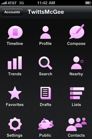
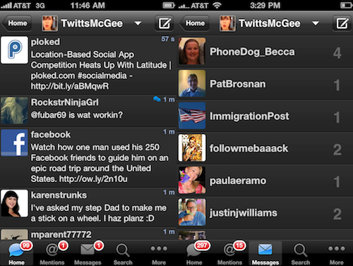
The aesthetic design is pleasing offering options for either a dark or light theme (dark is default). The home screen is laid out with large icons which you can also color-customize. Mine are now pink, of course. The timeline has the popular pull-down refresh feature as does the mentions. Unique to this app are the new post counts which add up on the icons along the bottom of the timeline page. I find the count on new mentions to be helpful, but not so much on the user posts. If you follow as many people as I do, there is the likely possibly of thousands of new posts when you don’t check Twitter for a few hours. Double-clicking the icon will bring up a menu that offers to “mark all as read.” Direct messages are listed as conversations also highlighting the number of times you have had correspondence with said user.

If you manage multiple Twitter accounts, you can easily switch from one to another with a pull-down menu on top of the timeline screen. Within the new tweet window are a string of helpful icons including add photo/video, tweet playing song/tweet song from library, find contact, add location, look up hashtag, and shorten tweet. This is one of my favorite features of this app. Instead of searching for these options, they are easily accessible while writing a new tweet.
Another great feature is the highly coveted old retweet style. The user is given the option to retweet old style (RT @user: Tweet, with the ability to edit and comment) or new style (no editing or commenting). I’m not sure why it was so difficult for other app developers to grasp that a large amount of Twitter users were unhappy with the new RT and wanted both options, but I’m relieved that this app offers it along with many other desirable features. Something I haven’t seen before is a “contacts” section where you can look through your followers/following by letter. Very handy when you can’t remember how to spell @*&%^mydadsays. When the trending topics aren't totally mind-numbing, they can actually be informative and Osfoora offers a glance at the worldwide Top 10, Top 20 and Top 30 of the week.
In my opinion, this app is worth every penny, especially you like the overall feel of Twitter for iPhone and it’s pull-down/refresh menus, but want an old-style RT option as well as the ability to easily tweet songs and customize the appearance.