NOTE: Due to the similarities between the devices, portions of this review also appear in my review of the Samsung Captivate (AT&T).
What's Good: Big, beautiful display; Light, pocketable form factor; Speedy download speeds; Fast, smooth performance; Good camera; Good social networking integration
What's Bad: Samsung's custom skin doesn't add much to Android and can't be disabled; Plastic materials feel cheap; No flash on camera
The Verdict: The Samsung Vibrant is the best phone T-Mobile currently sells. If you want a hard keyboard, consider myTouch 3G Slide instead. Otherwise, Vibrant is the way to go on T-Mo.

Introduction
Samsung's family of Galaxy S smartphones is spreading across the globe en masse this Summer, and T-Mobile's Vibrant joins AT&T's Captivate as the first models to launch on US carriers. Featuring a 4" screen with Super AMOLED technology, a 1GHz custom processor, and Android 2.1 OS paired with Samsung's own TouchWiz 3 user interface, Vibrant sets a new standard for smartphone performance on T-Mobile. With Google's own Nexus One no longer being sold, Vibrant becomes the flagship Android device on the Magenta-branded carrier.
Light and thin with a huge display, ample processing power and memory, and an HD video camera, Vibrant offers a potent mix of business, communications and social networking software. Though the phone has a somewhat cheap, plasticky feel to it, and Samsung's custom software suffers from a general lack of elegance, this is still a top-notch smartphone for everything from Web browsing to updating Facebook posts to, yes, making and receiving voice calls. Vibrant also is capable of some fast download speeds, particularly if you're in an area already upgraded to T-Mobile's HSPA+ network (even though it's "only" an HSDPA 7.2 phone).
When I first saw the original Galaxy S at its CTIA launch a few months back, I thought, "iPhone clone." Vibrant doesn't stray far from the original, design-wise, and it looks like a sort of cheap take on the basic, "Rectangle with rounded corners and chrome bezel" formula. While AT&T saw fit to make some changes to the overall look and feel of Captivate, T-Mobile and Samsung played it close to the vest with Vibrant. The result is a pretty generic looking device - at least until you turn it on.
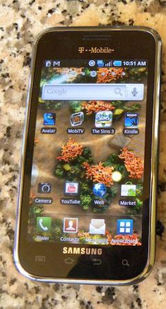
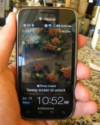
Vibrant's biggest, baddest feature is its 4", 800 x 480 resolution, Super AMOLED display. The capacitive, multitouch-aware screen takes up most of the front panel of the phone, save for a logo and some sensors above it and another logo and a row of four touch-sensitive buttons below. The top of the device features a 3.5mm headphone jack and a microUSB port covered by a neat sliding plastic door, and there's a rocker switch on one spine of the phone and a lock/power button on the other. You get a 5 megapixel camera with HD video capture (but no flash) on the back of the phone, mounted in a very generic, kinda cheap looking snap-on full-length battery cover. A second, different but also generic looking battery cover is included in the retail box.

I should be fair here and say while Vibrant looks and feels a little plasticky, it's exhibited no signs of creakiness or any build quality issues during the week or so that I've had it. And the upside of "plasticky" is that Vibrant is incredibly lightweight, tipping the scales at a mere 118 g, or 4.16 oz. The phone measures 122 x 65 x 9.9 mm, which also makes it one of the thinnest smartphones on the market and imminently pocketable despite the four full inches of display space. And for all the grief I'm giving poor Vibrant for its looks, I actually prefer it visually to AT&T's Captivate. Go figure.
Vibrant comes with a USB cable, a modular charger, stereo headset, and manuals in its box. You also get a 2GB microSD card preinstalled in the device to compliment 16GB of internal storage. The SD card has a full-length copy of the motion picture "Avatar" pre-installed and ready for playack.

Samsung's take on Android has evolved some over the past few years, and Vibrant comes with the latest version of their TouchWiz user interface installed as part of the Android 2.1 operating system. As said before, TouchWiz makes Android look a lot like iPhone's iOS, with similar looking icons arranged into a similar looking grid with a similar looking four-icon dock at the bottom of the home screens. The result is a user experience that's arguably more novice-friendly than standard Android, but also arguably less attractive. Personally I'd argue in favor of plain ol' Android 2.1 (better yet, 2.2) instead of TouchWiz, but custom skins seem to be the current favored method of making your Google Phone stand out from the pack, so I guess we have to live with 'em for the time being. A 2.2 "FroYo" update has been promised in the coming months, no doubt with TouchWiz 3.x still firmly in place.

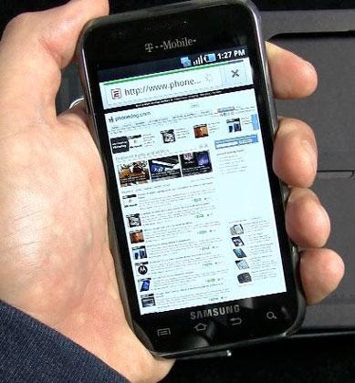
Vibrant is my new pick as the best T-Mobile smartphone, edging out HTC's myTouch 3G Slide thanks to its superior performance running Android software and that brilliant display. Reception and call quality have been solid during testing in San Francisco, Oakland and Berkeley, CA, and the phone functions equally well via "normal" speaker, speakerphone, or wired/wireless headset. Vibrant moved from app to app, from pinch to zoom, and from still photo viewing to video playback with nary a hiccup, and I delighted in nice download speeds while browsing the Web and pulling down Email attachments. Though Vibrant is an HSPA 7.2, not HSPA+, device, if you live in an area already upgraded to T-Mobile's HSPA+ network, you will experience some of the fastest downloads possible in the US right now. Battery life was even decent given the size and brightness of that display - I regularly got through the day without having to recharge the device before bed, which is on par with iPhone 4 and a bit better than HTC's Evo 4G and Droid Incredible.
Media playback on Vibrant was terrific. High quality video clips like the included copy of "Avatar" look spectacular on the device thanks to the Super AMOLED tech, which is bright and vivid like AMOLED but more usable in direct sunlight. Photos and videos captured with Vibrant are of above average quality so long as they're shot in decent lighting - there's a Night Mode that helps in low light, but no LED flash. 720p HD video in particular was quite impressive, notching in just below iPhone 4's camcorder in my utterly non-scientific tests. Built-in wired and wireless sharing makes it possible to zap your media to a PC or HDTV for family viewing, and a Samsung media store is coming soon to the entire Galaxy S lineup.
The obvious question, of course, is "Is this the best mobile phone display on the market?" My answer is No, but it's second-best. iPhone 4's display is smaller than Captivate's, but it's higher resolution and packs pixels in at a higher density, which to my eyes results in a richer experience when viewing text, graphics, and images/video. The same content viewed on Vibrant has a wee bit more "pop" to it (colors leaping off the screen) but just a bit less sharpness and depth than on iPhone 4. On the other hand, I'd take Captivate's display over any of HTC or Motorola's current offerings, hands-down.

Then again, because Vibrant's screen is physically larger than iPhone's, it's a wee bit easier to type on the Samsung than the Apple. Samsung's soft QWERTY board is quite good, and you also get the stock Android QWERTY and Swype's one-finger input method pre-installed on the phone. While I still rate Motorola's Droid X as the easiest touch-only phone to type on, I go back to that 4" display sweet spot thing in saying that Captivate strikes a great balance between all of the pluses of a noticeably larger-than-normal display without too many of the minuses that come with a ginormous form factor.
Samsung's custom software is interesting, if not altogether great. On the one hand you've got a pretty plain jane user interface that offers up seven home screen panels, live wallpaper support, a home screen dock and a bunch of extra widgets and apps, a few of which (Daily Briefing, Buddies Now) are actually kind of handy. On the other hand the look and feel of TouchWiz is way more cartoon-like than elegant, you can't opt-out of the custom skin in favor of stock Android, some of the widgets are pretty half-baked, Samsung's English language labels and dialogue boxes are full of weird diction and grammatical errors like, "And then you can see the new feeds on the idle by widget" (from the Twitter Sync dialogue). And the phone flat out refused to connect to my Mac in mass storage mode, though it did mount as a drive on my Windows laptop.
T-mobile didn't remove the Amazon MP3 store or lock unsigned apps out of Vibrant's system like AT&T did with Captivate, but they did add a few of their own apps to the base install. The Sims 3, Kindle, Layar, ThinkFree Office Slacker Radio top a fairly long list of T-Mo exclusive software - or "bloatware," if you prefer - pre-installed on Vibrant. Vibrant also features Visual Voicemail for no additional charge.
Frankly, I'd love to get my hands on Vibrant - or any Galaxy S phone - running a fully open, stock version of Android OS 2.2 with access to Samsung's widgets to use or not as I see fit. Vibrant is a great piece of hardware, and while it's more than useable with Sammy's software installed, TouchWiz doesn't do much for me. But like I said, I can see the Android newbie or first-time smartphone buyer being attracted to Vibrant's colorful array of icons and iPhone-like dock.

My gripes and groans about the choice of materials and custom software notwithstanding, I think Vibrant is an excellent smartphone. To say it again, I'll take Vibrant over myTouch 3G Slide as the current king of T-Mobile's offerings. Vibrant packs a ton of processing power, features, and display space into a remarkably thin, lightweight package, and the phone breezes through most tasks with ease.
Like its Galaxy S brethren, Vibrant's brilliant display is great for media consumption, big enough for decently comfortable typing, and responsive enough for easy pinch-and-zooming your way around Web pages and photo galleries. With 16GB of onboard storage, an above-average camera with HD video capture, and easy syncing to your Google account and social networks, Vibrant offers a compelling option for folks with particular - and varied - smartphone wish lists.
Android is Android and Apple's iOS is iOS, but Vibrant is a worthy answer to the question, "I want an iPhone but I'm on T-Mobile, what should I get?" Based on my short time with the device, I can recommend it without hesitation. And all other things being equal, running Vibrant on T-Mobile will make less of a dent in your pocket than keeping a Captivate going on AT&T: An unlimited talk, messaging and Web plan on T-Mobile will run you about $25/month less than a comparable plan on AT&T, and AT&T caps smartphone data at 2GB per month. Makes Vibrant a pretty compelling iPhone alternative, now doesn't it? Not that we're comparing or anything.