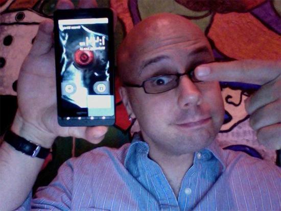
Motorola and Verizon launched the Droid X today with Adobe and Google joining them at the party. Droid X continues the new trend towards larger, mini-tablet style smartphones with big screens and advanced multimedia features. More important than whether or not Droid X can be an iPhone/Evo/Anything Killer is that Verizon now has two high end Android phones in its lineup: The more traditional-sized HTC Droid Incredible and the super-sized Droid X.
I haven't had much time at all to play with - uh, I mean, test - the new Droid, Motorola's Droid X for Verizon. So take these as very first impressions. I've literally been shooting editing an unboxing video since I got my review unit, sneaking in some time setting up the device while the video was exporting and uploading. So we're talking minutes, not hours or days, of time for impressions to form. I have had an HTC EVO 4G on me the whole time, though, so some apt comparisons could start to be made.
- Available July 15 for $199.99 on contract, after $100 rebate. Requires $30/month smartphone service plan. Optional $20/month mobile hotspot plan offers 2GB of data per month for tethered devices, and supports up to five simultaneous connections.
- Verizon is following AT&T's iPhone lead in making early upgrades available on Droid X purchases
- The screen is big and bright and responsive. 854 x 480 pixels spread across 4.3" at 16:9 widescreen aspect ratio makes for plenty of room for typing, and Motorola's done a few things with the keyboard on this device that I really like so far. Droid X might be easier to type on than EVO, and EVO's proved very easy to type on.
- Swype is also preinstalled on Droid X.
- Droid X runs Android 2.1 with a new version of the MotoBlur UI. So far the new MotoBlur is much better than the old one, mainly because it's easier to minimize it. Widgets are less intrusive, and can be hidden away altogether. But most of the original Blur's functionality remains.
- Blur can't do what HTC's Sense does for Evo, but the growing repository of native Android widgets - and integrated social networking support in OS 2.1 - minimizes the downside there.
- Droid X feels thin and solid, save for the "Camera Hump" at the top end of the device. Said hump isn't that big of a deal so far, particularly as you don't notice it at all when holding the phone with one hand in portrait orientation ("the long way").
- Physical buttons beneath the display? GOOD. Dedicated camera button? GOOD. Placement of the camera button? Perhaps mildly annoying during one-handed use, but likely no big deal.
- EVO Comparison: Droid X is slightly longer, perhaps ever so slightly narrower from left to right, and thinner overall (save for the camera hump). Droid X somehow feels a bit more like a traditional cell phone, form factor wise, because its 16:9 widescreen lends to the device's over all long, thin rectangle shape. More like a cellie, less like a tablet. But that's a very fine distinction at best, and a rather subjective one to boot.
- EVO Comparison: Droid X lacks the front-facing camera and kickstand found on EVO.
- EVO Comparison: Droid X features an 8MP camera, 720p hi-def video recording and HD video out just like EVO. Droid X steps it up a notch with support for DLNA wireless HD content sharing and three microphones for better audio capture. The mics can be configured via software "scenes" - Use one scene if you're narrating a video from behind the camera, another scene to use the rear-mounted mic to capture audio in front of the camera, and so on.
Alright, that's all I got for now. More impressions, and some better photos, coming soon. Meantime, check out the unboxing vid!
