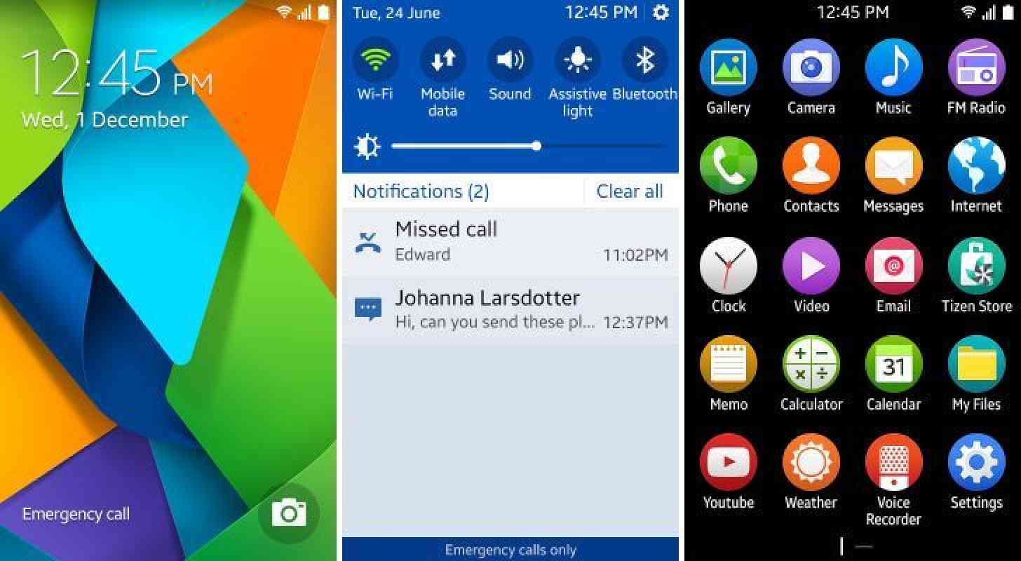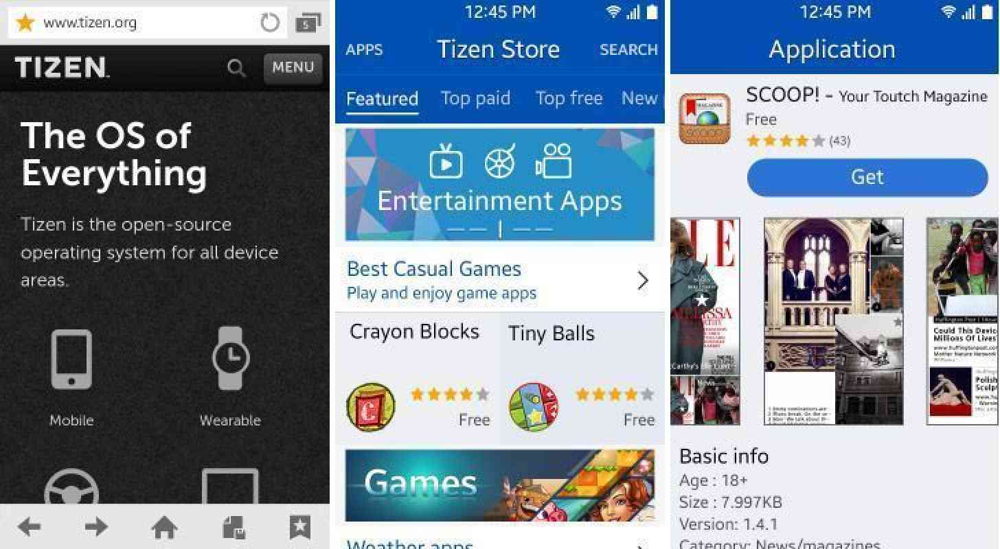
We still haven’t seen a Tizen smartphone get released to the public, but Samsung is still hard at work on the software, and today some screenshots have shown what the latest version of Tizen looks like.
The images show what’s said to be Tizen 2.3, which is reportedly focused on devices with a WVGA 800x480 screen resolution and up. The colors used in Tizen 2.3 are brighter than those used in previous versions, with the main color being blue. The icons used in the OS are mostly round, and the software used fonts from the TizenSans family.

Samsung’s TouchWiz user interface has been described as colorful and “gaudy” in the past, and so it’s no surprise to see that Sammy is using a similar design language with Tizen, the mobile OS that it’s playing a major part in creating. Tizen takes that bright, colorful look and even amps it up a bit. And while it’s unclear if Samsung’s first Tizen device will launch in November like we last heard, it’s definitely looking like Tizen OS is getting ready for prime time.
What do you think of Samsung’s Tizen software?