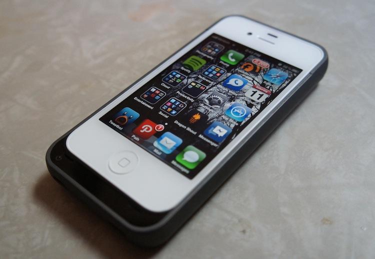
Apple first introduced iPhone OS back in 2007. It is now approaching five-years-old, has since been renamed to iOS (June 2010) and now supports more resolutions and installations of apps from App Store. Aside from those alterations, very little has changed. Sure, Apple has added new features like multitasking (if you want to call it that), Notification Center and iCloud. But for all intents and purposes, iOS is almost the exact same as it was when it was brand spankin' new. It looks almost identical to the first version software and it's high time for a refresh.
As a bit of contrast, Android has undergone a drastic interface change almost every step of the way. Eclair and Froyo looked very little like Donut and Cupcake. Gingerbread introduced yet another interface update. So did Honeycomb. And Ice Cream Sandwich brought yet another. Too much change can be a bad thing, of course. But in terms of Android, it was in need of a little extra polish – more than just a spit shine.
In Apple's defense, one could say that since iOS isn't broke, Apple shouldn't try to fix it. It isn't broke. In fact, it's easily one of the better performing operating systems out there and has arguably fewer glitches and bugs than any other (not app crashes, though). And the interface layout works just as intended. But that doesn't change the fact that it's utterly boring and dated. Infantile, even.
We're expecting yet another iOS update this year, which we imagine will come around the time of the next iPhone, assumed to be the iPhone 5 likely in late summer or fall. Aaron already said that he hopes there is a better multitasking implementation and Notification Center gets reworked. I certainly agree with him, but I have bigger hopes for iOS 6. Here are a few areas Apple needs to focus on in their next update:
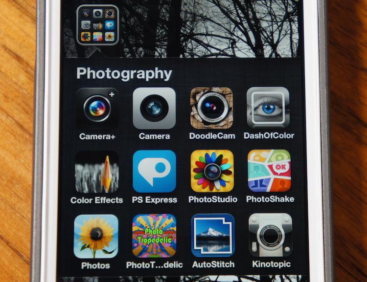
More so than anything else, the home screen needs a refresh. Since 2007, the iOS home screen has been composed of nothing but icons, with the addition of folders in iOS version 4.0. Every application installed on the device is displayed on an array of home screens, which are filled from left to right, top to bottom.
In comparison, both Windows Phone's and Android's home screens are more adept in that they offer live updating information, straight from the home screen. This makes information easier to consume at a glance. On Android, you can read emails, Twitter feeds, RSS feeds and more without ever having to launch an App. And with Windows Phone's live tiles, calendar entries and other information can be read from the home screen, too.
In short, iOS isn't optimized for using "at a glance." You can get your latest notifications without ever unlocking your phone. But once you slide to unlock, the information is scattered and you may have to launch several different applications to get the info you're looking for, which takes us to my next point ...
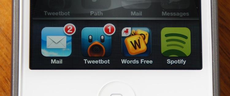
Multitasking was also implemented in the iOS 4 update. It's more appropriately called "task switching" than multitasking, but the idea is that you can switch apps without having to go back to the home screen. There's no arguing that this is better than not being able to switch apps at all. Not having the ability to run third-party music streaming services (like Pandora) in the background while tapping out a few notes on my iPad was one of the primary reasons I sold mine just a few months after I bought it and switched to an Android tablet.
But this was enabled with iOS 4 ... sufficiently. But when I'm in an application, I still find myself going back to the home screen to launch another application. Generally, this is because there are fewer steps (or taps) involved with going back to the home screen. To open the task switcher on iOS, it requires a double-tap of the home button, then flipping through a few four-icon pages to find the app you need to switch to. At a minimum, switching an app requires three taps using this method – usually more. If you exit the app and open one that is on the first home screen, you can do this just as fast with one less tap.
I'm not saying this is a big deal. It's probably negligible to most people. But it certainly leaves room for improvement. I only open the multitasking menu when I need to close a rogue app, which isn't very often. I think the adoption of some webOS-like gestures for switching apps (a swipe up from the bottom of the display, or left to right and right to left) are in order.
I ran a poll a few months ago asking which mobile platform has the best browser. With nearly 2,000 votes, Android took the cake with 56.56 percent and iOS came in second with 25.8 percent. That's not bad considering Apple really hasn't changed the browser all that much in almost five years. The biggest update I can remember came in iOS 5 with Safari Reader and Reading List.
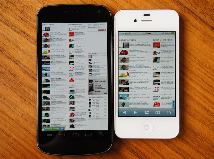
Safari on the iPad isn't so bad. But the iPhone's stature is looking rather bleak in comparison to its giant Android counterparts. With such a small display (by comparison, that is), there is a lot less room for information to be displayed, requiring more panning and zooming. Not to mention, the navigation bar in Safari is ... huge, to say the least. If nothing else, Apple needs to enable a full-screen viewing mode in Safari that implements some of the gestures used in the OS X version of Safari (two-finger swipe left to go back a page, two-finger swipe right to move forward a page).
If they bump the size of the display in the iPhone 5, like rumors will have us believe, this will be more of a non-issue. But there is nothing more annoying to me than having to pan left and right just to read some text within the browser of my phone. As it stands, Safari is my least favorite mobile browser out there, despite its fluidity. There is far too much wasted display space on a display that is entirely too small (by today's standards). Fix this, Apple.
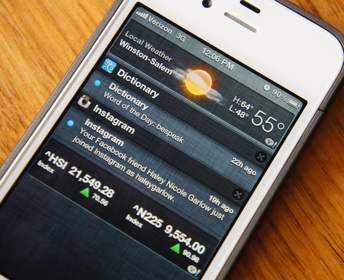
In iOS 5, Apple also introduced an "improved" notification system accurately named Notification Center. In essence, it's an Android-like pull-down shade that displays all of your recent notifications. It's a decent start, but it's far from very useful. It will be nice when they throw in some APIs for third-party widgets, much like the Stocks and Weather widgets you see above. And I might actually be enticed to pull down the shade every once in a while if Apple can update the OS to display unattended notifications in a way that connects them to Notification Center, not the individual badges that make me completely forget about the pull-down menu.
Before taking this picture, I cleared out about 50 or more notifications that I had completely forgotten about. Each set of notifications from different applications had to be cleared separately. It'd be nice if we could get a "Clear all" button, maybe one that's a little more finger-friendly than those little X buttons that you have to tap twice. I always miss them on the second tap and end up opening a notification I was trying to dismiss.
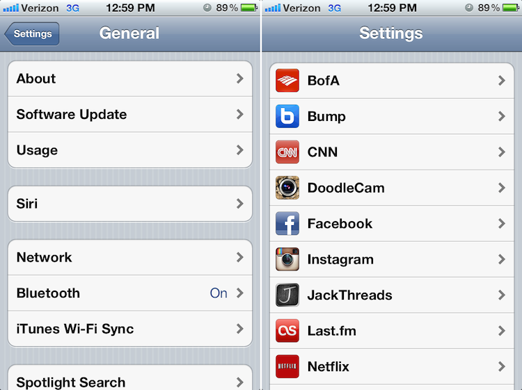
Despite all of the things I've mentioned above, the biggest eyesore of iOS is the Settings app. It's jumbled, and some of the most important settings are buried beneath menu after menu. But most importantly, when I want to toggle a setting, like Wi-Fi, for instance, I have to navigate to the Settings application, select Wi-Fi then toggle Wi-Fi on or off. The same goes for brightness settings, Bluetooth or any other toggle. These are things that need to be more quickly accessible – toggle switches that can be brought to the home screen, Notification Center or even the very top and front of Settings.
But the Settings app's problems are deeper than just toggle settings being buried too deeply. It's a jumbled mess. I understand the need for a unified location for settings, even for third-party applications. However, not everything needs to be listed on the opening page of the Settings app. Leave that room for more important settings and aggregate the individual application settings beneath an Applications tab.
Not everyone will agree with everything I've said here. I'm fully aware of that. There are going to be people who love iOS just as it is. Other people will want more changes than I've mentioned. But I think most can agree that iOS is overdue for a proper face lift. A new phone with a new design and a higher resolution display would be the perfect opportunity to introduce such a radical change – that is, if the iPhone 5 lives up to rumored specs.
What do you think, ladies and gents? Should iOS receive an interface update this time around? Is it time for the app drawer to be booted from the home screen? Or should everything stay just as it is?