Google Photos is one of Google's major products, and today it's getting a redesign.
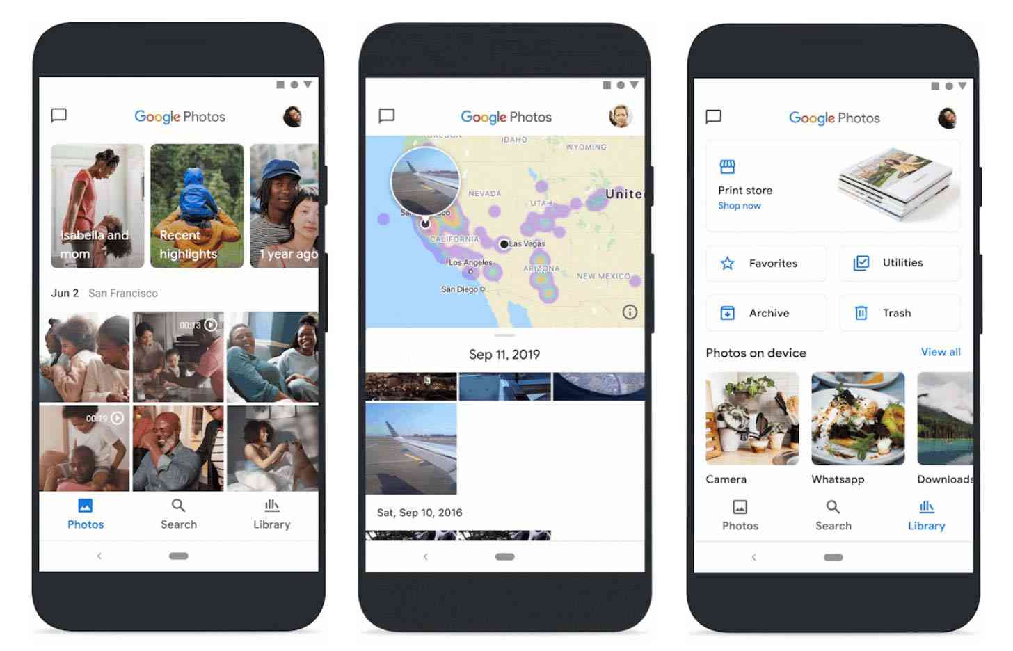
The new-look Google Photos has a three-tab interface meant to place more focus on your photos and the search tool. The main Photos tab includes all your photos and videos as usual, but it now has larger thumbnails, auto-playing videos, and less white space in-between images.
The Photos tab also has a Memories carousel at the top. Memories is an easy way for you to revisit your past photos and videos, and with today's redesign, Google is adding more types of Memories like the best photos of you and your loved ones over the years and and the highlights from the past week.
Memories is also gaining the automatic creations, like collages and stylized photos, that used to appear in the Google Photos "For you" tab that's no longer present. And finally, Google says you can hide specific people or time periods from Memories if there are some things you'd rather not see.
The second tab in this new Google Photos is Search. Not only can you quickly search your photos and videos library here, but the Search tab also includes a new interactive map view of your photos and videos. You can pinch and zoom around the world to see photos from where you've been and see where you've taken the most images around your town.
The third tab is your Library. Here you'll find your Albums, Favorites, Trash, Archive, and more. And folks in the US, EU, and Canada will also see the Google Photos Print Store, where you can buy printed products made using your own photos.
![]()
The final major piece of this Google Photos redesign is a new logo. The original Google Photos icon (above, left) is a pinwheel, which Google says is "a nod to childhoold and nostalgia". The new icon (above, right) is a simplified version that's still meant to retain that pinwheel shape.
The new-look Google Photos is rolling out on Android and iOS over the next week.