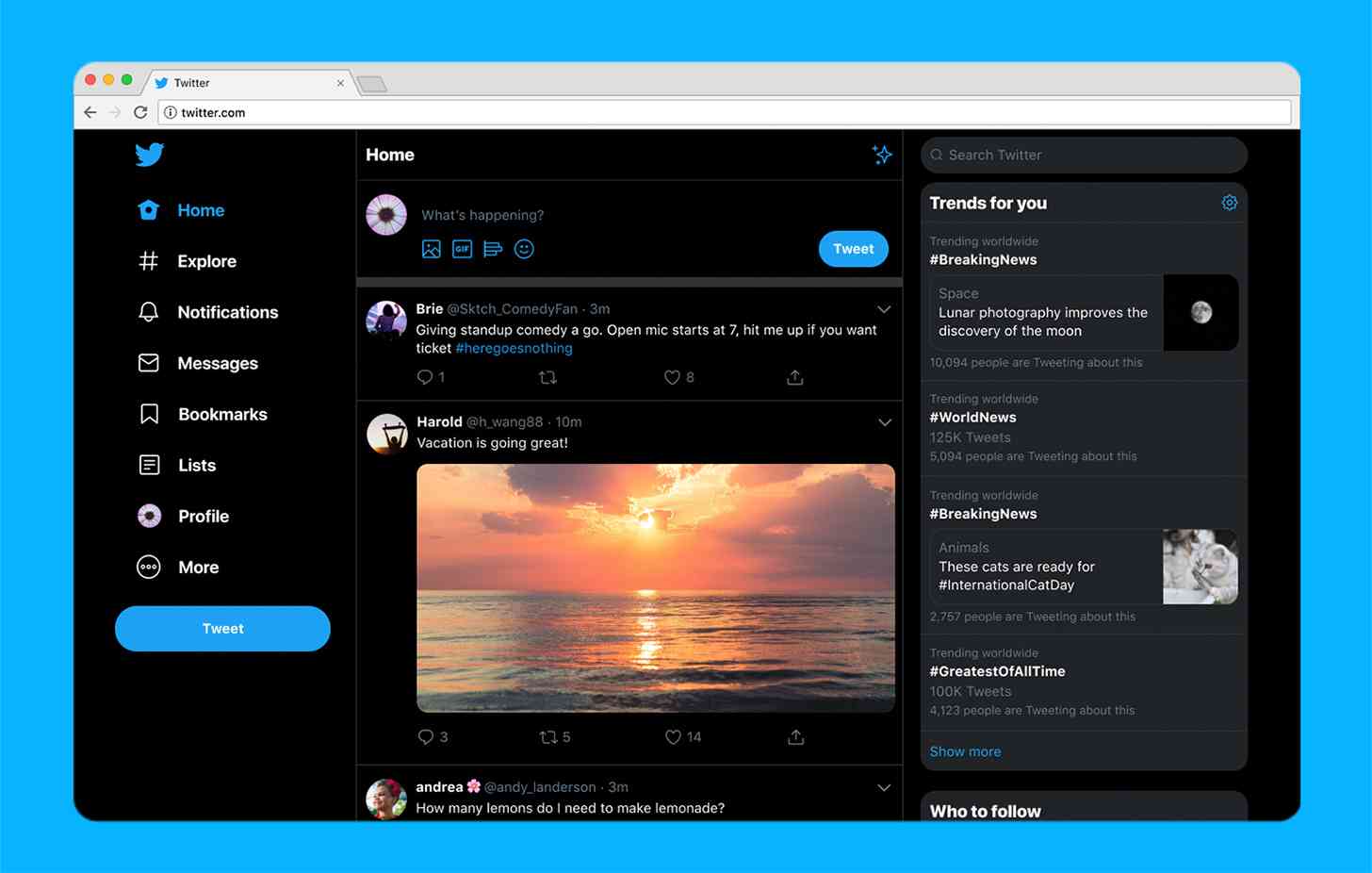
Twitter is launching a new look on your desktop.
Twtter today confirmed that it's started to roll out a new Twitter.com website for the desktop, promising that it's "faster, easier to navigate and more personalized." There are new themes and color options and two options for dark mode, Dim and Lights Out, letting you get the darker dark mode that we saw roll out on mobile devices earlier this year.
The redesigned Twitter website also gives Bookmarks, Lists, and Profile their own spots on the side navigation bar, making it easier for you to access those features. Direct Messages has been improved, too, getting an expansion that'll let you see your conversations and send messages from the same view.
Woah, what’s this? A shiny new https://t.co/q4wnE46fGs for desktop? Yup. IT’S HERE. pic.twitter.com/8y4TMzqBGa
— Twitter (@Twitter) July 15, 2019
Rounding out the redesign is the Explore feature from mobile that'll let you see personalized live video and local moments, profile information within conversations, and the ability to see Top Trends in any view. The updated design will help you switch accounts more easily as well.
There are lots of apps out there that help you access Twitter, including on desktop and mobile, but sometimes you don't want to spend a bunch of time searching for the best app for your platform and then installing it. That's where Twitter on the desktop comes in, letting you easily access Twitter from any computer without having to install anything extra. It's nice to see Twitter improving its desktop experience with these new features, making using Twitter more enjoyable for those folks who don't want to install an app.