Google's mobile search is getting a refresh.
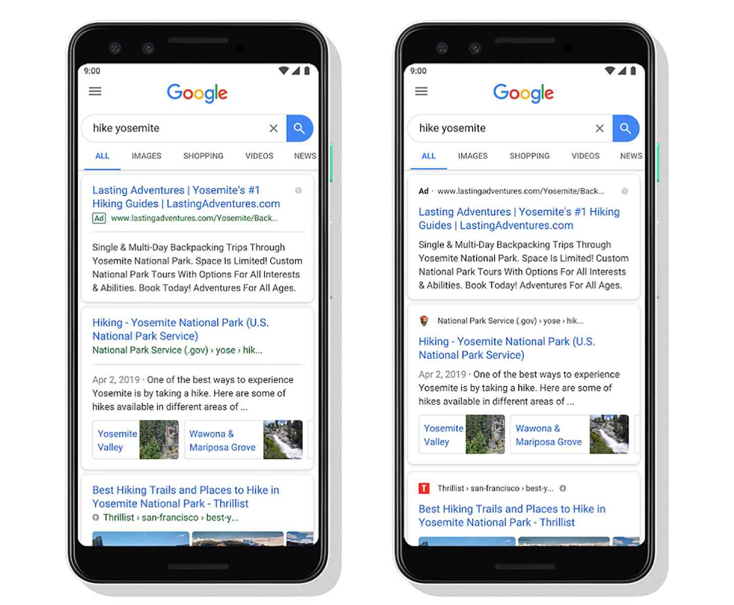
Google today announced a new look for Search on mobile devices that's aimed at helping you better understand where the search results are coming from. With the new look, the name of a website and its brand icon appear at the top of a results card, making it easier for you to scan through the search results and decide what to tap on.
If there's an ad in your search results, you'll see the word "Ad" bolded at the top of that result card, too, so you can more easily identify that result.
You can see a comparison between the old and new looks in the image above, with the old design on the left and the new on the right.
"As we continue to make new content formats and useful actions available—from buying movie tickets to playing podcasts—this new design allows us to add more action buttons and helpful previews to search results cards, all while giving you a better sense of the web page’s content with clear attribution back to the source," explains Google.
This new look for mobile Google Search will begin rolling out over the next few days.
When you're scrolling through search results, the name of a website can easily blend in with the text unless your placing a lot of focus on examining each result. This new-look Google Search aims to help with that, placing the name of a website and its brand icon at the top of a results card to help them both stand out.