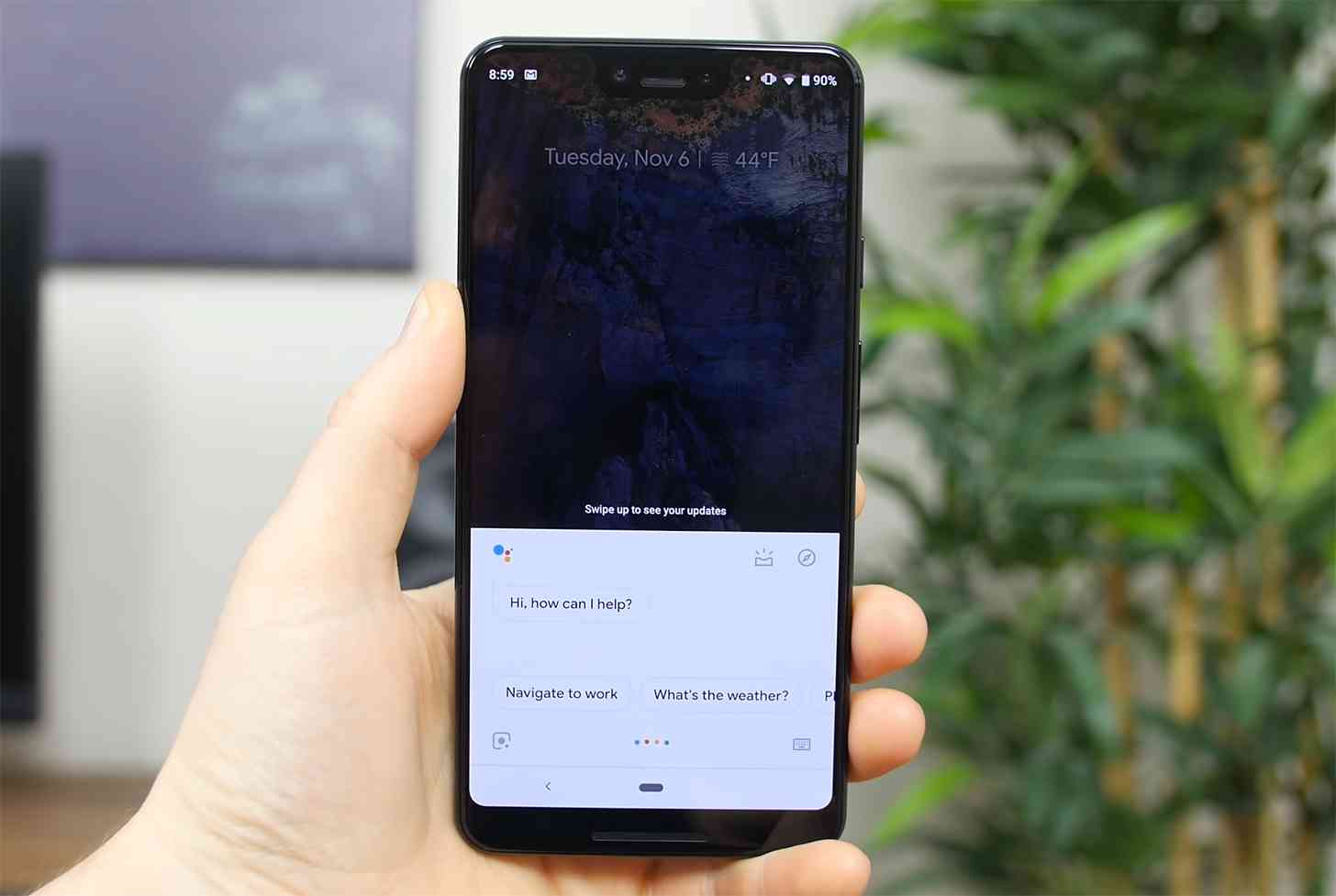
Google Assistant has long been displayed as a white card that pops up when you activate it, but a new test shows that Google is toying with a redesign.
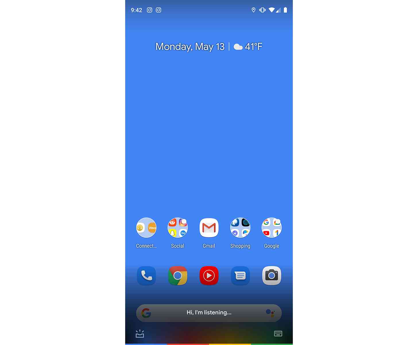
Some Reddit users have received a redesigned Google Assistant that's totally different than the one most of us have today. As you can see in the screenshot below, the new-look Google Assistant shows the phrase "Hi, I'm listening..." at the bottom of the screen along with a colorful light bar that's reminiscent of the Chromebook Pixel as well as the keyboard and inbox icons in the lower corners of the display.

There are a few Reddit users that say they've got this new Google Assistant, but overall it looks like its rollout is pretty limited. The original poster is on version 9.84.10.21 of the Google app and on a Pixel 3, but a few other users have chimed in to say they're on different devices, so it looks like this new Assistant is enabled by a server-side switch.
The new Google Assistant is quite a bit more minimal than the previous version that most of us are running, letting you see much more of your wallpaper and app icons than the white card that pops up. It's unclear if this new Assistant will eventually roll out to everyone or if Google is just testing it and will ultimately decide to stick with the same version we've had.
What do you think of this new Google Assistant? Should Google move to it fully or stick with the existing version?