Google is regularly tweaking and improving the user interface of its Android features, and today it's the Google Assistant that's getting a new look.
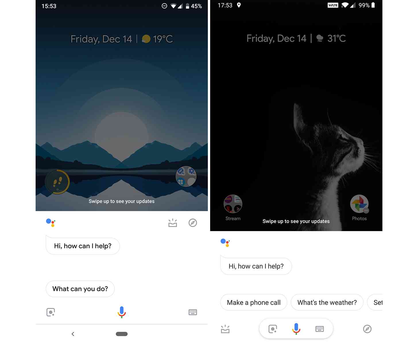
Google is testing an updated design for the Google Assistant that puts Visual Snapshot and Explore shortcuts in the bottom bar. These buttons are on the left and right sides of the bottom section of the screen, while the Google Lens and keyboard buttons are on either side of the microphone button.
This is a server-side update, so you can't get it by updating an app or anything like that. Also of note is that the feature appears to only be in testing for now, so it's unclear if these changes will roll out more widely in the future. You can see a comparison of the current (left) and new (right) layouts in the screenshots below.

Visual Snapshot is a feature that'll show you information to help you throughout your day, like the weather, travel time for your commute, your upcoming appointments, and more. Meanwhile, the Explore section will help you learn about the Assistant's capabilities. Both of these features used to be located in the upper right corner of the Assistant section, so bringing them to the bottom bar should make them easier to reach. I think it helps to clean up the look of the Google Assistant, too.
What do you think of this new-look Google Assistant?