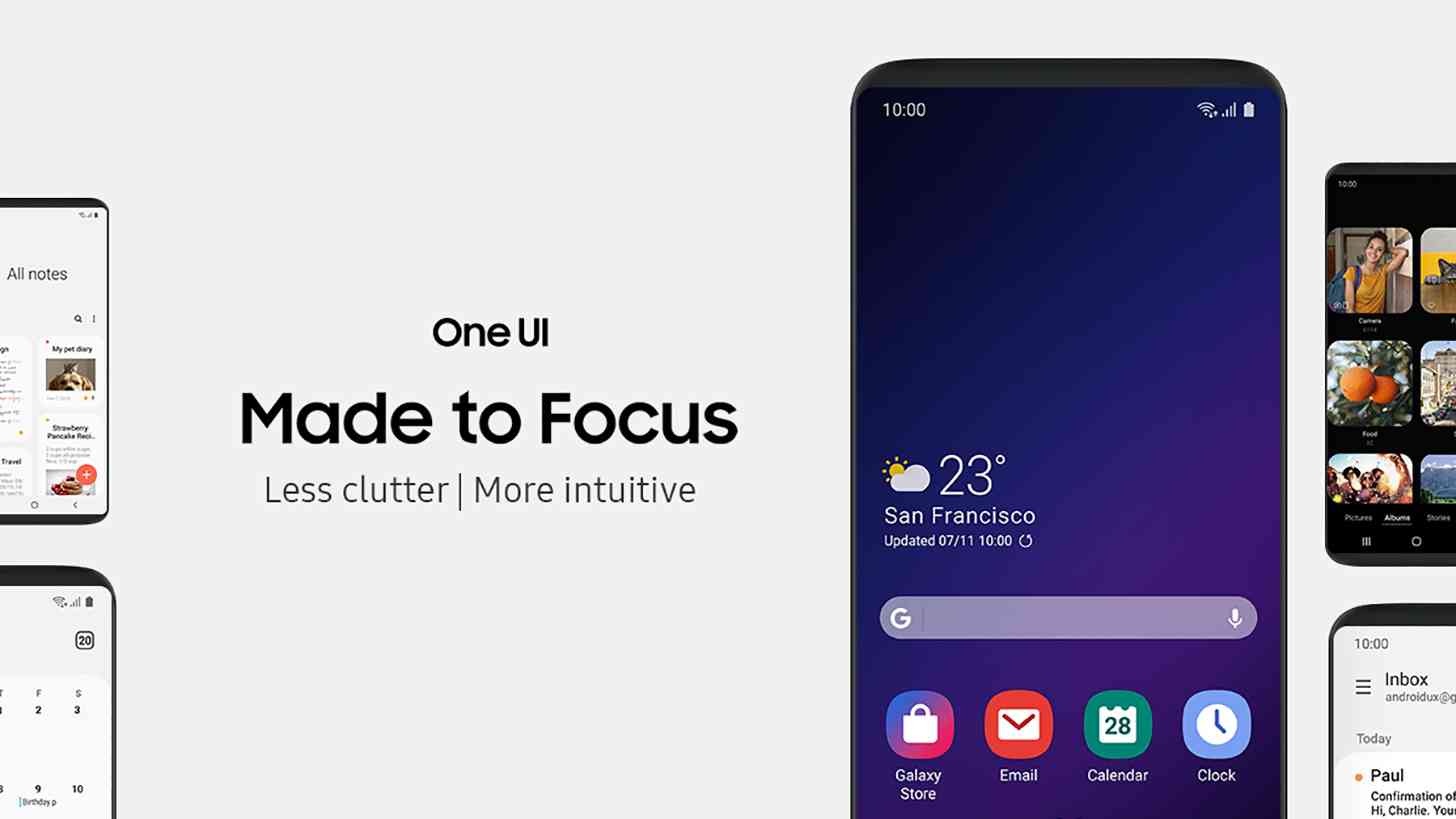
Along with its Infinity Flex Display and foldable phone, Samsung today revealed its updated user interface for smartphones: One UI.
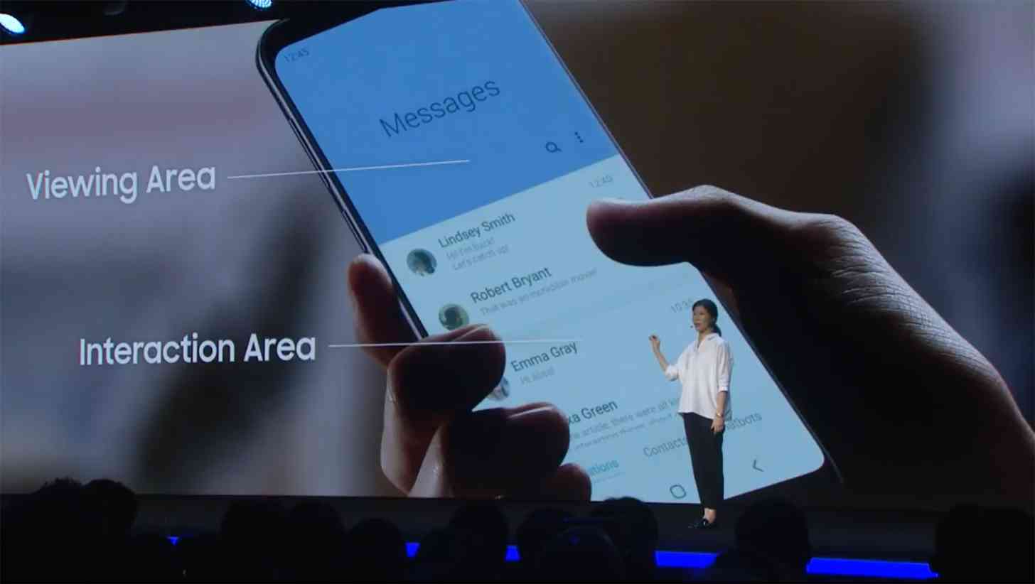
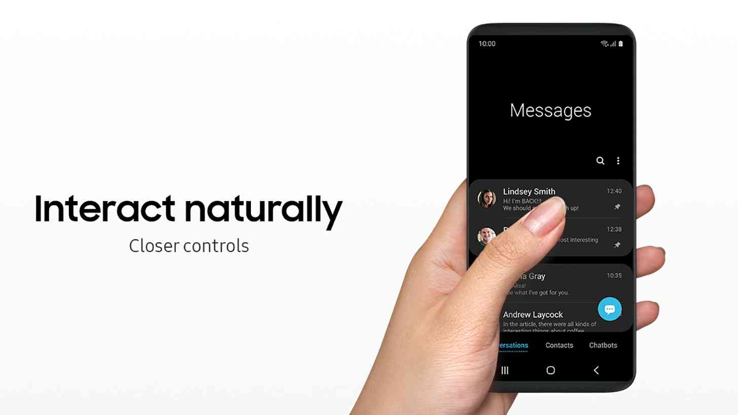
One major focus of One UI is to help make the interface easier to navigate, especially as phone screens get larger and larger. Samsung has done this by keeping the most relevant content on the bottom half of the screen in its "Interaction Area", while keeping content that you want to view on the upper part of the display. For example, in the Messages app, the list of messages available for you to view is in the bottom half of the screen, making the top-most threads easier for you to tap.

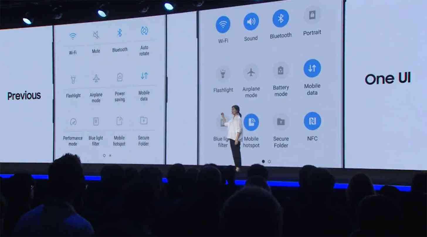
Samsung is also working to improve the look of its software with One UI. It's updating the UI to be more clear and intuitive and has tuned the colors to provide more visual clarity. Samsung is adding Night Mode across its user interface, a move that can help to save your eyes from a blinding white screen at night and can also help to preserve battery life on OLED displays.
Other notable improvements of One UI include a regrouped Settings app that'll show your most used settings first, as well as a range of colored UX themes that can match the hardware that you're using.

Samsung says that it plans to offer an open beta of One UI in the U.S., Germany, and Korea starting in November, with more countries in Europe and Asia to follow. One UI is expected to begin rolling out to the Samsung Galaxy S9, Galaxy S9+, and Galaxy Note 9 in January 2019.
With screens on smartphones getting larger and larger, it can be difficult to reach UI elements that are in the upper half of the display. Samsung appears to be making that a focus with its One UI. While this update doesn't look like a major overhaul of Samsung's custom Android user interface, it does look like it offers several improvements to make using a Samsung phone easier, especially devices with big screens like the Galaxy Note 9.
What do you think of Samsung's One UI?
