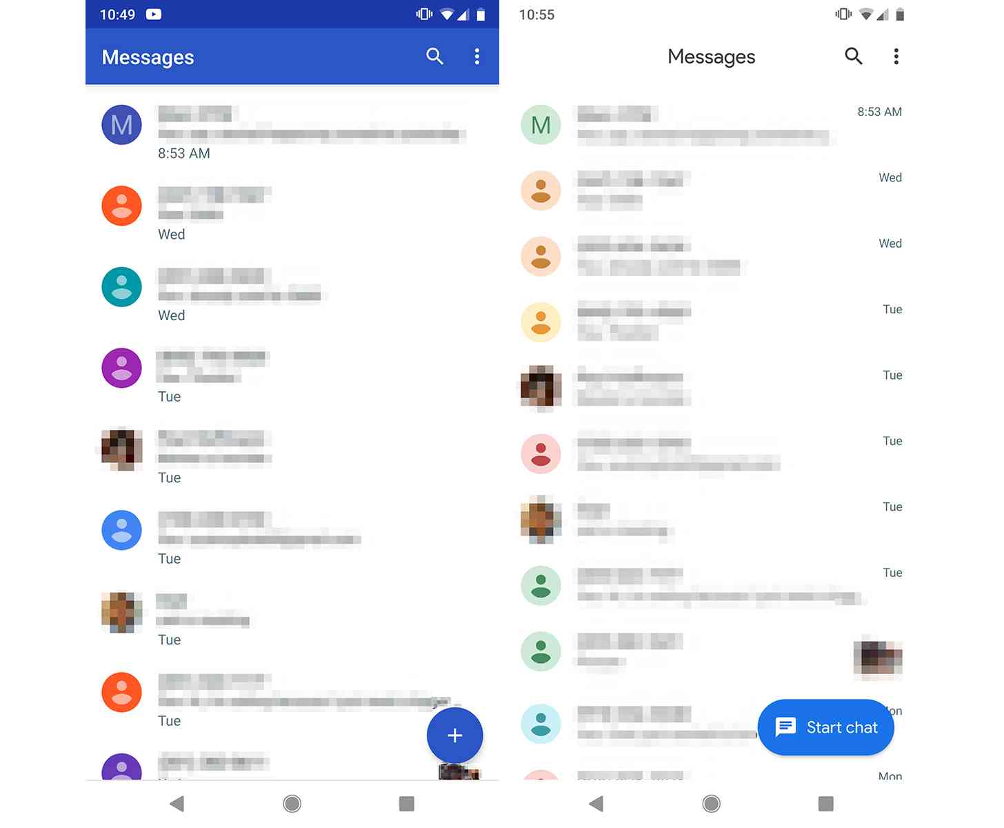
Google has been working to update is Android apps with a fresh Material look this month, including the Contacts app. Now another app has gotten a fresh coat of Material paint.
Android Messages version 3.5 is now rolling out, complete with a Material redesign and a dark mode. As noted by Android Police, the Material makeover (above right) ditches the color accents that we saw in the old version of the app (above left) and opting for an all-white background and a larger Floating Action Button that now says "Start chat". The update also pushes the times of the messages to the right of the screen, centers the word "Messages" at the top of the display, and makes the colors for the chat bubbles more of a pastel hue.
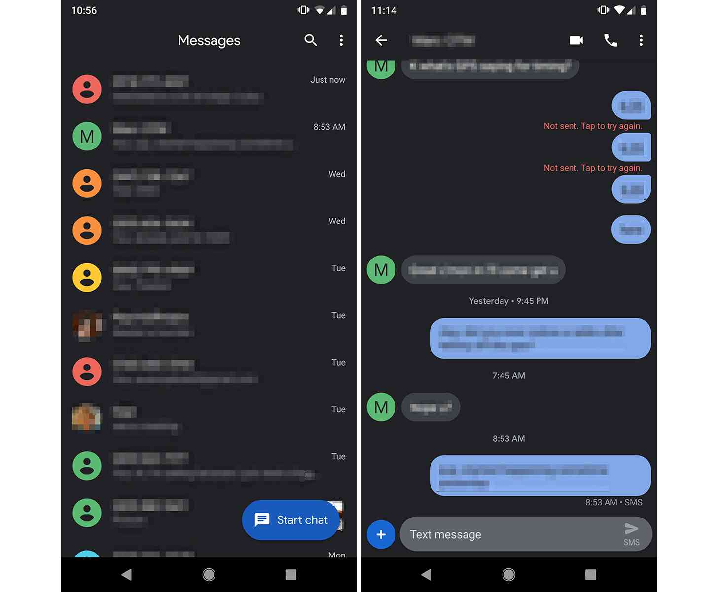
And then there's the dark mode. Just like you'd expect, toggling the dark mode turns the app's UI dark. It's not totally black, though, as it's more of a dark gray. Still, there will likely be a lot of excited Android Messages users with this new update.

To toggle the dark mode, tap the three-dot menu in the upper right corner of your screen.
If you use Android Messages, be on the lookout for the update to version 3.5 in the Play Store.
This looks like a great update for the Android Messages app. Not only is it nice to see Google continue to update its apps with its more modern Material look, but the dark mode is something that a lot of Android users want in their UI. While there's not a system-wide dark mode in Android quite yet, the addition of a dark mode to Android Messages is a nice little surprise.