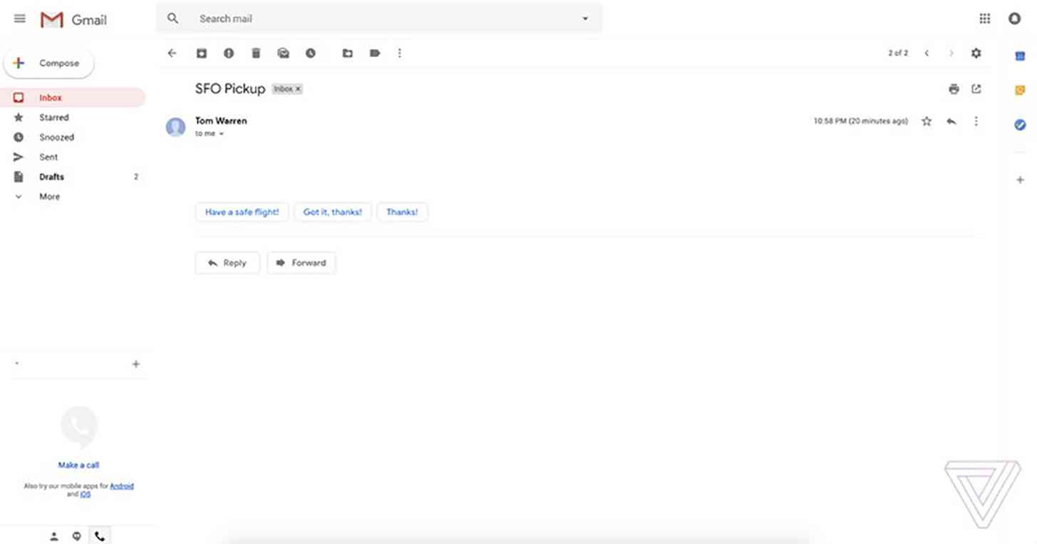
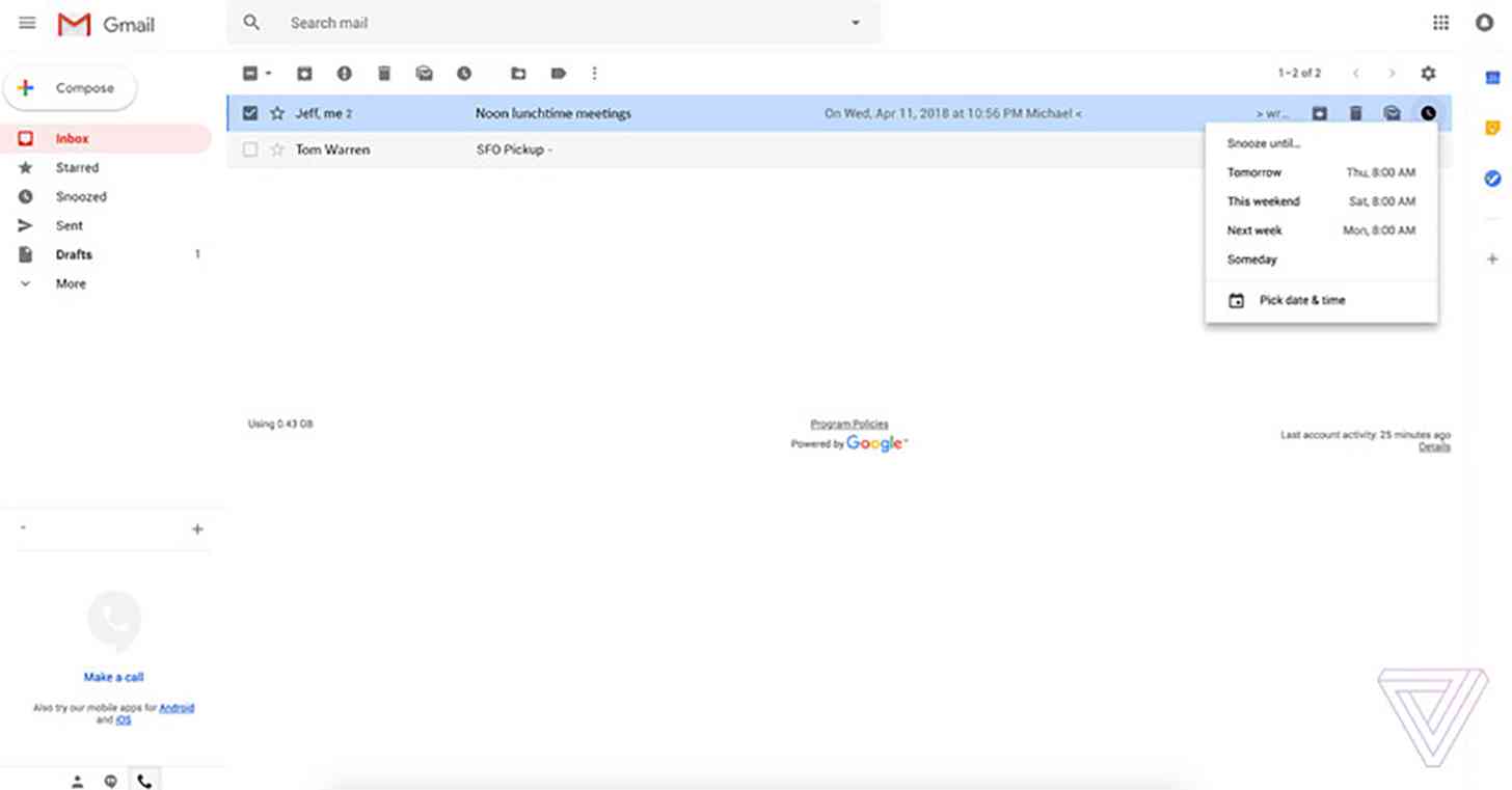
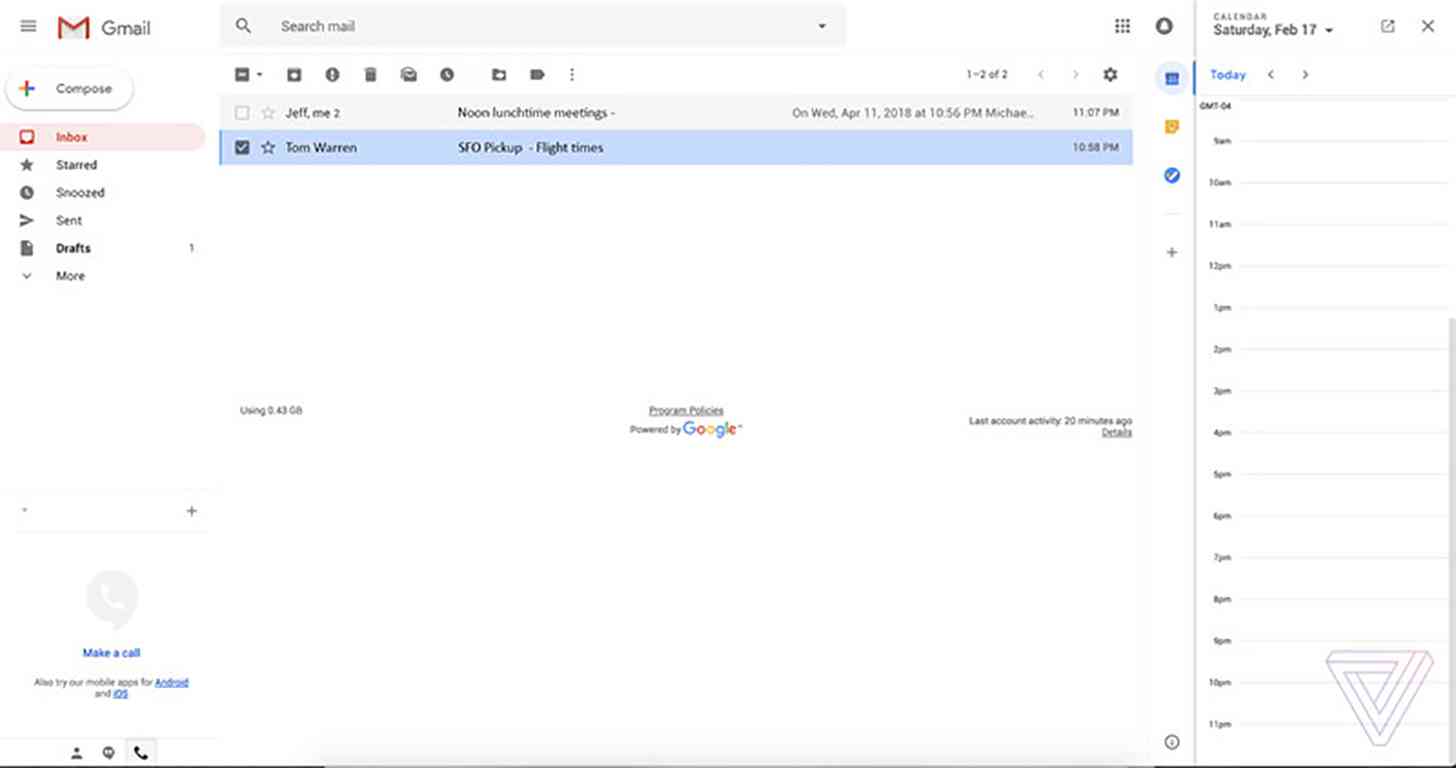
Google wasn't willing to spill any details of its new "fresh, clean look" for Gmail on the web earlier this week, but now the rumor mill has come through with some info.
Images that show the redesigned Gmail for the web have leaked out. Shared by The Verge, the images show a clean UI that borrows some of Android's Material Design but is definitely still recognizable as Gmail. We can also see some shortcuts on the right side of the screen for quick access to Google Calendar, Google Keep, and more.

Google is said to be prepping three new layouts for Gmail. The default view highlights attachments, the comfortable view doesn't highlight attachments, and the compact view will let you see more emails on your screen. The compact view is said to be most similar to Gmail's current look.

In addition to this new look, Gmail will gain new features, like the ability to snooze messages, Smart Reply, and offline support.
This looks like a nice update to Gmail for the web, bringing in a clean look that incorporates more modern design elements from Android while still keeping that web Gmail look that we've become accustomed to. The good news for folks that like the current Gmail look is that it sounds like you'll be able to closely replicate it with the compact view of this new design.
What do you think of this new-look Gmail?
