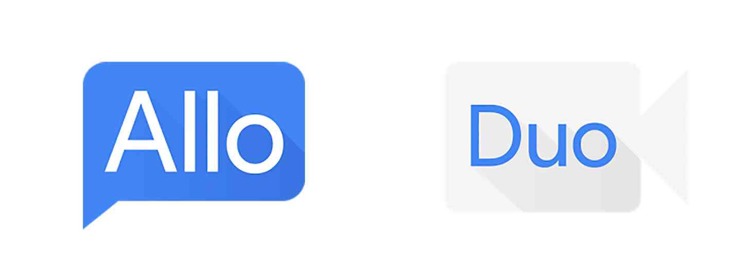
Back at I/O, Google introduced two new apps for communication: Allo for messaging and Duo for video calling. Those apps will officially launch to the public this summer, but before they do, they’ve undergone a bit of a change.
Google appears to have tweaked the app icons for both Allo and Duo. While they’ve got the same basic design — Allo is a speech bubble and Duo is a video camera — their colors have been changed. Allo’s icon was originally a red speech bubble with white text, but its Play Store page now shows a blue speech bubble with white text. Meanwhile, Duo was originally a blue video camera with white text, but it’s now a white camera with blue text.
Below is an image that shows what the icons looked like when they were first announced by Google.

The apps’ feature sets don’t appear to have changed. You can still use Smart Replies, Stickers, and Incognito Mode while messaging in Allo, while Duo still offers simple video calling with a Knock Knock feature that’ll let you see the person calling you before you answer.
These app icon changes aren’t huge, but hey, it’s still interesting to track the tweaks being made to two new Google apps ahead of their launch. The two apps are scheduled to hit both Android and iOS this summer, and when they are released, I’m sure that these app icons — or whatever the final ones that Google decides on — will appear on a lot of home screens as folks scurry to try out Google’s new apps.
Will you try Allo and Duo when they launch?