Smartwatches are a fairly popular accessory nowadays. There are plenty of top-notch options to choose from, from all different manufacturers and platforms. Just a few years ago, the market for smartwatches had much slimmer pickings. Yet, even among those slim pickings there was a clear winner.
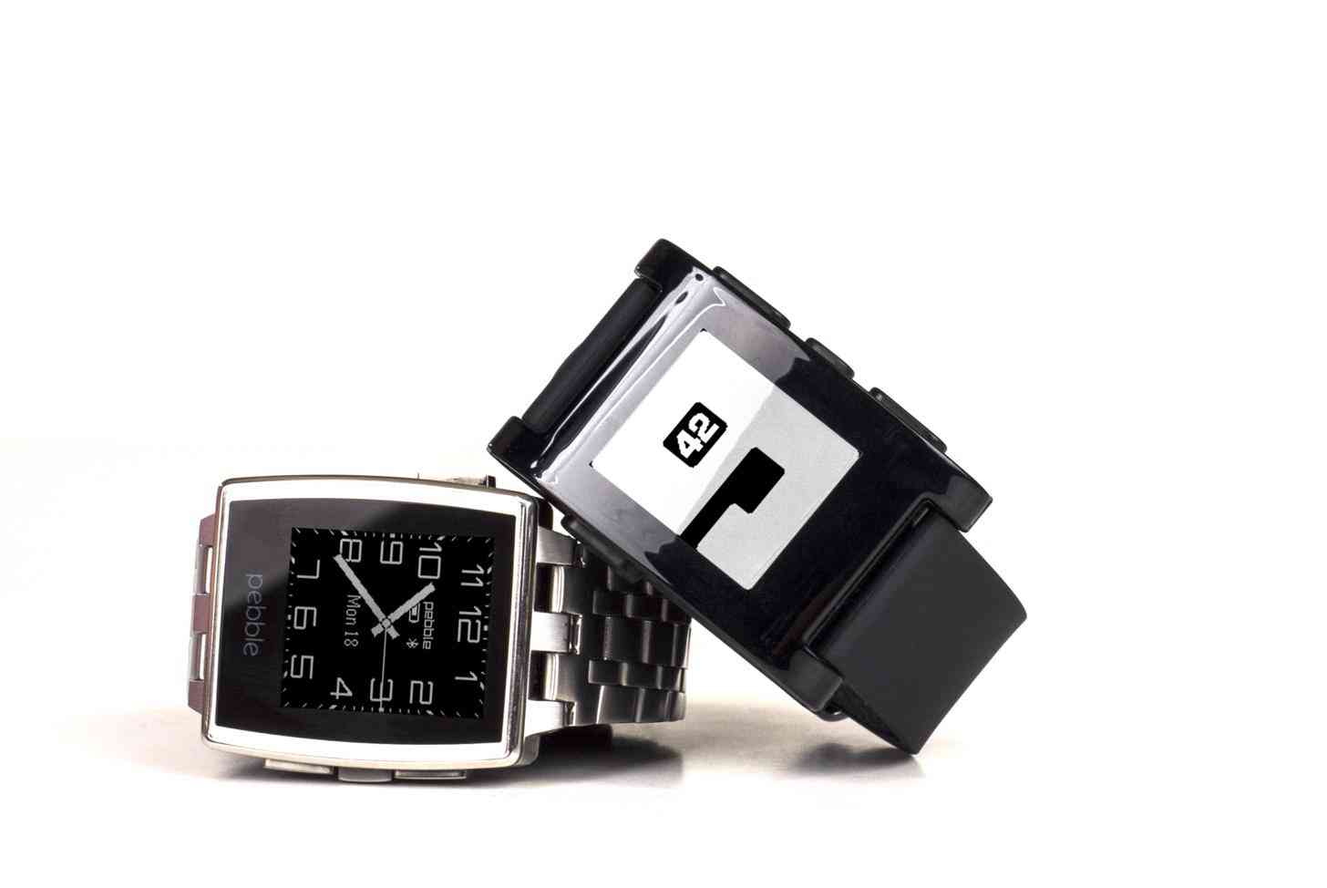
The Pebble smartwatch is the smartwatch that started it all. It wasn't the first smartwatch that had been attempted, but it was the first that managed to gain any real traction. While I'm not sure anybody would call it the most beautiful smartwatch on the market with its bulky plastic design and e-paper display, it was – and still is – one of the most efficient. Pebble tackled four key points to make their smartwatch a success: productivity, cross-platform compatibility, affordability, and good battery life. As far as smartwatches were concerned, Pebble hit the most important parts.
It's been a few years since the original Pebble, now known as the Pebble Classic, came out. We’ve seen many other smartwatches rise to recognition such as the Moto 360, LG Watch Urbane, ASUS Zenwatch, Samsung Gear, and Apple Watch, just to name a few. These smartwatches have focused on bringing more features to smartwatches such as sharper displays, broader app support, camera functionality, heart-rate monitors, and more.
But how has Pebble fared throughout all of this? For the most part, they've stuck with the same features since the beginning. With so many smartwatches pushing the limits of technology in such a tiny gadget, it might seem as if Pebble would be easily forgotten. In actuality, it's quite the opposite; Pebble continuously has a ton of support backing their products year after year.
Despite staying true to their original form, Pebble has done some growing up. They came out with the Pebble Steel, which features a more premium hardware design. There's also the Pebble Time, which features a color e-paper display. Just yesterday, Pebble announced the Pebble 2, Pebble Time 2, and the new Pebble Core accessory. They have already received 7 times the amount needed for their Kickstarter project ($1,000,000) in just one day’s time.
Aside from the new Pebble Core, most of the changes made to the two Pebbles are minimal. The Pebble 2 now includes a heart rate monitor and a slimmer design. The Pebble Time 2 also features a heart rate monitor and a larger, improved color display. Both products still get 7 and 10 day battery life, respectively, and are both still quite affordable at $99 for the Pebble 2, and $169 for the Pebble Time 2 (which are Early Bird prices; both prices will raise to $129 and $199 by launch, which is still competitively priced). The Pebble Core fits in perfectly with this line-up as a "modern iPod Shuffle" accessory.
While the changes may not be too major in comparison, I'm really glad that Pebble has kept things simple. Not every smartwatch needs to have all of the bells and whistles. Pebble keeps things simple and affordable, and I feel there is a very real need for both in this market. I'm not at all surprised that they consistently have successful Kickstarter campaigns.
I imagine it’s easy for any company to get swept away with the idea that adding more features will always be better in the end, but I think in this case Pebble has taken the best course, all things considered. I admire them for that.