I pretty much laid all of my thoughts about HTC’s recently unveiled HTC 10 out in an article I wrote yesterday. In short, the device is pretty much nails every issue that people had with the M9 without straying too far from its brand image. The design, features, and specs of the HTC 10 are all part of one beautiful package.
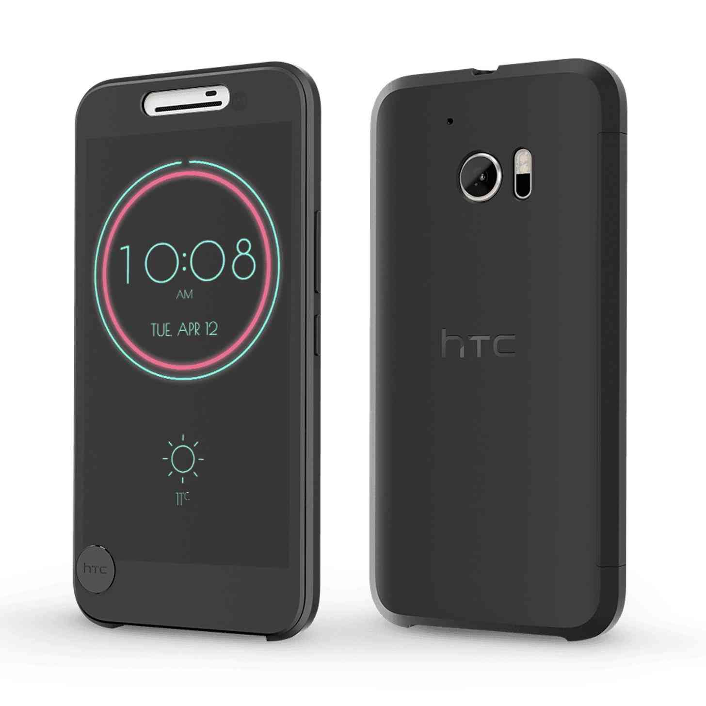
Quietly unveiled alongside the HTC 10 was the new Ice View case, which is an upgrade from the Dot View Case available for the HTC One M8 and M9. The Dot View case is one of the most unique cases I’ve ever seen for a smartphone. Period. Not only is the case, well, a case for protecting your expensive investment, but the Dot View Case also served two additional purposes: an automatic display toggle when the flip case is open or closed, and a fashionable low-power notification display that works together with the case’s retro dot-patterned design. The Dot View case is a stylish and functional way to protect your phone while still being able to view notifications.
With the HTC 10, its accompanying Ice View case stands to one-up its predecessor. Instead of dots, the Ice View case is designed with a frosted glass effect. Similar to the Dot View case, the Ice View case completely encases your phone in a folio style while still allowing you to view important notifications, answer calls, turn on the flashlight, view texts and social media posts, and as an added bonus you can even take pictures with the flap still closed if you’re in a pinch and need to take a photo now. This is, in my opinion, the coolest part of the case by far.
I was impressed by the Dot View case, but I wasn’t completely sold on its design. I found the fact that HTC allowed you to theme your Dot View with scenes and pictures charming and fun, but trying to read names with the fonts in dot form was a little difficult for me. The Ice View case provides more clarity, and without the dots it proves to be more functional.
I never purchased a Dot View of my own for the M8 when I used it, but I did test the case out on display at an AT&T store for a while. I eventually decided against it because, at the time, I absolutely hated folio cases. I felt that such a case design provided more hassle than worth, but over time I’ve changed my view on it. The last case I used on my iPhone 6 was a folio case that doubled as a wallet and as a stand. I still think it’s a hassle trying to flip it open sometimes, but it’s not as bad as I had originally made it out to be.
HTC managed to take a lot of the complication out of a “traditional” flip case (completely covering the screen without a way to view notifications) with the Dot View, and even more so with the Ice View designs. Coming in a close second would be Samsung’s S-View or LG’s QuickWindow cases, but I find myself partial to HTC’s design because it leaves no part of the screen vulnerable. While the Dot View was innovative and somewhat useful, the Ice View case is a definite improvement – which seems to be a theme with HTC's flagship this year.
Personally, I think I’ll always prefer a tempered glass screen protector and a case for the back of my phone only, but I can also see the draw for folio cases as well – especially now with the Ice View case and all of its added functionality.
Readers, what are your thoughts on the new Ice View case? Do you prefer the upgraded version of the Dot Case, or are you partial to the original?