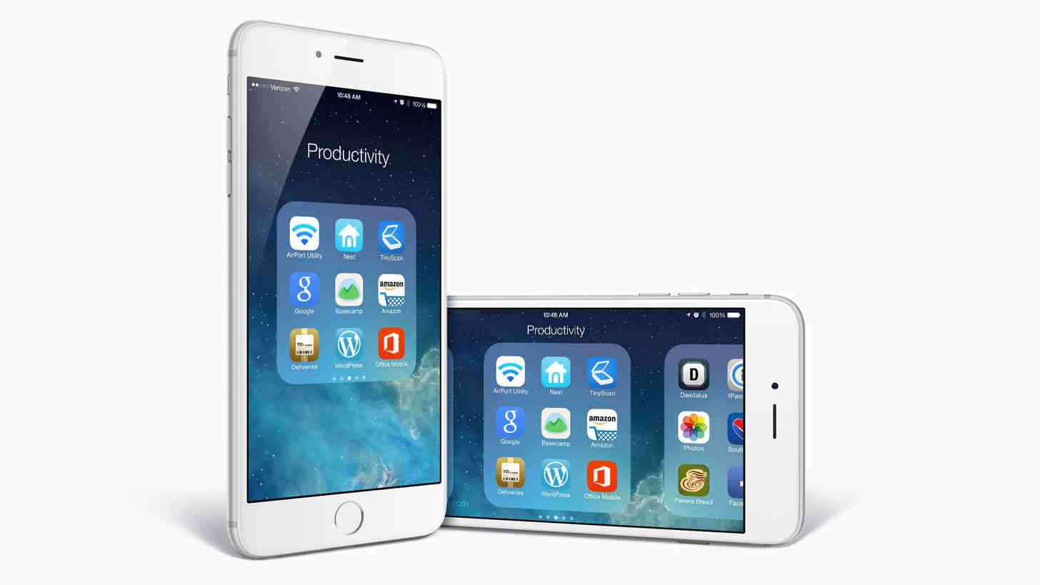
The iconic Apple iPhone has undergone some big changes (pun intended) within the past year, with the iPhone 6 and 6 Plus being the first two iPhones to drastically change its screen size (although the iPhone 5 was the first iPhone to increase screen size with a 4-inch display over the prior 3.5-inch display). However, the iPhone itself – aside from its size – has remained largely the same since its inception, reflected by both its hardware and software design.
I’ve mentioned that I’m rather happy with my iPhone 6, but during the holiday season I find that I’m usually tempted to spring for one of the many good deals that pop up for smartphones. This year is no different, and I have created a list of pros and cons for keeping the iPhone or switching back to Android. One of the seemingly lesser cons I had on my list was that the iPhone still has no app drawer, and that had me thinking about a couple of things (and brings me back to my original point).
As I mentioned, the iPhone hasn’t changed much software-wise over the years in terms of design. It has changed, but not by such a large margin that the software is unrecognizable. If you put a first generation iPhone next to an iPhone 6s, you’ll see a lot of similarities between the two, including the fact that for the past 8 years the iPhone has never had an app drawer.

The “app drawer”, or a place where you can hide away all of those applications that you don’t use regularly, was made popular by Android devices. Without realizing it, it was one of my favorite features of the platform. (You know the saying, you don’t know what you’ve got until it’s gone? That’s how I felt about the app drawer.) It wasn’t a deal-breaker, obviously, but it was something that I missed when I moved over the iPhone for the first time in 2011. I guess I figured that eventually it would make its way to the iPhone – at the very least as an option, right?
Apparently not.
The iPhone’s current set up has it so that all of your apps are accessible from your home screens, and are automatically placed in the order that you download them. You can move them around to an extent, or place them in folders if you want to group similar apps together. As of iOS 8, you can even move all of your applications to the second home screen if you just want to unlock your phone to an almost completely clean slate.
Previously I have thought that this method was fine. I particularly felt this way when I didn’t have very many apps on my phone. Lately, though, I’ve decided to make use of the fact that I have a smartphone with hundreds of thousands of apps on them and I’ve been on a “new app” kick lately. I no longer consider the iPhone’s only means of displaying apps convenient, now that I have about 3 pages’ worth of apps available if I don’t put them in folders.
And when I do put them in folders, I find that they’re rather unsightly and not well executed. Although folders are adequate for cleaning up pages’ worth of apps, it's a confined space where you can only see 9 apps at a time before you have to scroll to another page. It's consistent with how iOS works, but I now realize this is a huge waste of real estate. What’s the point of having a bigger iPhone if you’re not even going to use all of that space?
On most Androids I owned, everything would pretty much organize automatically with minimal effort. I do miss that sometimes on the iPhone, and I’m not sure why it hasn’t been implemented yet. There are jailbreak methods of getting an app drawer, or even just an extra 5th icon for you’re the dock row, which you could theoretically use to make a folder for all of those apps you don’t need on the regular. But I feel like it’s a feature that’s handy enough for Apple to consider implementing at some point; preferably some point soon.
Although I find that the iPhone works well for me in many ways, I no longer feel that the way apps are displayed is one of those ways. Just offering the option of using an app drawer would be a solid move. That way people who want the app drawer can use it, and people who don’t can keep the grid that they’ve always used.
Readers, what are your thoughts? Would the iPhone benefit from an app drawer, or would it be best just keep things the way they are? Let us know in the comments below!