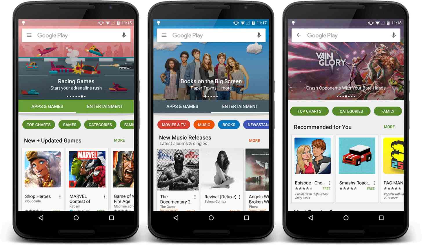
Well, that didn’t take long. Just one day after we got a look at a refreshed Google Pay app user interface, it looks like the new-look app is starting to roll out to users.
Some folks have received the updated Google Play app UI today, complete with a new splash screen and a new home page with two tabs: Apps & Games and Entertainment. Below those tabs are subcategories for each main category, like Top Charts and Games as well as Movies & TV and Music. There’s also a huge banner up top that Google can use to highlight whatever content it likes. You can see screenshots from the folks that’ve already gotten the update below.

In addition to these big UI changes, this update adds right-to-left (RTL) support for languages that are displayed that way.
So how can you get it? Unfortunately, it looks like you’ll just have to wait. While a new version of the Google Play app (5.10.29) began rolling out yesterday, updating to it doesn’t appear to enable the change. That means that this new UI is likely a server-side thing that Google is slowly rolling out. Until that happens, you’ll just have to settle for gawking at the images of the update that were released yesterday.
Once this new-look Google Play arrives on your device, be sure to let us know!