Google has steadily been updating its core Android apps with Material Design looks ahead of its Android L rollout, and tonight that push continued with the Play Store.
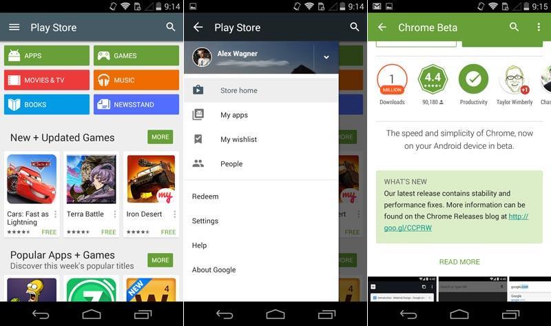
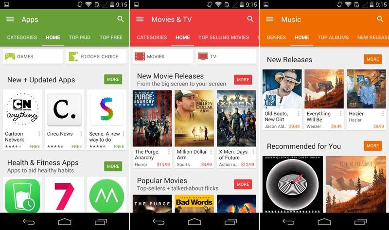
The Google Play Store app is now being updated to version 5.0.31, bringing with it a refreshed Material Design look and even an updated app icon. The app looks similar to the leak that we saw back in September, sporting a flatter look and a floating hamburger menu button.

Android Police notes that the “What’s New” section of apps have been moved closer to the top of an app page and that clicking the section simply expands it rather than pushing it down to the bottom of the listing. Additionally, the color of each store section is now used more in the main pages of the sections and the animations inside of the app are now smoother and more attractive.
This new version of the Google Play Store looks pretty nice, and it ought to fit in nicely with Android L once that update begins rolling out later this year. This updated Play Store app will likely roll out to users in phases, but if you don’t feel like waiting, the folks at Android Police have a .apk that you can sideload now.
Happy updating!
Via Android Police