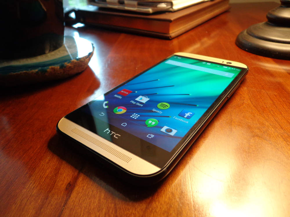
Moving right along with our 30-Day Challenge, today we’re going to talk about something that’s specific to HTC: Sense. Sense is the custom user interface that HTC places over Android, giving it an alternative look to a phone that uses what is considered “stock” Android - or Android as Google intended for it to look. Along with looking different, Sense also has various features that make it stand out from other Androids as well. With the HTC One (M8) comes the introduction of Sense 6, which is a slight upgrade from Sense 5 (and 5.5), which was introduced with the original HTC One.
One thing I will say about Sense is that I’ve always liked how it’s looked over the years. It especially drew me in when I first saw the HTC EVO 4G; that big sense clock was just too pretty to ignore. I still have a thing for the giant sense clock, even if there is little to no point in having it when the time is always conveniently located in the top right corner of the notification bar. Still, Sense (especially Sense 5 and up) has been able to give Android a steely, more professional look to it, which is a nice contrast to the bright and colorful TouchWiz.
The biggest difference I noticed with Sense 6 is that now you have on-screen controls rather than the two capacitive buttons on the bottom of the original One, which makes sense becase the M8 doesn’t have capacitive buttons. I also noticed that the buttons on the bottom of the home screen are no longer on a solid background, but instead are resting on a clear background. It makes sense given the new on-screen buttons - you wouldn’t want two rows’ worth of icons sitting on solid bars. That would look awful.
Something that was kept the same with Sense 6, however, was BlinkFeed. Initially, I was intrigued by the idea of BlinkFeed. However, once I actually used BlinkFeed, I found that I didn’t really like having certain bits of information spoonfed to me. I still needed to open the applications I was getting the feed from to get the whole story anyway, so I was glad when HTC finally introduced a way to turn BlinkFeed off. These options are still present in Sense 6, which is a good thing - whether you like BlinkFeed or not.
I was never a big fan of Sense’s app drawer, as I’d always preferred scrolling from side-to-side rather than vertically, but there have been a few changes in Sense 6’s app drawer that have made the experience a little better. When you open the app drawer in a phone running on Sense 5, there is a large sense clock with the weather on top of the app drawer. Now, I’m all for knowing what the time and weather is at all times, but I never felt that the app drawer was exactly an appropriate place to put something like that. In Sense 6, the big clock and weather has been removed, leaving more room for more apps to be seen from the get-go.
Sense 6 also introduced a number of gesture-based navigation options, which HTC calls “Motion Launch gestures”. Overall, I think it’s good that HTC is getting on the gesture-based navigation aspect of the industry because a lot of big brand manufacturers already have. Personally, I can never remember for the life of me what actions I set for what gesture (double tap, swipe left, swipe right, swipe up, up, down, down, left, right, left, right, b, a, start?) so for me the features aren’t exactly useful. Still, if you’re fortunate enough to have been gifted with a memory better than a goldfish then you’ll probably be pleased to know that HTC has included this as an option in Sense 6.
My favorite feature that’s been introduced is Extreme Battery Saving Mode, for people who think that regular power saving mode just isn’t extreme enough as it is. Basically, at 10% of battery life you can turn this mode on for 30 extra hours of standby battery time, and only using the parts of the phone you need when you need it. Something similar was introduced in the Galaxy S5, which I thought was really neat, so I’m happy that HTC included a similar feature in their phone as well.
My least favorite change is that it seems like with Sense 6 came an ungodly amount of stagnant icons in the notification bar. It takes up a lot of unnecessary space, in my opinion. It’s a small complaint, but a very noticeable one.
Overall, I’m still quite pleased with HTC’s Sense. It’s one of my favorite custom Android UIs to date, and it’s nice to have a bit of a polished and professional look to Android. Now if only there was a way to easily get rid of unnecessary bloatware...
Readers, what are your thoughts on HTC’s Sense these days? Do you like the direction that Sense is heading, or is it just not your cup of tea? Let us know your thoughts in the comments below!