The Internet is an interesting place. Depending on the day, or even the hour, you can probably find somewhere that boasts a lot of people complaining about something. The common thread between those places is the comment threads, and in those threads there's an effort to build noise. What would normally be quiet dissonance in select pockets of the world, there's now the ability to ban together and make as much noise as possible. This isn't always a bad thing, mind you, but when it comes to the mobile market, it tends to be more often than not.
I can't say for sure how many people out there really care about software updates, the ones that add a software version number to your device, change certain things and add other features, but if you were to gauge that interest based entirely on the Internet's comment threads, well, you'd be safe in an assumption that it's everyone. Everyone I know has a smartphone, but I'd wager that I know more folks who don't care about the software version or upcoming updates to their device. Most of you are probably the same way.
Don't get me wrong, I care, but I'm the odd duck. And I'm honestly trying to care less. (It's not working yet.)
Over the last few years, the back-and-forth about software upgrades hasn't died down by any means, but it hasn't been the only thing people want to talk/yell about. This particular hardware detail hasn't really caught on with a lot of manufacturers quite yet, but that's certainly not due to the lack of effort from folks pointing it out.
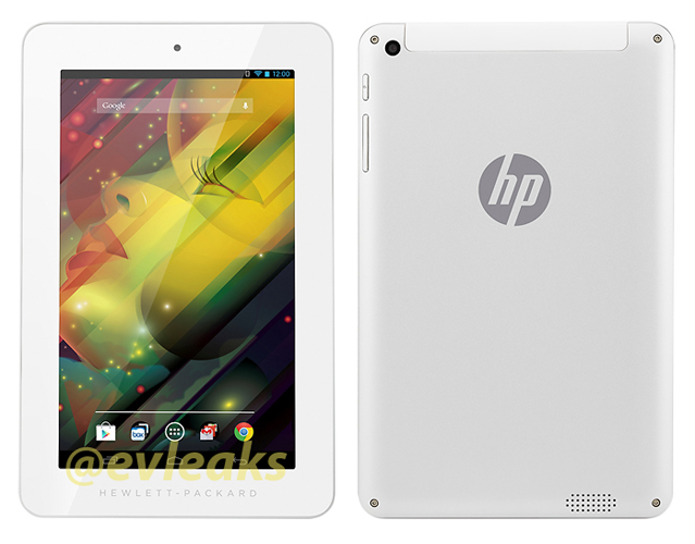
I'm talking about bezels. As you can see from the image above, which is said to forecast HP's design language for upcoming tablets, there are some bezels there. And, if I'm being perfectly honest with you, the bezels were the first thing I saw. I even said, "Whoa, bezels," out loud. Obviously it isn't HP that's alone in this design language, as we've seen plenty of companies out there whittle down the bezel in hopes of making sure the Internet doesn't yell at them anymore.
The iPad's bezel has drastically been reduced over the years, for instance. And just look at LG's upcoming Isai FL, which is said to be the design language behind the upcoming G3. Some manufacturers are willing to offer devices with a ridiculously small amount of bezel, except for certain areas on the device. And, as you can imagine, those areas are where they're promoting their brand or company name (just like with the Isai FL).
There are some devices out there that I just don't like the look of. As I'm sure you can relate, some devices just don't work for my personal tastes, but I'm not necessarily sure that I've ever been one to blame, specifically, the bezels. At least not out loud, or in my conscious mind. Maybe my subconscious is angry at all the bezels, and it's just leaking through.
I do know that I don't like the bezel on the bottom of the new HTC One M8. However, I'll tell you right now that it didn't bother me so much on the original One M7, so I don't think it's the bezel itself, but more in the way they implemented it on the new device. It just looks weird. The "stacked" design of the bezel, the logo, and the software buttons above that and the BoomSound speakers below it just looks off. To me -- you may love it, and that's fine.
In the smartphone industry these days, we have a lot of different areas to put under the magnifying glass and tear apart in our search for the perfect device. The materials, the display technology/pixels, battery life, processor, and whatever else. There's a lot there, and it looks like the bezels of our smartphones and tablets are definitely getting more and more time in the limelight.
So, I wanted to ask: how do you feel about bezels? Are you in the camp that wants manufacturers to trim them down as much as possible, even at the cost of a structurally sound handset/device? Or are you someone who doesn't mind a little bezel here and there, as long as the rest of the design supports it? Let me know!
image via @evleaks