Yesterday, Samsung unveiled their newest flagship device. It's another member of the Galaxy S lineup, and there are a lot of people on the Internet calling it the Galaxy S4S. The real name of the handset is the Galaxy S5, but you get the point of the nickname, don't you? A lot of people think Samsung's iterative updates to their flagship family of devices is getting old, and many of them seemed to be disappointed in the new device.
I wasn't all that disappointed in the handset specifically, but I would have liked to have seen some real changes taken by Samsung. Some real "out of the box" thinking, especially in the design language for their new smartphone. Or with TouchWiz. But hey, at least we've got some new menu icons, right? Right.
Samsung wasn't the only manufacturer to unveil a new product yesterday, though. They got the majority of the press coverage, sure, but it's Samsung so that should have been expected. Sony, Nokia, HTC, and even ZTE all had something to talk about yesterday, the official start of Mobile World Congress in Barcelona.
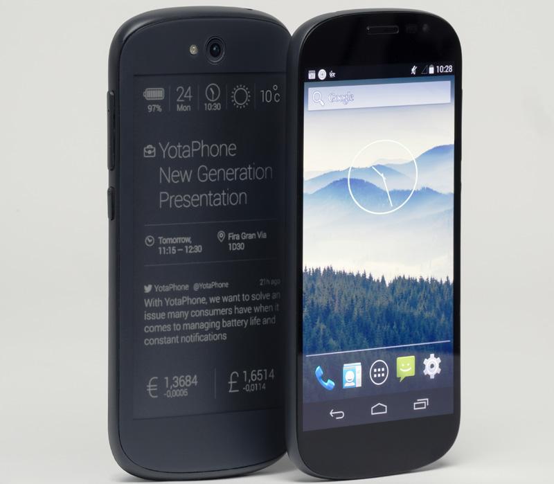
And yet, it's the next generation YotaPhone that's currently getting all of my attention.
In case you missed it, here's Alex's write-up on the new device. Go check it out, then come back. Good? Pretty cool, right? It's definitely not a slouch in the specifications department, even if it may not stand out in the physical design department. Not at face value, anyway. Turn the device around, though, and we start to have a very different conversation.
The original YotaPhone was a cool idea in concept, back when it was unveiled at the end of 2012. It took a year before the handset made it to market, and the final result was a great first attempt, but it wasn't all that enticing for most consumers. I could see that changing with the next generation YotaPhone, seeing as it has plenty of features that many people seem to want, like a big 1080p HD display, a quad-core processor, plenty of onboard storage and even 2GB of RAM.
It's the bigger eInk display that has me really excited to get my hands on this handset. At 4.7-inches, it's actually worth looking at now. But, more than that, Yota Devices has actually made it back-lit this time around, as well as making it a touchscreen. You can actually interact with the information it's showing you now, and that's a big step in the right direction.
Honestly, I don't turn my phone over on its face because it wouldn't make any sense, seeing as the back of my phone --all of my phones-- just doesn't do anything, except usually show me a lot of logos and camera sensors. The next generation YotaPhone wants to give me a whole new area of real estate on my phone, and at the same time make it actually functional. I think this is pretty great, and a nice way to change things up in our industry.
It's different, and that counts for quite a bit in my eyes. Even if the front of the handset looks similar to plenty of other phones out there, the real star of the show is the back, and that's where the real magic is. I want to be able to use the device and see how well it functions, but right now, just thinking about the possibilities has me plenty excited for the next generation YotaPhone.
What do you think of the device? Is the larger, touch-enabled eInk display something you'd like to use? Or is it a gimmick that you believe won't ever catch on? Let me know.