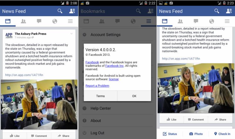
We've seen quite a few applications and platforms make the shift to a flat design lately in mobile, and according to some newly-leaked screenshots, another major app will soon be adopting a flattened look.
The folks over at Android Police have shared some images of an upcoming version of the Facebook for Android app that show a design that's much flatter than the app's current look. The buttons have also been moved around quite a bit, with the buttons for Status, Photo and Check In now at the bottom of the screen and a set of News Feed, friend requests, status updates, notifications, and the menu above the user's feed. Finally, the top of the screen features a page title and search key.
As I mentioned before, flat design seems to be all the rage in the mobile world lately, with Twitter, iOS, Windows Phone and many more apps and platforms utilizing flattened looks. It's kind of a surprise that it's taken Facebook this long to make the switch, and it's worth noting that since this all comes from a test build of the Facebook for Android app, so it's possible that the flattened Facebook won't ever even make it out to the public.
So how can you try out this new-look Facebook for yourself? Unfortunately, it sounds like Facebook controls access to the new UI, so it's not something that you can just flip a switch and gain access to. If you'd like to give it a shot, though, you can find the version 4.0 APK of the Facebook for Android app at the link below.
What do you think of the recent flat design trend? Do you think it looks good or are you getting a little tired of it at this point?
Via Android Police