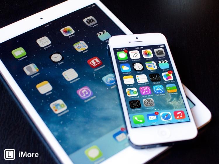
Design is important in a phone, both inside and out. While the outside design, meaning the hardware, is mostly important in terms of how it feels in the hand, it doesn't hurt for the device to look a little snazzy to. After all, if we're going to be holding this device out in public as often as we do it might as well be pleasing to the eye, right? But just as we would like for the outside to look good, what we ourselves will be looking at wouldn't be so bad if it had a nice design as well. Again, if we're going to be looking at something all day every day, why shouldn't it look good?
I would say that functionality is more important than design, first of all, and I think that for the most part it is true. But then I think back and I realize that a significant reason that I decided to switch from iOS back to Android was that I thought the new design of iOS 7 was rather unflattering compared to what iOS used to be. It's a matter of opinion what I actually think of the design itself, but it's fact that what Apple was aiming for with the drastic redesign of iOS 7 was flat, stark and simplistic - something that another mobile platform has already been well-known for.
Windows Phone, whether Windows Phone 8 or Windows Phone 7, has always had a minimalistic tile-like design that was never very flashy. To me, the design of Windows Phone has always been rather appealing, and if nothing else at least modest. Smartphones are becoming increasingly complicated and, dare I say it, cluttered with features on the occasion. Windows Phone is a nice alternative for those that want to get away from the hustle and bustle of busy smartphone designs, or just for somebody who wants to keep it simple. I've always associated "flat and minimal" with Windows Phone over any other mobile platform. That's just the way it was before iOS made the switch to the design. And yes, while the designs are still vastly different, the same concept was applied - less depth, less detail, more simplicity.
So now we have two platforms that are trying to do the whole simplicity thing, but it doesn't stop there. Even Android is trying to get in on the flattening action with their latest software update, KitKat. Although I will say that Android has been more subtle about their change of design, it's still clear that from the beginning of Android to now that Google has leaned towards a more minimal skinning of their platform - at least when it comes to stock Android, that is. I will also say that I think that a more gradual progression was the way to handle it, because I am starting to wonder if such a drastic change from what iOS used to be just a few months ago to what it is now is what led so much backlash to the design.
Now we have three out of four platforms that are considered to have "minimalistic" designs, and I have to wonder... why? Is it really that much more pleasing to the eye? I can admit that in the case of Android, the platform was in desperate need of a makeover from the get-go, mostly because it used to be really, really ugly. And perhaps iOS needed a makeover because many people agree that while it might not be ugly per se, it did get boring after reusing practically the same design for 6 major updates. But in both situations, why did the two who didn't start out flat or minimal opt for flattened designs? Personally, I thought that iOS 6 looked pretty good. It could have used a good polishing and a refresher, but I'm not sure if flattened (or the use of so many gradients) was exactly what I would have had as my first pick for a new design. Android does admittedly look better now than it ever has before, but I still wonder what the platform would have looked like if it had evolved with a design that had more depth.
It's not just platforms anymore, either. Facebook for Android is also rumored to be coming out with a new, flatter UI. I get that it's simple, and probably even "safe" to go with such a design, but I do miss having a little bit of depth in the mix. Now we just have "flat", "super flat" and "ugly flat". So much minimalism!
Readers, what are your thoughts on the new push for minimalism? Is this the kind of design smartphones need, or do you miss seeing some depth? Let us know your thoughts in the comments below!
Image via iMore