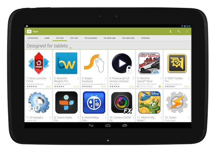
Google announced last month that it'd be making some changes to the Play Store and how it displays tablet-optimized apps on Nov. 21, and now that that date has rolled around, the company has issued another announcement to make sure developers know what's up. Any users browsing the Play Store on a tablet will now be directed to a "Designed for tablets" section when they navigate to the top lists. The move is part of an effort by Google to highlight apps that've been made to look great on tablet hardware.
So what about apps that don't meet Google's "Designed for tablets" criteria? Tablet users will still be able to see them, but the apps will be designated as being "Designed for phones." That's obviously not quite as attractive to tablet users as the "Designed for tablets" tag. The good news is that Google has several resources to help developers make their apps tablet-ready, including design tips, examples of what tablet-optimized apps look like and stories from other developers that describe how optimizing their apps for tablet use helped to grow installs and user engagement.
As tablet adoption among consumers continues to grow, it's increasingly important for mobile platforms to have tablets that look good on larger displays and take advantage of the added screen real estate that comes with them. A lack of tablet-optimized apps could leave a bad impression of the platform as a whole on some consumers, which is why Google is making a push to highlight quality tablet apps that already exist and encouraging other developers to make their apps more tablet-friendly. Making a "Designed for tablets" view the first thing that a user sees on the Play Store's top charts ought to help ensure that Android tablet users are able to quickly and easily find apps that'll work well with their big-screen hardware.
Do you own a tablet? If so, what are some of your favorite tablet-optimized apps?