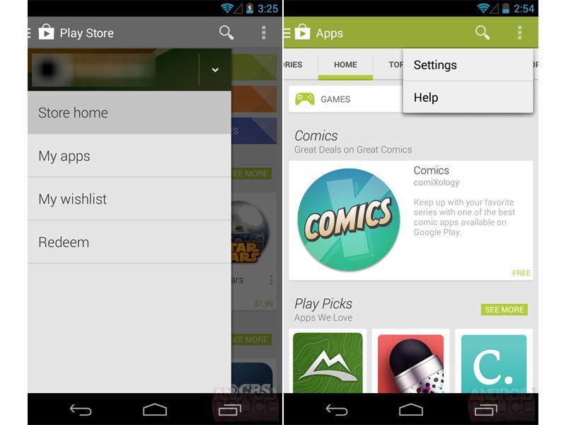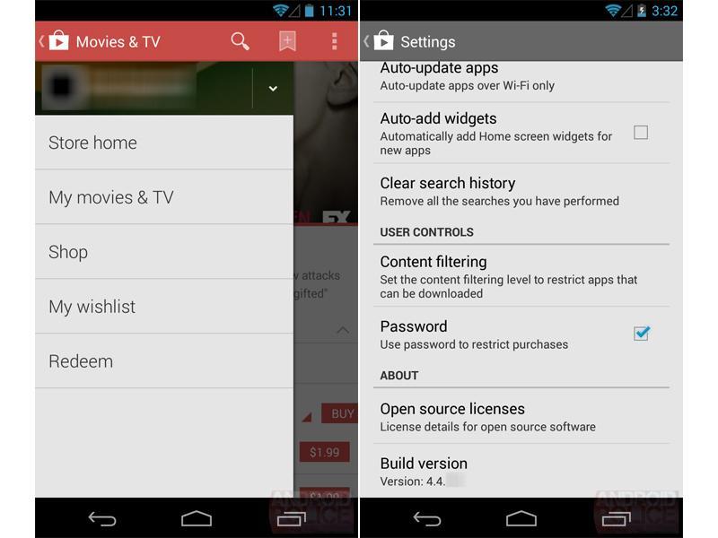
Google made some pretty big changes to its Play Store for Android earlier this year, introducing a redesign that brought with it larger images and Google Now-style cards. Now it looks like El Goog has gotten the itch to tweak its mobile marketplace once again, as some screenshots posted by Android Police claim to show a new version of the Play Store with a fresh layout.
This new Play Store app is said to be version 4.4, up from the version 4.3.11 software that's currently available to Android users. The biggest change in this updated storefront is the presence of a "hamburger"-style slide-out navigation drawer that houses links to the Play Store's home, a user's existing content and wishlist as well as the redeem button. Those options are currently placed in an overflow menu in the upper-right corner, but in version 4.4 that menu only plays host to the Settings and Help buttons. Version 4.4 of the Play Store is said to be compatible with devices running Android 2.2 Froyo and higher.
In addition to this new slide-out drawer, it's said that Google is planning to make even more tweaks to the Play Store UI, giving the entire app a more card-based design. There aren't any screenshots that show off this look, but it's described as being similar to the recently-updated Gmail for Android app.
So when can you begin browsing the virtual shelves of this new Google Play Store? That much is a mystery for now, but it's said that the app is currently being tested on devices running Android 4.4, so it's likely that the latest that it'll debut is with KitKat. It's also worth noting that the app is still a work-in-progress, so it could undergo even more changes before it's finally pushed out to users.
While still a rumor for now, we've seen Google add "hamburger"-style navigation to several of its other apps, and so it wouldn't be a surprise if the company added a similar slide-out drawer to the Play Store. Overall this updated Play Store seems pretty nice, and I'm looking forward to seeing how Google ends up card-ifying its storefront even further. What do you think of these changes? Are you a fan of the slide-out navigation drawer?

Via Android Police