So, iOS 7. Is it the next best thing since sliced bread? Is it even the "next big thing?" Does it even matter? Did Apple achieve what they were "supposed" to achieve? Is iOS 7 the change that the company needed to freshen its presence in the mobile market, and maybe even gain additional users? Or, on the other hand, is iOS 7 an inexorable train wreck just waiting to happen later this year?
Well, it's anyone's guess at this point. As it stands, we've only been dealt two betas after the initial launch of the new software, so it really is still up in the air. Anything we're talking about here, or anywhere else, that has to deal with iOS 7 in its current state is directly related to unfinished software. Indeed, the rumors and speculation still swirling around Apple's newest mobile operating system suggest that the Cupertino-based company could still change quite a bit by the time it officially launches for everyone later this year.
So, now that we have it out of the way that we understand this is beta software, and that nothing here is final, we can talk about what we're all here to discuss: what absolutely has to change. Because, while we know that a lot of the things could be changed, we should also know that Apple's designers and developers probably have a few things set in iOS 7 that aren't going to be changed in the final version. Why? Who knows. They could just like it. Whatever the case, not everything is going to change, and that's what we're going to touch on this time around.
Just under two weeks ago, I wrote about what I hope makes it to the final version. I pointed out that I think some of those things will probably be considered bugs, like the music player's lock screen controls not disappearing after the screen goes dark, and get the axe by the time the final version launches. I also said that I wanted that particular "bug" or feature to stick around.
This morning's article is about the other side of the spectrum. I want to, today, talk about the things that I think Apple is planning to keep, but that should probably see some major changes by the time the final version of the software lands on user's devices.
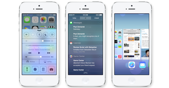
I'm going to just say it now, to get it out of the way: I'm a fan of the "frosted glass" approach to overlapping shades that Apple has implemented. I like the way that it blurs the images and colors behind it. It's a simple touch, but one that I think is pretty neat. With that being said, the Notification Center runs into a problem when you have a dark background behind it.
As you can see from the image above, there is an 'X' right there at the end of a notification title, which gives you the ability to discard that notification when you see fit. In the image above, though, there's a relatively light image behind the Notification Center shade, which means the 'X' is easy to see. Relatively easy, anyway. Just imagine that with a dark image behind it, and you can see where I'm going with this.
In the current version of iOS, the Notification Center 'X' marks are pretty small, but they're at least easy to see, thanks to the slate grey "threaded" background. In iOS 7 the 'X' marks are small and they're able to just "disappear" into the background thanks to the fact that the background shares the same ability. I can't tell you how many times I've missed dismissing a notification because I can't make out the 'X' all that well, just by glancing. I shouldn't have to stare down my screen, depending on the background I have, just to dismiss a notification.
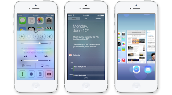
The new Notification Center can be segregated into three separate categories: Today, All and Missed. As you can imagine, pertinent notifications fall into these areas. All of them have been working well enough in the betas, but one thing I really wish I could do? Swipe between panels. Having to reach up just to tap the title is slightly annoying. I think Apple is going to keep this tap-happy experience in the final version, but I hope they drop it in favor of swipe-able panels, from one section to another. It would make navigation nice and fluid.

This one is pretty easy, and you can probably guess it just by looking at the image of Control Center up top. The four options on the bottom. Camera, calculator, something that looks like it could be a clock or a timer (it leads into the Clock App), and finally a flashlight. I like Control Center. No, actually, I'm a huge fan of it, however these four bottom options are frustrating. Not because I never need an alarm, or because I never want to activate my camera, but simply because I can't change their options. This is one thing that I'm on the fence as to whether or not Apple will keep in the final version, but I'm really hoping they aren't planning on making it only these options in the final version.
Let us choose what to have in our bottom row of Control Center, Apple.
There is a lot that I could cover in an article like this, but I have only so much room. The truth is, I'm going back-and-forth with iOS 7. However, unlike our own Anna Scantlin, I haven't quite given up on it. The more I use the beta for iOS 7, though, the more I find myself wishing I had a white iPhone 5. But hey, here's to hoping that Apple includes colored themes in the final version of iOS 7, too.
Based on what you've seen in iOS 7, what do you think absolutely needs to be changed by the time the final version gets released? Do you think Apple's using the frosted glass element too much? Would you like to see a few more options included in Control Center (if they could figure out a way not to make it even more cramped)? Or do you think Apple should just go back to the drawing board altogether? Let me know!