In my article yesterday I talked about my first 24-hour experience of using iOS 7’s beta software on my iPhone 4S. I mainly focused on the positives of the device and purposely left out key opinions on how I felt about the overall design of the device. While I can honestly say I’m happy with the new features that Apple wants to bring to iOS, I feel like the design (and even a few “missing features”) could give the new iOS 7 a better look and feel.
Here are some of the things that I would personally change about iOS 7, if given the chance:
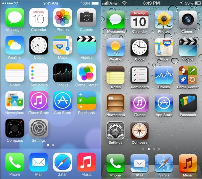
The minimalistic style change of the traditional iOS icons certainly do a good job of portraying the vision that Jonathan Ive seemed to envision: flat and simple. However, many of the revamped icon designs from iOS 7 baffle me and, quite frankly, make no sense in some cases. Here a few key cases:
The icon for the stock Photos app in iOS 6 was already irrelevant enough as it was, what with being a colorful render of a sunflower and all. The new change in iOS 7 depicts the Photos icon as a color palette, which I feel could have been changed to something more relevant. Perhaps an icon of some photos or depicting an album of some sort?
The previous icon for game center depicts a four-square image of a chess piece, a baseball bat, a rocket ship, and a dart board (archery target?). This makes sense as these could be seen as… well, games. The current image of Game Center in iOS 7 is four bubbles. The icon makes more sense once you open the app and the different menu options are presented to you in the form of bubbles, but all in all you’re left hanging kinda thinkin’… whaaaaaaat? I think a simplified version of the original icon could have been done.
The Camera icon is kind of being nit-picky on my part. It gets the right message across for most, but nonetheless I feel like changing from the iOS 6 icon (lens that resembles the actual rear-facing camera on the back of the iPhone) vs. the 80’s-style disposable camera is dating it a little bit. But as I said, that’s pretty much just me being nit-picky.
Thanks for replacing that useless wooden shelf with a bunch of reading material that magically stands by themselves! I’m not sure if the Newsstand app could ever look great, but I prefer the wooden rack to the posse of literature. I am glad that they allowed the application to be placed inside of a folder, though.
I know that iOS isn’t exactly the forefront of customization, but on the other hand… it really couldn’t hurt to give users some sort of freedom on the way their phone looks, right?
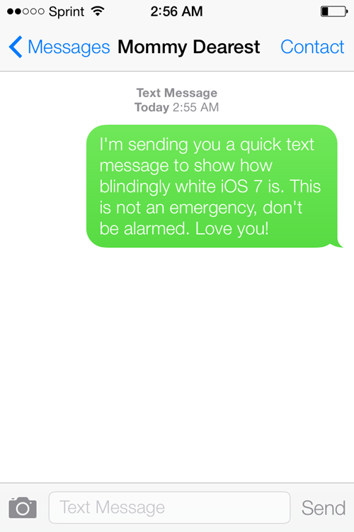
The Messages application was the first one that stood out to me. I like green bubbles as much as the next person, but I was hoping that this version of iOS would allow for us to customize the colors of our chat bubbles. I feel like it’s a simple enough request, but I could be wrong.

Almost every application background in this phone is set to white with no way to turn it to black without going into Settings > General > Accessibility and inverting the colors. As much as I love the inverted color scheme (who says brown-orange and purple can’t go together? Halloween begs to differ!) I can’t bring myself to want to use it on a daily basis. I think Apple could have done itself a favor by introducing a second, darker option for those who may not necessarily want the bright white elements across the entire platform.

While Control Center is nice, the OCD in me comes out in the fact that the drawer never touches the top of the screen. It stops midway between the top row of applications, which gives it too much room to justify it leaving enough room to show the status bar, and too little room to justify it giving you much access to whatever screen you happen to be on. There’s no purpose! Just let it reach the top of the screen! Please!
I’m getting used to the overall design of iOS 7 – minimalism was key, and minimalism was reached. Don't get me wrong, I'm loving the features that have been introduced in this iOS version. The main issue I’m having is that we went from the icons in previous iOS versions, which looked like we were actually advancing in graphic design, and took a step back and oversimplified it… and maybe used too many gradients. Maybe.
However, we do have to consider that this is still the first beta phase in this new version of iOS that isn’t due to officially release for months. I won’t lose hope that these things won’t be addressed or changed in the future – previous iOS versions have seen alterations before their final release as well. iOS 7 looks to be starting off on a good foot, but could definitely use some of these minor improvements in my opinion.
What do you think readers? Is there anything you would like to see changed in iOS 7? Tell me what you think in the comments below!