 With Monday having been and gone and the new knowledge we have of what iOS 7 officially looks like, it’s time for me to discuss my first impressions of the new version of iOS now that I’ve had about 24 hours to play with the new beta software. iOS 7 went through a rather extensive overhaul of its design to make it look more simplistic, but even becoming simplistic can be a complicated thing.
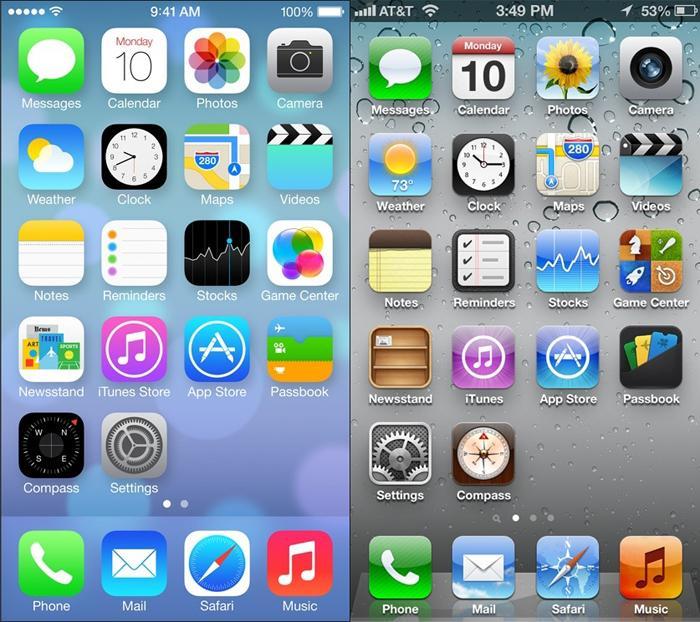
The first and most obvious change you’ll notice is the overall design. I’m sure most of you have already seen the redesign at this point, but for reference here’s a picture of the differences between iOS 7 and iOS 6’s home screens:

My first impressions of iOS 7 are going to try and focus as much on the new features and redesign as possible. I’m trying to keep most of the negative experiences I’ve had so far to a minimal because as many of you know, I’m working with A.) beta software and more importantly B.) outdated hardware (the iPhone 4S) – I was prepared for bugs and hiccups galore. Nonetheless, my new experience with iOS 7 has been mostly pleasurable so far. Let’s dive into the details so you can get a better understanding of what I mean.
The visual changes that Apple has introduced with iOS 7 is vastly different than what we’ve seen in the previous versions of iOS – no surprises to be had, the design really can be described as flat and stark. However, I am pleased to say that despite being flat and stark Apple has provided other changes to make the device still seem multi-dimensional, and it all has to do with the wallpapers.
I’ve described how much I enjoy personalizing my devices in the past, so it probably comes as no surprise that one of the first things I did once my iPhone updated to iOS 7 was to check out the new wallpapers. I was surprised to see that there are now two categories for wallpapers: dynamic and stills. Well, someone slap me sideways and call me Suzie; welcome to the 21st century, iOS users! We now have animated wallpapers. But you know what they say, better late than never. I like the dynamic wallpapers because the animations are subtle, but noticeable. You can set the dynamic wallpapers as your home screen or lock screen backgrounds.
However, as many of us know from experience, generally by choosing to use extra animations on your phone you’re sacrificing precious battery life. Although I enjoyed the preview of the dynamic wallpapers, I think I enjoyed the next Easter egg even more.
I opted to go for the still wallpaper in order to save battery. With most beta software you’re likely to experience poor battery life (which I have, but my 4S had been experiencing battery issues in iOS 6 as well) so opting for still wallpapers was the smartest option. However, as ‘still’ as they may be you might be as pleased as I was to find out that Apple employed the use of what is called a “parallax effect” on the phone, which moves the background as you move the phone to give it a “3D” effect. I thought this was pretty cool and I enjoy this feature immensely. You can kind of see what I’m talking about in our ‘First Look’ video of iOS 7 by our Editor-in-Chief, Aaron Baker. Now instead of looking like a moron holding your phone in the air to get reception, you can look like a moron tilting your phone from side to side watching the background move! Sweet!
Although the parallax effect on the home screen certainly adds some dimension to the home screens of the device, the rest of the device really is mostly minimalistic design. Messaging, Calendar, Clocks, and every other stock app all became minimalistic in design with hardly any depth at all to them. It is very stark compared to what we have grown accustomed to in iOS. It definitely takes some getting used to, but I think I’m beginning to somewhat enjoy it. There are certain design aesthetics that I don’t agree with, but I plan to cover those in a more extensive way in the future. Overall, I feel that the simple changes made have actually made a huge difference in iOS – whether you will see it as a good change or a bad change, the changes are definitely there.
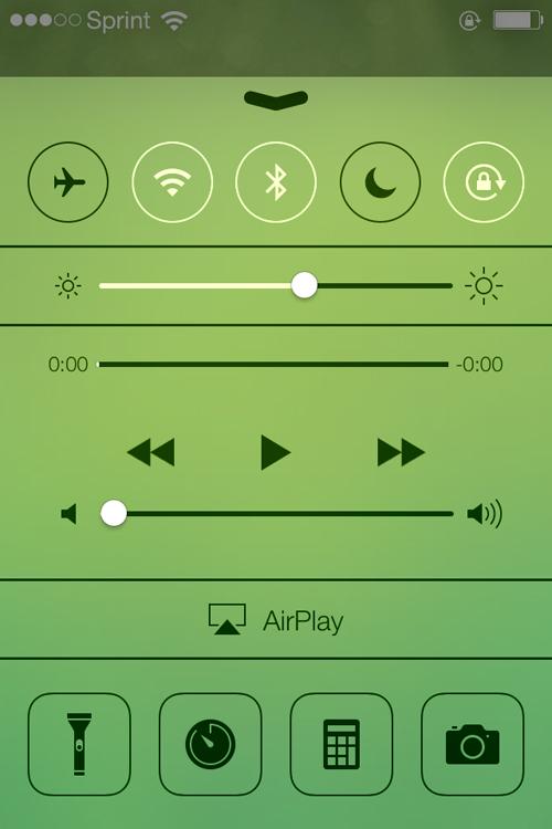
One of the things I have been enjoying about iOS 7 is the gesture-based functionality. I initially thought it would take a lot of getting used to for such a feature, but once I figured out what swipe does what it’s incredibly easy to incorporate into web-page browsing and the Mail app, making a lot of things more convenient to navigate. One of the new gesture-based options includes a set of toggles when you swipe from the bottom of the screen upwards – something that has already been introduced in other smartphone platforms, but is nonetheless a welcome change in my opinion. You can toggle your basics like Airplane Mode, Wi-Fi, Bluetooth, Do Not Disturb, Brightness, Volume, and Portrait Orientation; you can also toggle other useful features like Flashlight, Clocks, Calculator, Camera, and Music.

Along with gesture-based navigation you also have the introduction of a “card-based” multitasking feature when you double tap the home button. Now, I’m not here to point figures or anything, so all I’m going to say about it is that I enjoyed this feature in iOS 7 almost as much as I did when I had webOS.
A couple of extra tidbits that I’m also enjoying is a new ‘Blocking’ feature that allows you to block certain people from calling you (which I previously had to use a jailbreak app for in the past) and the ability to place what I considered the most useless space-waster on my phone, Newsstand, into a folder.
Thus far I’m enjoying the changes more than I thought I would, but there are definitely things that I would like to see changed before its official debut in the fall this year. Many people have asked me if I think that the changes in iOS 7 would make me stick with the iPhone for my next device. I think if enough improvements from the beta are made and the next iPhone is drool-worthy enough, it may be high time that I begin carrying two devices with me (I’ve still got my eye on the Nokia Lumia 925). I think that the changes in iOS 7 can be placed in the “better” category, which is good considering I thought the changes would be for the worst upon hearing the terms “flat” and “simple” used to describe such changes.
Readers, what are your first impressions of iOS 7? Have you had a chance to experience the beta for yourself? If not, are you interested? Tell me about your first impressions below!