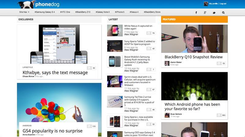
Welcome to PhoneDog v4.0! What you see is the result of months and months (and months!) of hard work, but now that the new design is live, it's clear that all of that work was worth it. On the main page you'll find three different columns with Exclusive content, News articles and Featured posts. The Exclusive and Featured columns are sporting bigger images to give you a better preview of the content within the posts, and all of the images of inside the posts themselves have gotten larger as well. Our mobile site has also gotten a makeover, complete with the same three tabs to make it easy for you to jump to exactly the content that you're looking for.
Of course, just because the new design is finally live, that doesn't mean that our work with it is done. We'll be constantly tweaking the site going forward, and we'd like your feedback to help us do that. Go ahead and start clicking around, and then hit us up in the comments below or on Twitter, Facebook and Google+ and give us your thoughts on the new look and how you think that we can make it better. Here's where you can find us:
Thank you for all coming back to the site, reading the articles, watching the videos and supporting PhoneDog. We look forward to hearing from you!