"It will help you find great entertainment, fast."
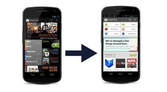
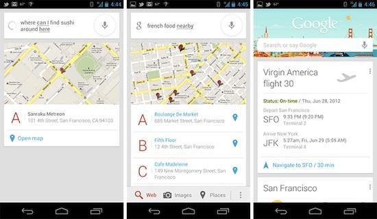
This is how Google describes the Play Store update which has begun rolling out to Android devices running version 2.2 and above in the coming weeks. The update brings a familiar card-style layout akin to Google Now. The result is a much cleaner interface than the previous Play Store which oozes a more mature approach to digital content, and could be a tell-tale sign of a Key Lime Pie future. An update to Google's portfolio of digital content puts it clear of Google I/O scheduled for May 15-17, and the new look could coincide with the next version of Google's Android.
Google's new Play Store update is simple and let's users "breeze through checkout and get to enjoying your movie rental or other content." Basically, the net effect of the update is identical to any other platform that sells digital content such as apps, games, music or movies. But where the Play Store gets to the nitty-gritty elements of the OS beneath is in the Play Store's colorful, card-schemed interface.
The new Play Store UI brings the same cards we have seen in Google Now to both the tablet and smartphone Play Store interfaces, yet both remain similar in appearance. You're going to get categories of digital content along the top of each specific genre with content-specific items below to the nth degree. Swiping within the category takes you through Top Paid, Top Selling, New Arrivals, Top Grossing, and so on, all the while upholding Project Butter's 60 frames per second of fluidity. The interface is simple. It is bright. The cards are organized.
However, beneath the bright and approachable visage of the Play Store lie true changes to the Google enterprise. Most importantly, Android as the world's most popular OS seems to have evolved to a point of maturity previously unimagined. The interface is clean and bright with elements of Google's silver platter, Google Now, and ditches the dark themes of Jelly Bean for an unoffensive rainbow of hues. If this is a sign of what's to come, I'm excited for what the Play Store update could mean for the next version of Android.
At first glance, the Play Store exhibits a more mature feel as soon as you start to navigate through it. You'll find the same icons for search and categories, and even the checkout process. Yet, once you dive into a category of digital content you soon realize that Key Lime Pie could easily adopt a similar level of organization.
Within each category, you swipe between "top" digital content with cards appearing for each individual app. The appearance is simple to the point of idiocracy with the app's icon, name, developer, and price. But Google has slipped in the three dot menu button to each card which can be tapped to add to your wishlist, or buy it without diving into the app itself. This "out in the open" approach alludes to a future Android OS allowing users to get app information without going into the application itself. To the same effect you can get app information in the Settings > Device > Apps location on stock Jelly Bean, I wouldn't be surprised to see the next iteration of Android take the same spearheaded approach to items on the home screen. Options are good.

Perhaps the most notable change awaiting Key Lime Pie is something I briefly touched on in a past editorial I've written: a new color scheme. Google has long preferred a neutral approach to the stock Android OS. Gingerbread took a black and neon green approach. Android 3.0 Honeycomb (for tablets) epitomized the OS as a bruised affair equipped with a neo-digital clock and fonts that were almost bionic. Ice Cream Sandwich kept the same black and blue aura of Honeycomb, but ditched the digital clock font for Roboto, a more mature and smooth take on characters. Finally, Jelly Bean kept the same color scheme as Honeycomb and Ice Cream Sandwich, but included minor updates (with the major update being Google Now) to the consensus of an incremental update.
The next version of Android ought to take note of how welcoming the new Play Store really is. I might sound like a 14-year old girl when I say pretty, bright colors pop, but it's true, Reader. Pretty, bright colors engage me to no avail. It's how I want to feel while swooshing through a mobile operating system. It exudes a polarity to past versions of Android that I would have never deemed possible. The brightness is engorging and I welcome this like a dog does a bone. Listen here, Google.
Honestly, if Android Key Lime Pie doesn't partake in the blues, oranges, greens, reds, and purples of the new Play Store, the Android OS could look out of place once the Play Store is closed and you're back at your home screen. The new Google is ready to bare all and mature to the point of unrecognition. Remember Cupcake? Google doesn't. Do you prefer primary colors? Not I, says the new Play Store.
Some could argue that the color scheme of Android hasn't changed because it was clean and simple, and I agree to a certain extent. Android isn't supposed to be shiny and skeumorphic like iOS, but it should be unique and attractive. Google's mobile OS has long felt clunky and disconnected, something many would even consider robotic. With an effervescent lag that was largely excusable simple because of the Android OS, I've felt Google has needed to address fluidity on an aesthetic level. Android has never truly felt like home. It's a baseline albeit a strong one. Cards is due to help organize Android and a new array of colors could surely help play a role in the recognition of Android Key Lime Pie.
As an optimistic fan of new mobile operating systems, you can be assured that Android probably won't shy away from what the Play Store has illustrated in its latest update. In short, I feel it must match Key Lime Pie or else Android could feel mismatched like polka dots and plaid.
What do you think the Play Store means for the next version of Android? Would you be happy with cards and bright colors in a future update to Android?