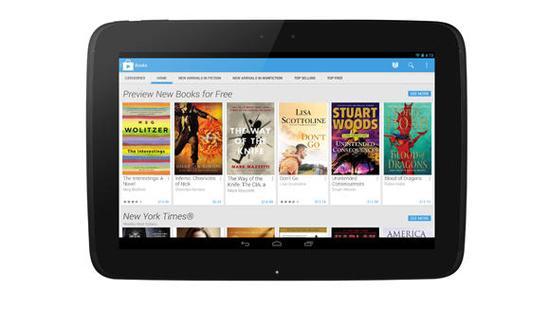
A couple of days ago news hit the shelves that said Google had begun rolling out its updated and refreshed version of the Google Play Store, focusing on making it more simplistic and easier to find entertaining applications. The update also brought faster response time from searching for applications and is described as looking “much cleaner” than previous versions. For the most part, it seems that the update is welcome by Android users as it’s made the overall process a better experience.
You know, I think I know another platform that could benefit from an App Store update sometime in the near future. This platform has an App Store whose update seemed to be a little more lacking than the previous version; it’s not intuitive, it’s precision-based (little room for error here), and it makes about as much sense as the translated text from the 1989 Sega game Zero Wing (think “All your base are belong to us.”)
For the next App Store update, I choose you, Applechu.
No application store, market, shop - whatever you want to call them as a generic whole – will ever be perfect. However, there is a difference between a good interface and a lacking interface. Unfortunately for Apple what might have seemed like a good idea turned out to be not so good of an idea after all. The release of iOS 6 also brought a new version of the App Store that’s received quite a bit of backlash from iOS users.
We’ll start from the beginning. When you open up the App Store, not a whole lot is different. You have your “New and Noteworthy” category, then a scrolling selection of basic categories, “What’s Hot”, a tutorial for the App Store, and for some reason mine features a collection of golf-related apps when I’ve never done anything more than putt-putt in my life. You also have your five basic navigations at the bottom dedicated to ‘Featured’, ‘Top Charts’, ‘Genius’, ‘Search’, and ‘Updates’. A home page is a home page I guess, and they’re going to throw a lot of stuff at you to get the user engaged. I feel like the layout is a little awkward and impersonal, mostly because of the strange placement of the Tutorial (hidden in the midst of all the hubbub) and the Golf apps. For the most part, I’ll leave the home page alone.
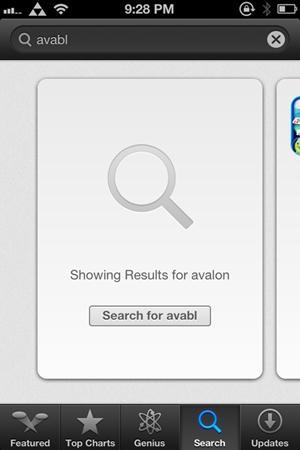
The main problem comes in with the search function because it’s not very functional at all. Most search functions give you a marginal room for error. You know, within reason. Obviously if you type in “grflawghabrugh” most engines won’t know you were trying to type in ‘Netflix’ with clumsy fingers. However, on several occasions I’ll miss only one letter and the search results either come up null or with a completely different result. For an example, I tried to look up a new game that came out for iOS called “Avabel Online”, and I accidentally searched ‘avabl’. Not only did it not come up with the result I wanted, but instead it searched the store for ‘avalon’, a result that isn’t even very close aside from the first three letters. Also, actually searching for 'avabl' like the box suggests didn't bring up any results.

‘Avalon’ actually came up with quite a few results, as I found out by scrolling through the app cards. This brings me to my next issue with the App Store interface. Scrolling each app one at a time is almost maddening. I'll put this in Layman's terms: List good; single card bad. We’ve been using lists for so long with the App Store, so why are we changing to singular cards now? It’s inconvenient and sometimes takes way too much effort to find that ‘one’ app you might be looking for in a long list of apps with similar names.
The one good thing I can say about the App Store is that it’s really easy to download apps if you already know that’s what you want. Just click-n-go and that’s it.
While the entire App Store isn’t unbearable, it still lacks being intuitive or easy to navigate. I don’t think that Apple should wait for another version of iOS to roll out before fixing it. I’m not saying copy Google’s every design element, but I am saying maybe Apple can pick up on some of Google’s cues and see that the positive response for what might seem like a small update would be in Apple’s favor.
I know I’m kind of jealous of the Play Store update.
Readers, what do you think about Apple’s App Store? Do you like the way it’s currently set up or would you like to see improvements made? Let me know your thoughts!
Image via TechRadar